|
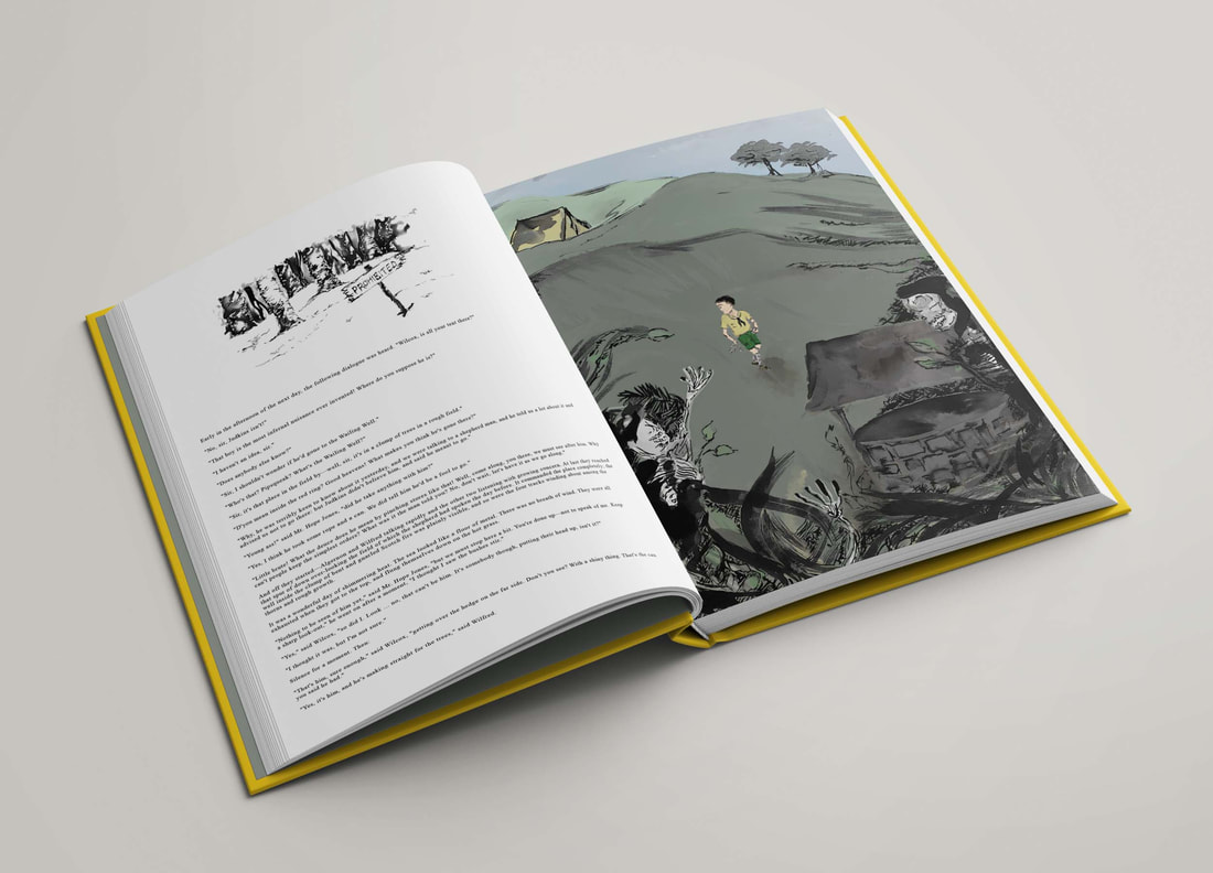
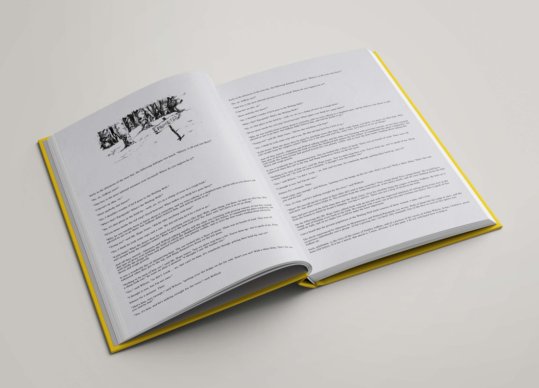
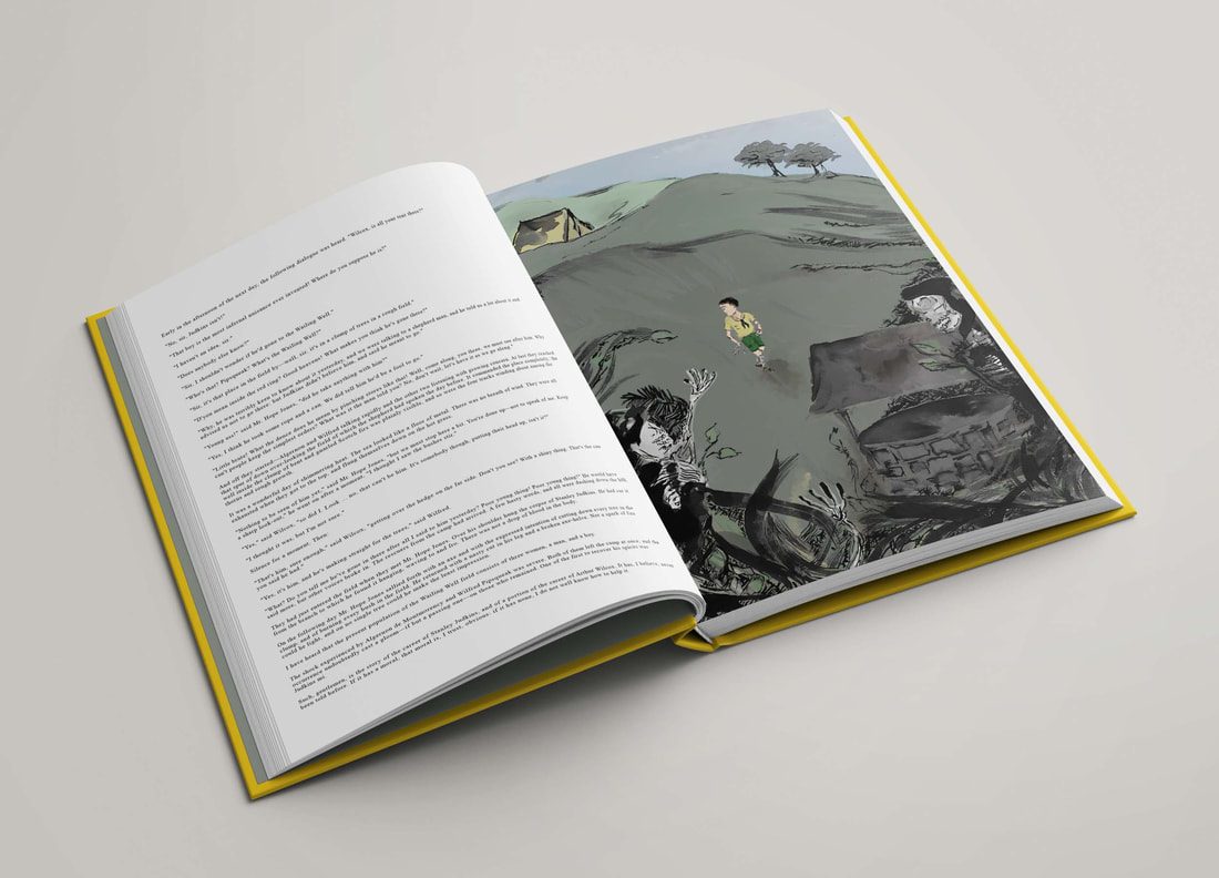
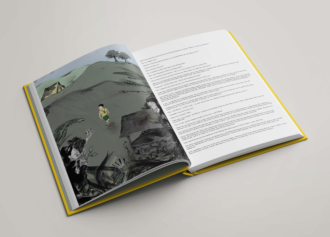
For the next project of the module, we have each been assigned a short story by M. R. James, and the brief consists of producing 1 full bleed illustration, 160x226mm, CMYK (300 dpi) and 1 chapter heading illustration, 105x50mm, greyscale (300 dpi). Also for this project we are to take a more literal approach in contrast to the previous project.
Wailing Well
Brief synopsis: "Wailing Well" is a ghost story written by M R James in 1928. It is about a young boy scout named Stanley Judkins, who is a disobedient, ill-mannered boy. The story revolves around a scout camping trip, set during an undisclosed time of the early 1900s, in which they are given maps which points out the 'danger' zones with a red ring around them. The 'wailing well' is in the red ring, and despite being a prohibited area linked to lots of horror stories, Judkins is keen to go regardless. Needless to say the story doesn't have a happy ending. Key quotes from the story: "That sort of clump in the middle of the field down there" "Three women and a man" "You can pretty well see from here what a state it's got into with brambles and suckers and trash of all kinds" "There's tracks in it" "Four tracks: three women and a man" "Rags and bones", "flutterin' rags and whity bones" "They hadn't much to call faces", "but I could seem to see they had teeth" "The well inside the clump of bent and gnarled scotch firs was plainly visible, and so were the four tracks winding about among the thorns and rough growth' "He's making a straight for the trees" "He saw a terrible figure - something in ragged black - with whitish patches breaking out of it: the head, perched on a long thing neck, half hidden by a shapeless sort of blackened sun-bonnet" "The boys took it all in in an instance of silence"
Visual Research
The main illustrators I have looked at for inspiration include Daniel Egneus, Mervyn Peake, Lorenzo Mattotti and Charles Keeping. I like Daniel Egneus' abstract stylisation of figures and I think this would work well when portraying 'flutterin' rags and whity bones'. I also really like the spookiness involved with Charles Keeping's work and the use of line, I think they are very gloomy pieces. Also with both Egneus and Keeping, there are elements of colour which have inspired some of my thumbnails, for example for the portrayal of shadows etc. I really like the layered effect these artists use and I think it would be ideal for this story. Mervyn Peake however I think provides an atmosphere which I am aiming for. I really like the use of light and dark, and his approach also provides the feeling of something old. Here are my initial thumbnails below for both the full page illustration and the chapter header. I am more confident with the chapter header thumbnails at the minute as I feel they provide a brief introduction to the mood and atmosphere, revealing little about the story. For the main illustration part of me is thinking I've over complicated it in some aspects, as a simple idea done in an effective manner could be just as, if not more, communicative in the sense that it wouldn't give too much away to the reader, yet it provides everything we want the reader to be feeling.
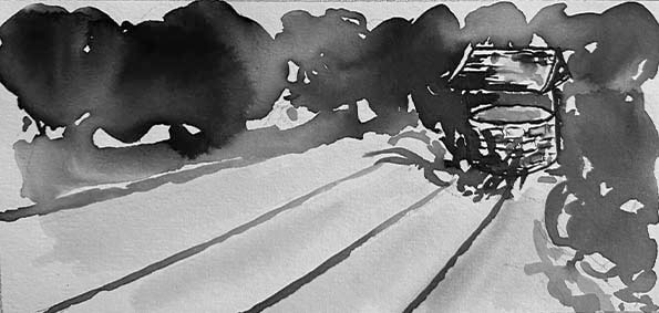
Developed thumbnails for main full bleed illustration:
Developed thumbnails for chapter header:
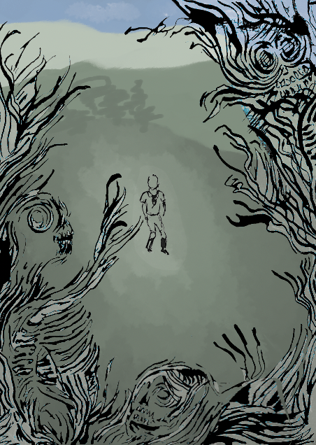
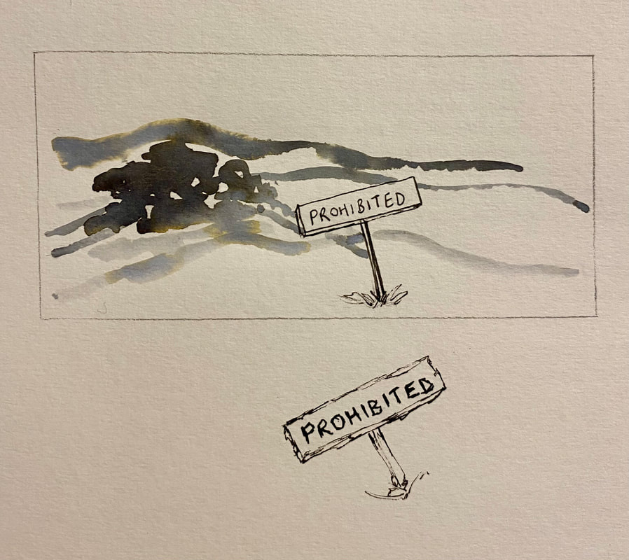
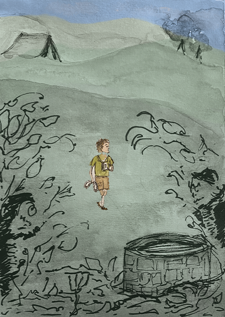
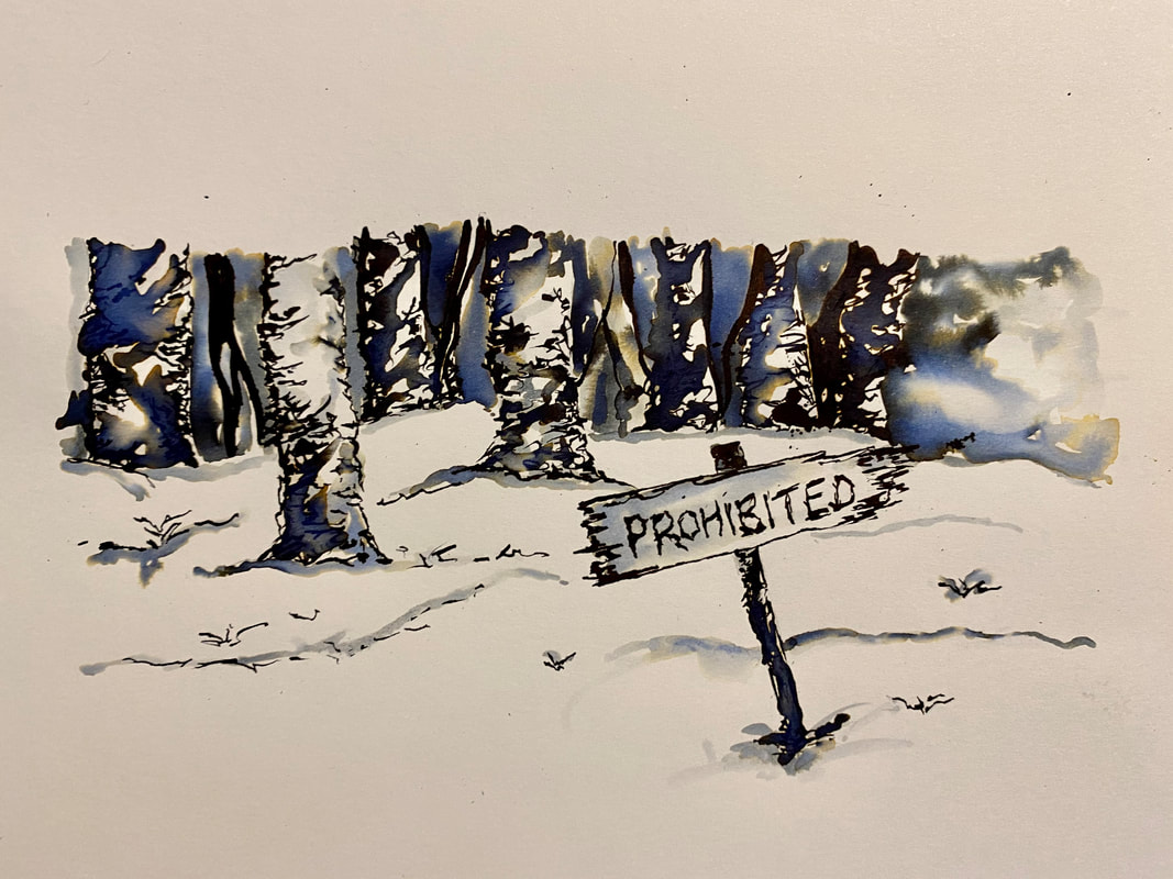
Following a group feedback session, Tony's main points were that he wanted me to experiment more with colour for the full bleed illustration, and also encouraged me not to lose the figures in the foliage - look at less skeletal figures (include more of the 'rags' that are mentioned in the story). Other things that were mentioned included the possibility of a bit more distant background, more attention to detail regarding the characteristics of the figures. For my chapter header his thoughts were that it was a little too similar to my full bleed illustration. He suggested maybe keeping it a bit more brief and home in a bit more on the 'do not enter' idea, and the fact that the place is dangerous. Considering the feedback, I had a play with a few more ideas shown below.
VERY rough chapter heading ideas...
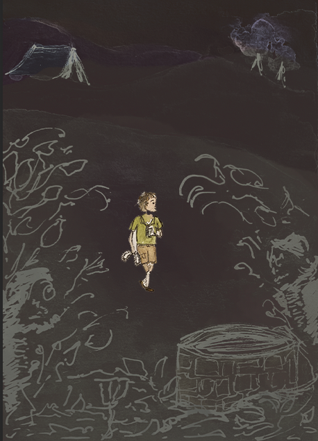
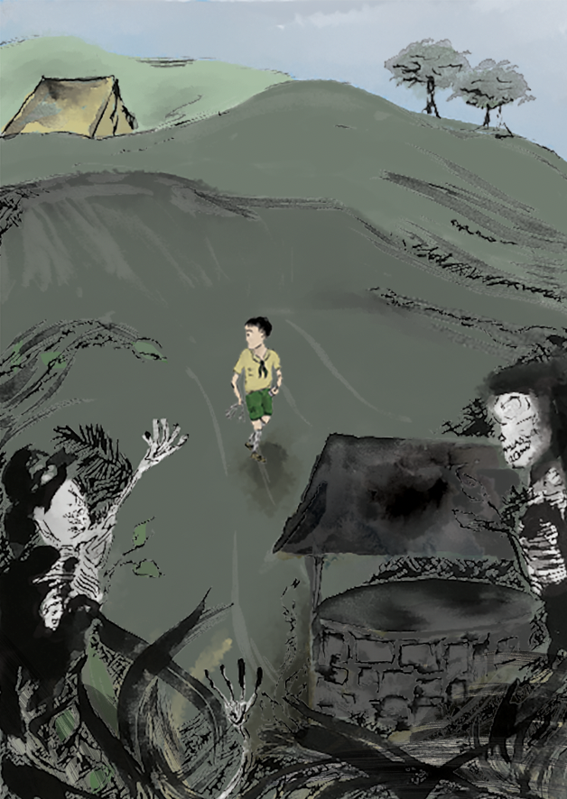
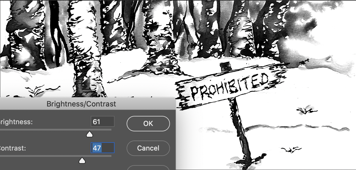
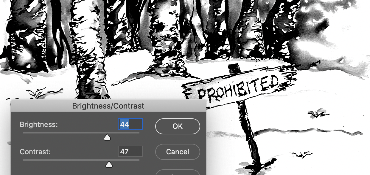
I also had a play with some of the different filters on the layers just out of curiosity really but I thought they displayed some interesting moods.
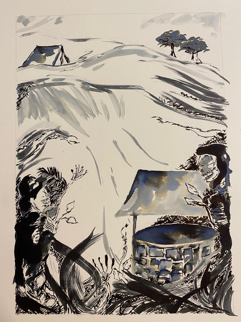
Full page illustration progress:
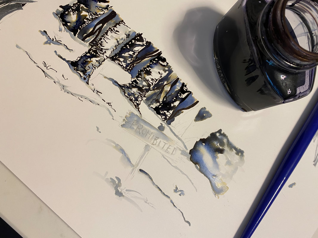
Chapter header:
0 Comments
For the first project of the semester, we were each given a written article for which we are tasked with producing illustrations for. We are also looking conceptually here rather than literally, which will be really interesting.
Within conceptual illustration we are aiming to attract interest to the article, without revealing too much about whats included in the article. We don't want to almost repeat what's already been said in the article. It is a complex and professional form of illustration which involves a clever use of imagery and problem-solving. The pieces often involve extreme distortion and abstraction, used to display certain effects and meanings. Particularly with conceptual illustration, we need to focus on who the audience will be, and what key points we need to include which will trigger a meaningful reaction - all linked to semiotics.
I looked at a range of conceptual illustration on Pinterest and a few that I found fascinating were John Holcroft, and Dan Page. Here are some of the pieces I found particularly engaging.
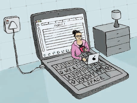
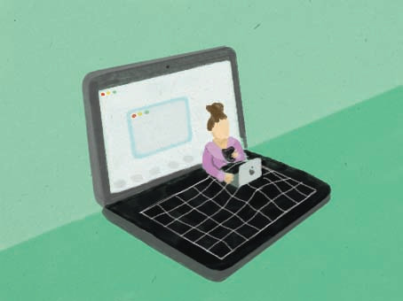
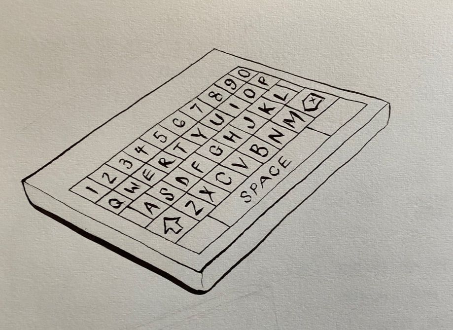
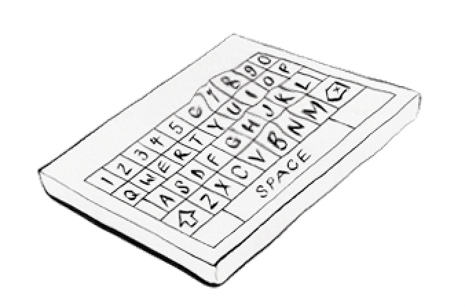
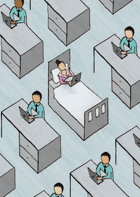
My article was a BBC article about 'working from bed' - the way in which people have adapted to working at home, in particular in bed, since the growth of the pandemic. I was tasked with producing 1 × illustration - 160 × 120mm, 1 × spot illustration - 50 × 70, both CMYK. I found this a very interesting topic, very current, and something which I could definitely develop. For my initial thumbnails I was looking at the shape of a bed, and things which I also associated with that shape, which I could also link to this topic. So I came up with using an open book as a bed, which progressed to a laptop as a bed - which I thought was a much better shape for this idea. I also played with the global aspects of the topic - the article speaks about how global decisions can be made from bed, but I thought I was going a bit far with the idea at that point. After a group crit, I decided I'd go with the idea of the laptop opening out into a bed, using the keyboard of the laptop as the duvet cover. It also came up in my crit that I had explored the idea of working in bed in a bedroom, but not so much in an office environment, so I thought I'd use this as a simple idea for the spot illustration.
BBC article: www.bbc.co.uk/news/business-55775292
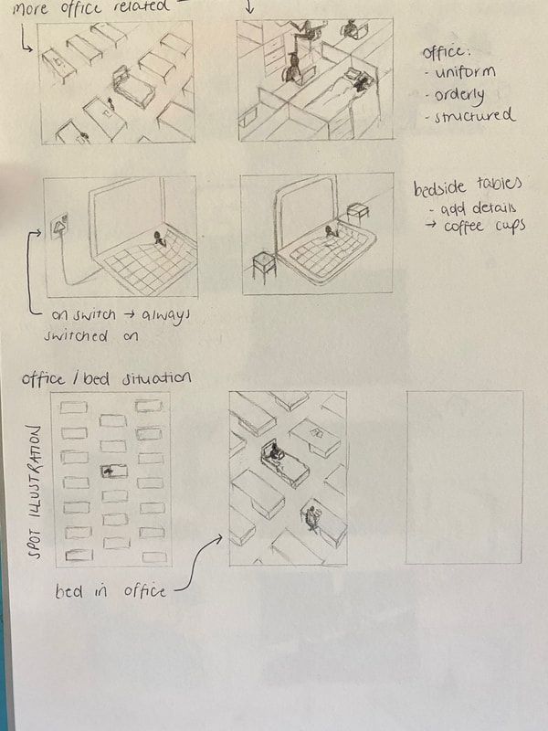
Here are my developed thumbnails, I aim for the 'laptop bed' to be my main illustration, and the simple office scene to be my spot illustration. Through developing my concept I also added in the plug socket for the laptop which came to be quite important to the piece, as it is switched on - and within the article it is discussed that working from bed makes it difficult to 'switch off' from work mode. The colour scheme I was generally aiming towards was blue/grey as grey is always a colour which springs to mind when I think about technology, and also blue.
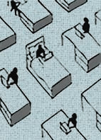
I was very happy with my feedback from the second group crit. Tony really liked my ideas, showing both concepts - working in bed in a bedroom scene. Then for the spot illustration I was showing the other side - a uniform, orderly office setting, with one of them being a bed instead of a desk. To keep the image in an orderly setting I just included anonymous workers as the focus was mainly on the bed.

Here is my final main illustration (120mm x 160mm). I produced the line work using dip pen, and then uploaded it into photoshop, adding my colour and texture. I am really happy with how this turned out, and I think it's a really clever concept for the article. I think the colour palette works really well here as well as it's quite plain which I'd associate with an office vibe.
For my spot illustration (50mm x 70mm) I found that working initially to these dimensions was difficult when it came to editing in photoshop (see below) so I worked on a larger scale using the same ratio to make life easier for production.
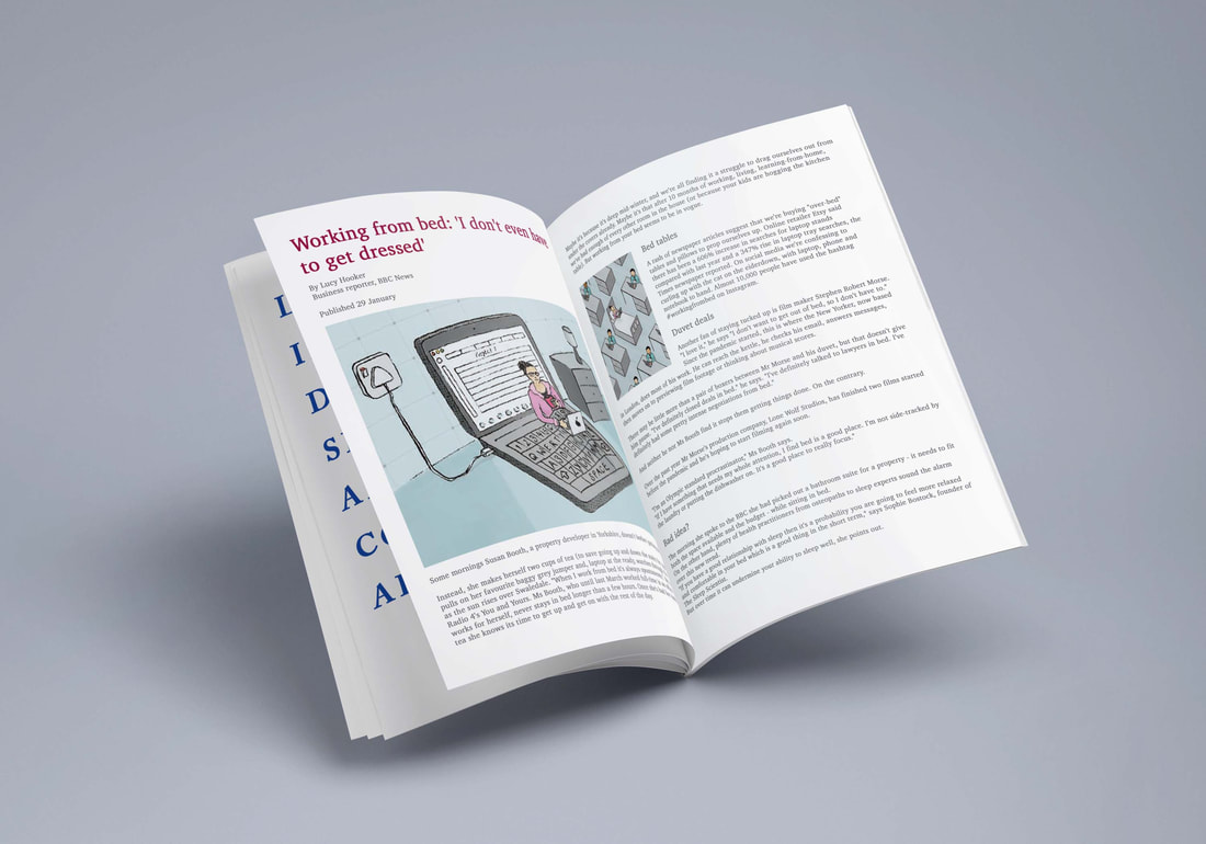
FINALS & MOCK UP
|
Archives |



























 RSS Feed