|
For the first project of the semester, we were each given a written article for which we are tasked with producing illustrations for. We are also looking conceptually here rather than literally, which will be really interesting.
Within conceptual illustration we are aiming to attract interest to the article, without revealing too much about whats included in the article. We don't want to almost repeat what's already been said in the article. It is a complex and professional form of illustration which involves a clever use of imagery and problem-solving. The pieces often involve extreme distortion and abstraction, used to display certain effects and meanings. Particularly with conceptual illustration, we need to focus on who the audience will be, and what key points we need to include which will trigger a meaningful reaction - all linked to semiotics.
I looked at a range of conceptual illustration on Pinterest and a few that I found fascinating were John Holcroft, and Dan Page. Here are some of the pieces I found particularly engaging.
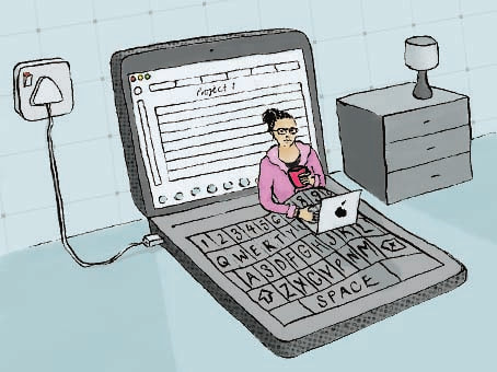
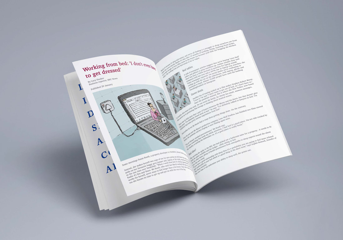
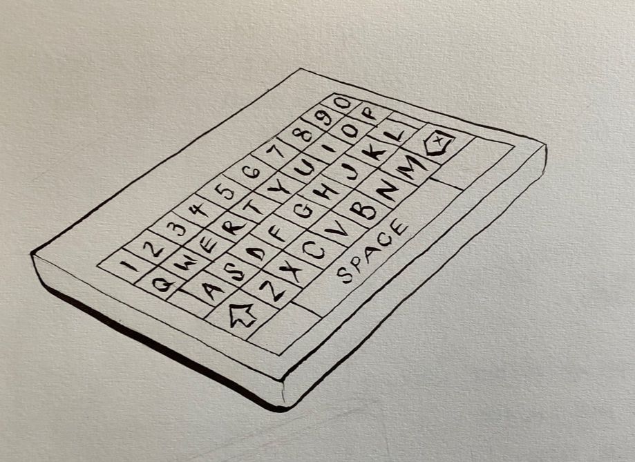
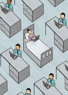
My article was a BBC article about 'working from bed' - the way in which people have adapted to working at home, in particular in bed, since the growth of the pandemic. I was tasked with producing 1 × illustration - 160 × 120mm, 1 × spot illustration - 50 × 70, both CMYK. I found this a very interesting topic, very current, and something which I could definitely develop. For my initial thumbnails I was looking at the shape of a bed, and things which I also associated with that shape, which I could also link to this topic. So I came up with using an open book as a bed, which progressed to a laptop as a bed - which I thought was a much better shape for this idea. I also played with the global aspects of the topic - the article speaks about how global decisions can be made from bed, but I thought I was going a bit far with the idea at that point. After a group crit, I decided I'd go with the idea of the laptop opening out into a bed, using the keyboard of the laptop as the duvet cover. It also came up in my crit that I had explored the idea of working in bed in a bedroom, but not so much in an office environment, so I thought I'd use this as a simple idea for the spot illustration.
BBC article: www.bbc.co.uk/news/business-55775292
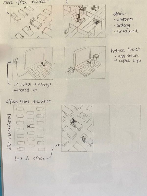
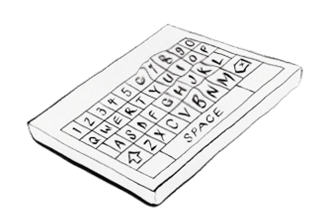
Here are my developed thumbnails, I aim for the 'laptop bed' to be my main illustration, and the simple office scene to be my spot illustration. Through developing my concept I also added in the plug socket for the laptop which came to be quite important to the piece, as it is switched on - and within the article it is discussed that working from bed makes it difficult to 'switch off' from work mode. The colour scheme I was generally aiming towards was blue/grey as grey is always a colour which springs to mind when I think about technology, and also blue.
I was very happy with my feedback from the second group crit. Tony really liked my ideas, showing both concepts - working in bed in a bedroom scene. Then for the spot illustration I was showing the other side - a uniform, orderly office setting, with one of them being a bed instead of a desk. To keep the image in an orderly setting I just included anonymous workers as the focus was mainly on the bed.

Here is my final main illustration (120mm x 160mm). I produced the line work using dip pen, and then uploaded it into photoshop, adding my colour and texture. I am really happy with how this turned out, and I think it's a really clever concept for the article. I think the colour palette works really well here as well as it's quite plain which I'd associate with an office vibe.
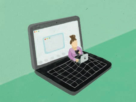
For my spot illustration (50mm x 70mm) I found that working initially to these dimensions was difficult when it came to editing in photoshop (see below) so I worked on a larger scale using the same ratio to make life easier for production.
FINALS & MOCK UP
0 Comments
Leave a Reply. |
Archives |


 RSS Feed