|
For the last brief of the semester, we had a very broad choice for the subject. I opted for the children's book brief as I really liked the look of it and I thought this would allow me to really have some fun and experiment. Also after watching an episode of BBC4's Picture Book series, I felt really inspired, particularly in the way children's books are incredibly thought through regarding educational elements and ways of learning and development. I have a nephew and I've read him countless books and it's fascinating how much he learns from them - I find that he counts EVERYTHING - (e.g. the number of birds on each page), they're good at teaching colours, and also the names of animals etc.
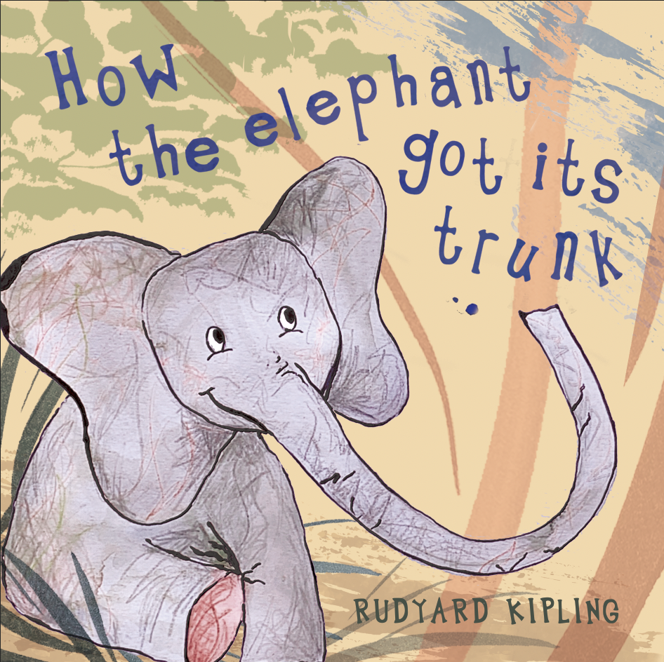
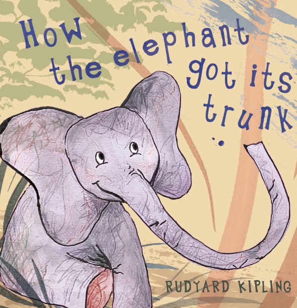
The children's book I have chosen within the brief is 'How the Elephant got its Trunk'. It is a very cute story about how the little elephant went from having a black bumpy nose to now having a trunk. The story involves lots of different animals - a hippo, a crocodile, an aunt ostridge, an uncle giraffe, birds and more. I noticed how the story involves family orientated elements, which is common in lots of children's books as it helps engage the children. I think it's particularly important to produce characters who appear friendly, warm and lovable, who the children feel they can resonate with. The main illustrators who particularly interested me were Catherine Rayner who I love - I really like how her main focus is the characters which is something I am going to think about, I liked Eric Carle and Brian Wildsmith's collage styles, and Quentin Blake's images which contain such personality.
Within the brief, we are tasked with producing a front cover, a single page, and a double page spread, taking into consideration and demonstrating the integration of type. Therefore I will focus on the elements of the book I find most interesting! We are also to provide proof of concept (i.e. how the book will pan out). We had the freedom of using our own dimensions so after doing research into what is generally accepted within industry, I will opt to do my book 8.5inches x 8.5inches. Although children's books do range in sizes, generally books are either 8.5x8.5inches or 7x10inches, so sticking to these dimensions makes it more likely your book would be published, and also easily mass produced.
First hand research:
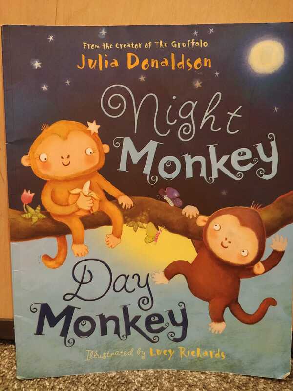
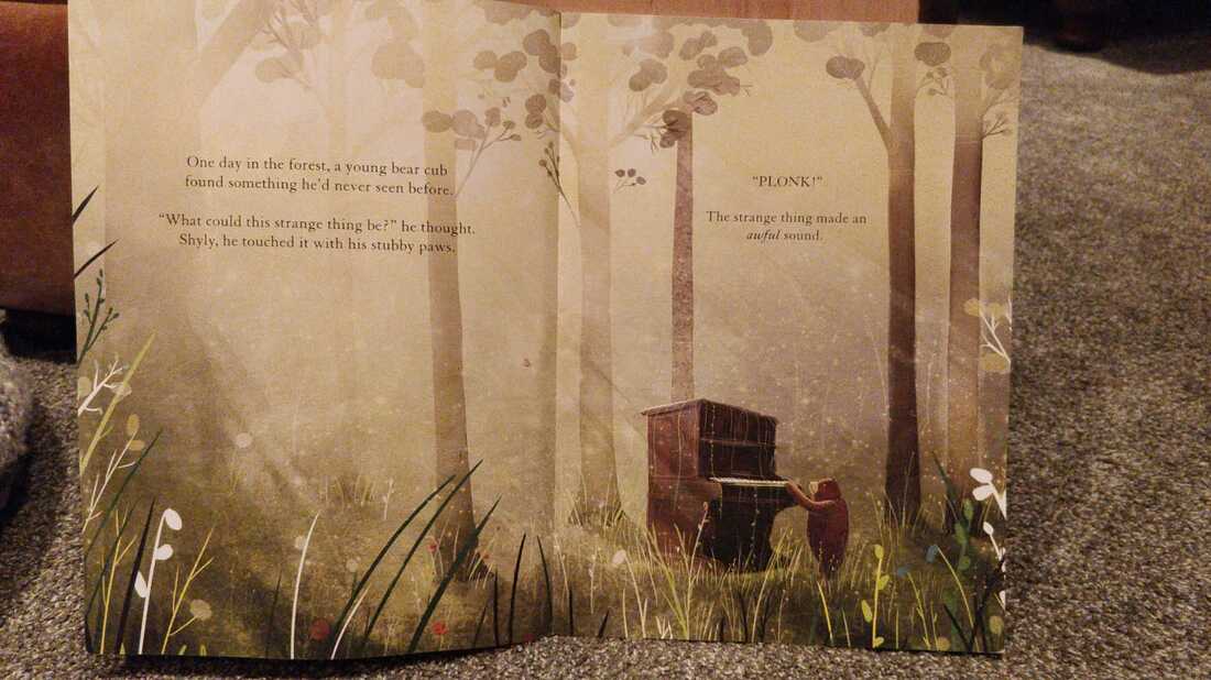
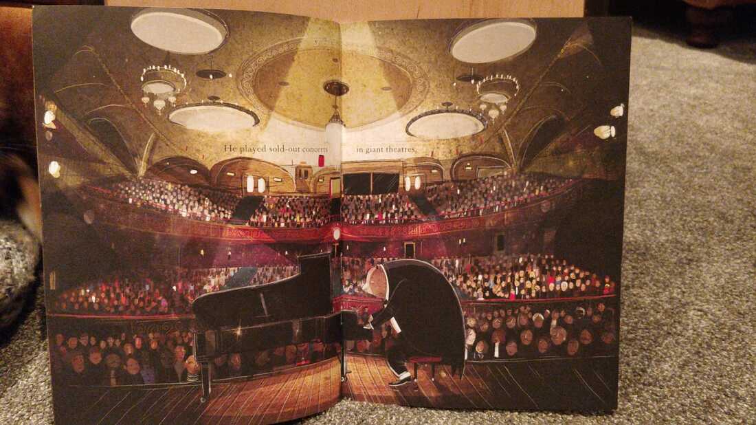
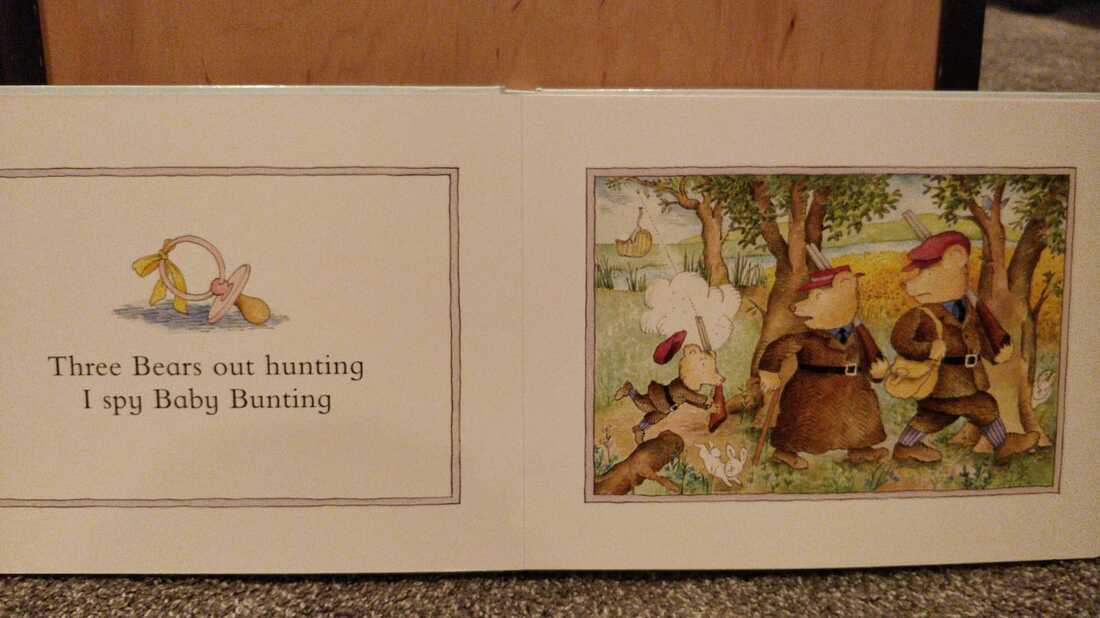
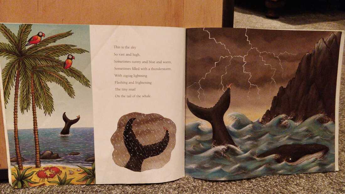
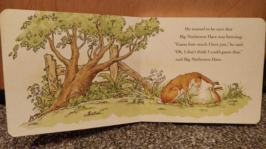
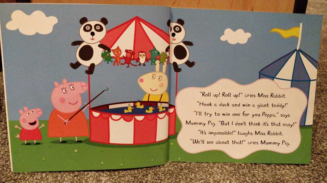
To gain some inspiration and further insight to children's picture books I raided my nephews large story collection. Mainly looking at illustrations which particularly caught my intention and also associated with animals. Also this was very useful when looking at the ways text has been integrated.
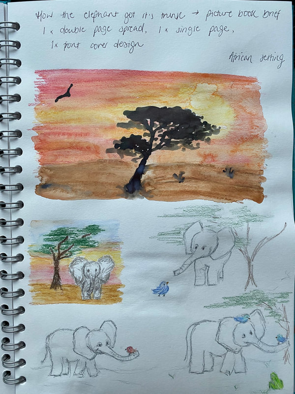
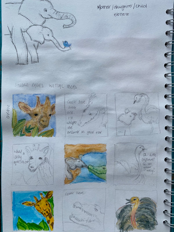
Initial thumbnail sketches, playing with composition, idea generation:
Experimenting with collage, mark making (very rough, quick developments):
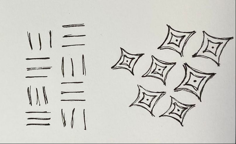
I produced some sheets of mark making as a bit of a fun therapeutic exercise, but I can use these for collage both digital and handmade. Also they would be really good for using as textures within photoshop. I was generally just having a rough play with collage and composition. After these exercises I came to the conclusion that I think I prefer the idea of digitally layering elements - I really like the crocodile experiment I did. I would love to experiment further with producing a layered background (maybe screen printed) with more detailed illustrations on top - possibly in ink and watercolour with added textures through photoshop.
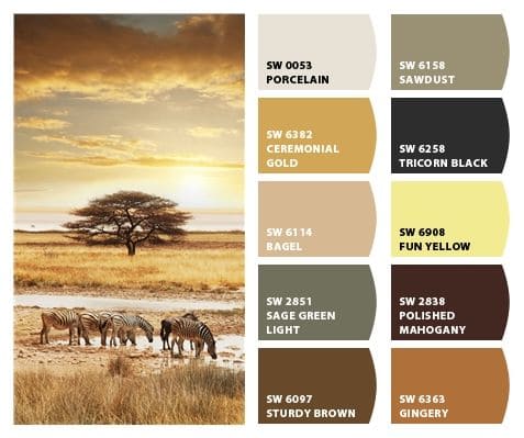
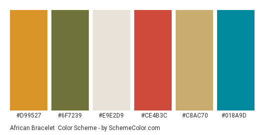
On reflection, I really hadn't thought enough about my colour scheme. As the book is based in Africa, I think I want to stick to potentially more muted tones, however on the warmer end of the spectrum - more reds and oranges, browns etc. I think I should steer clear of the blue as this does not reflect Africa at all. I really like the crocodile development here and I think the colour scheme on this piece is effective.
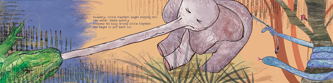
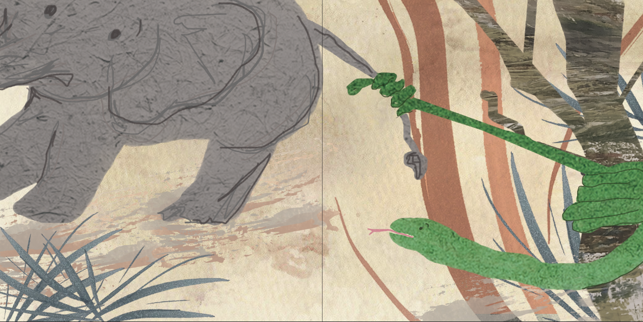
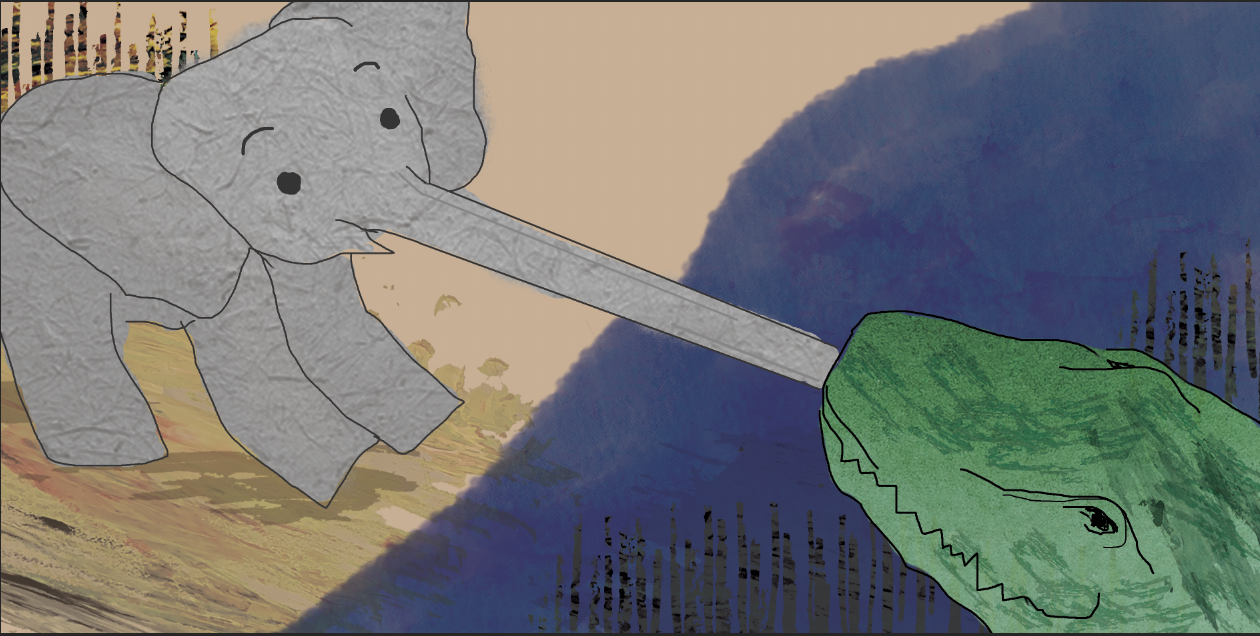
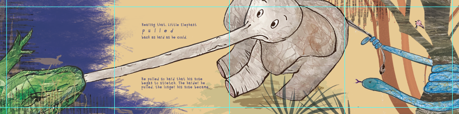
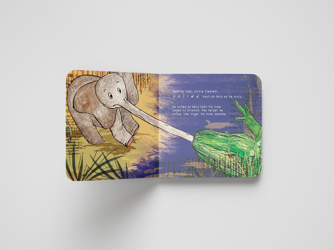
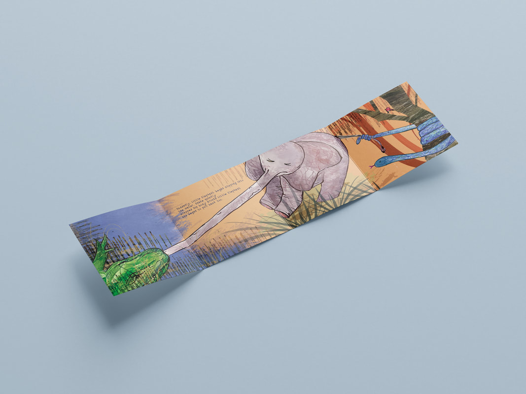
I experimented here with the 'tug of war' scene, after my group crit I was inspired to make the most of the double page spread, and thought this could be emphasised further by spreading it across several pages. I thought this would also be enjoyable and engaging for the reader. I used a mixture of my mark making sheets and also textured papers for the collage effect but this was mainly just for figuring out composition etc and having a play. Another idea would be to have these pages in a concertina format - this would be very interesting and especially engaging for a young audience.
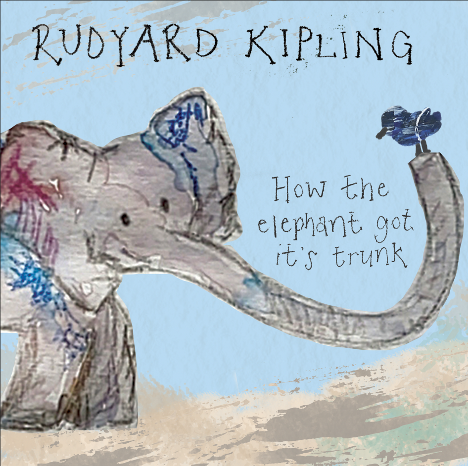
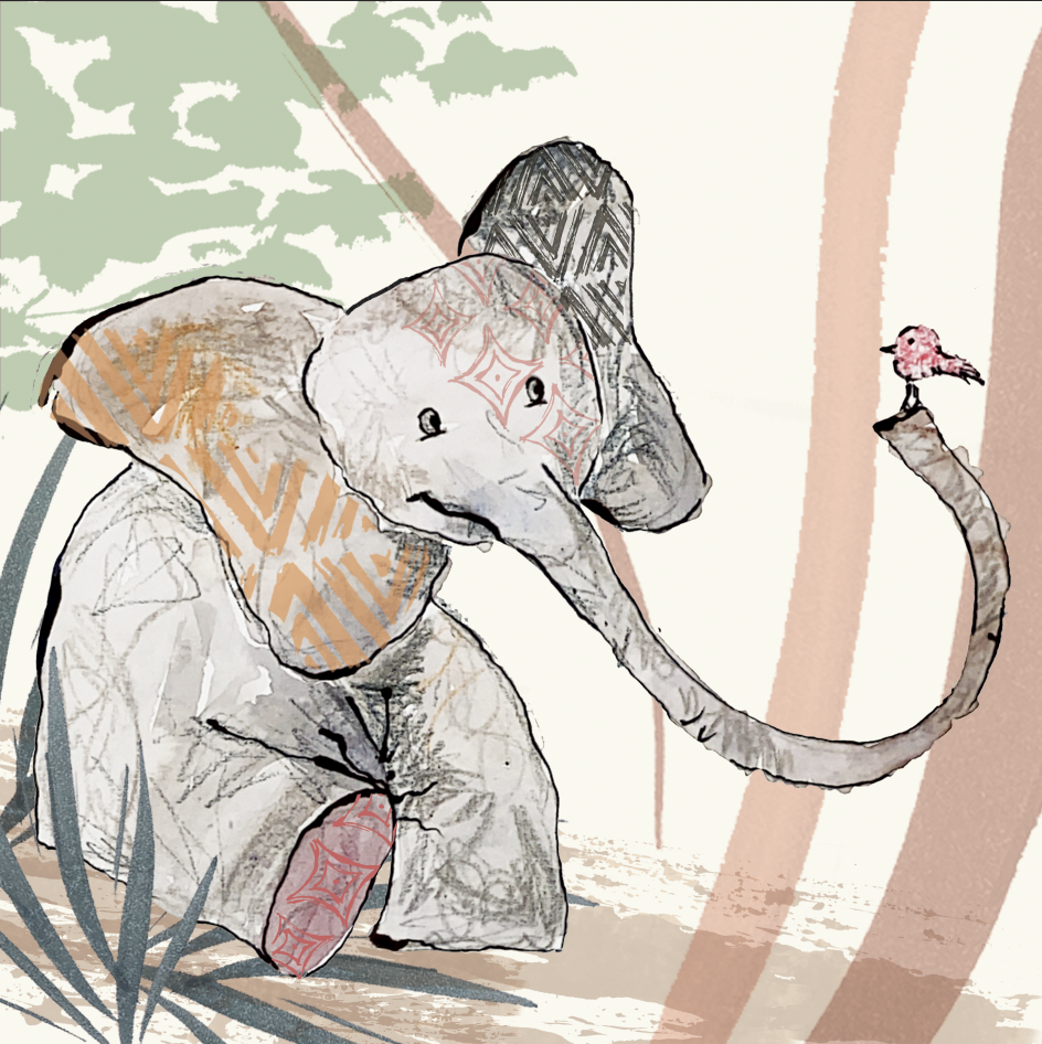
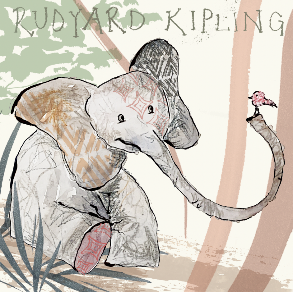
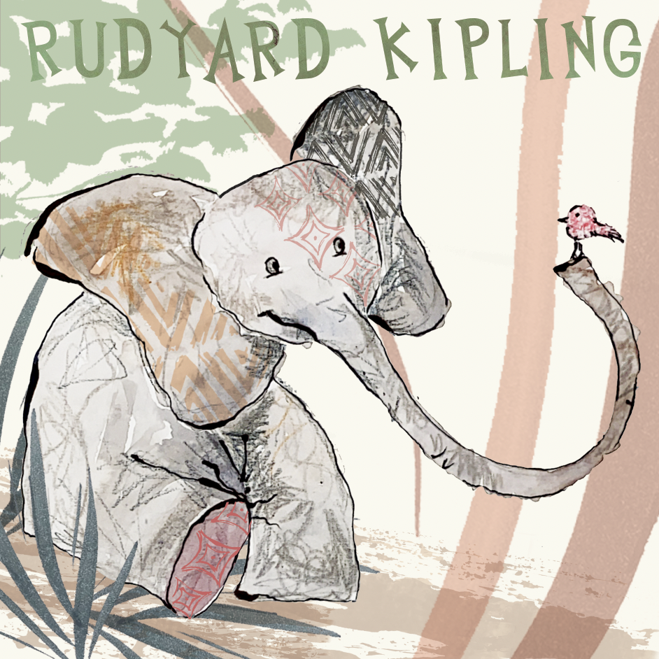
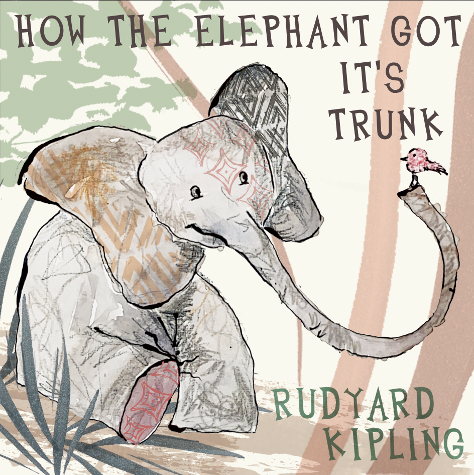
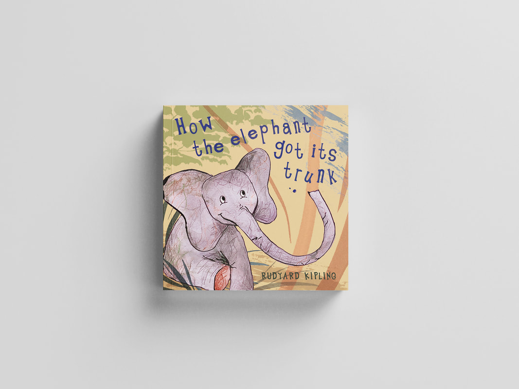
Here are some further developments for the front cover focusing more on style and the typography. I really like the idea of using watercolour and pencil crayon for the animals, inspired by Catherine Rayner. I have also developed the use of layers in photoshop, aiming for a screen printed effect background. I really want the characters to have a personality, and be characters children can resonate with. I aim for the elephant to appear innocent, friendly and lovable. I have roughly experimented with hand rendered type in my developments but I came across another font which I have used below which I think is really effective and I think it suits the genre.
Here I went back to one of my other ideas just to have a bit of a further play with composition and with the incorporation of text.
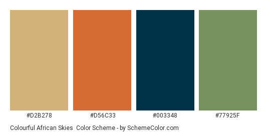
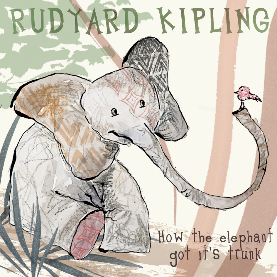
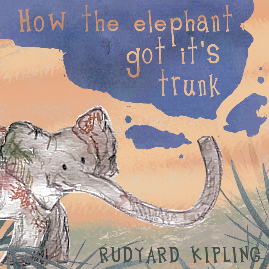
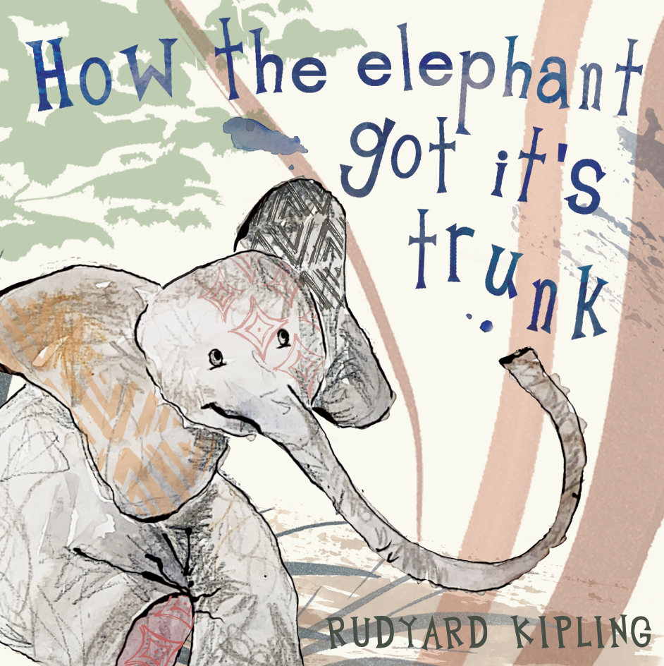
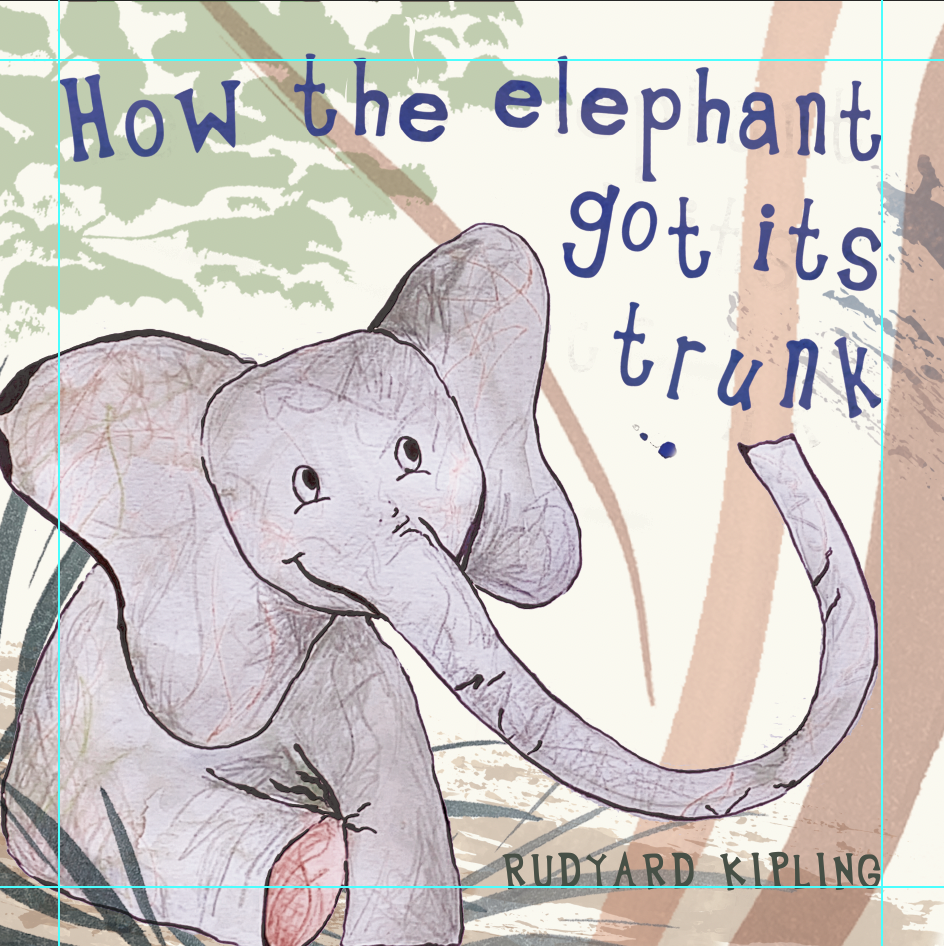
After some feedback, this gave me some developments for improving composition and other elements such as the text. I took this font here, and edited some of the letters to make them a bit more 'child friendly' such as the 't'. I also made all the edges of the characters a bit softer to produce my own typeface using this font as a bit of a basis. Using the website calligraphr, I produced this font which I'm really happy with. Furthermore, I made alterations to the elephant to make it a bit more friendly/'cuddly' and appropriately in proportion (for a children's book). I also used guides on photoshop to ensure I didn't have anything too close to the edges. Another thing that came up in feedback was the colour scheme - it was suggested that I push it further with the Africa theme - the colours could be a bit bolder, so this is another thing I worked on. I also wanted to make the title appear more as tho it's water splashing out of the elephant's trunk as it's almost a celebration of the trunk, so I had a bit more of a play with this.
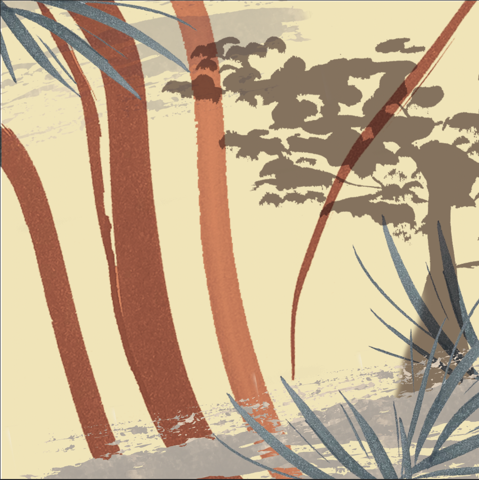
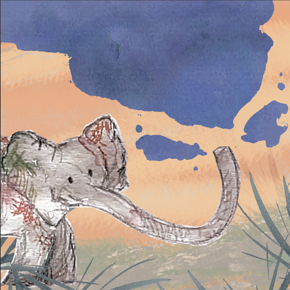
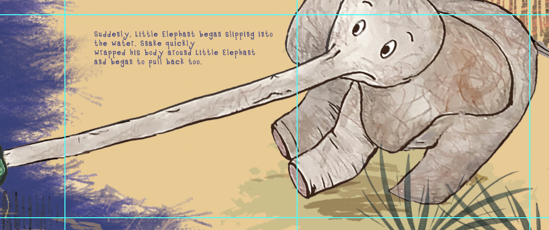
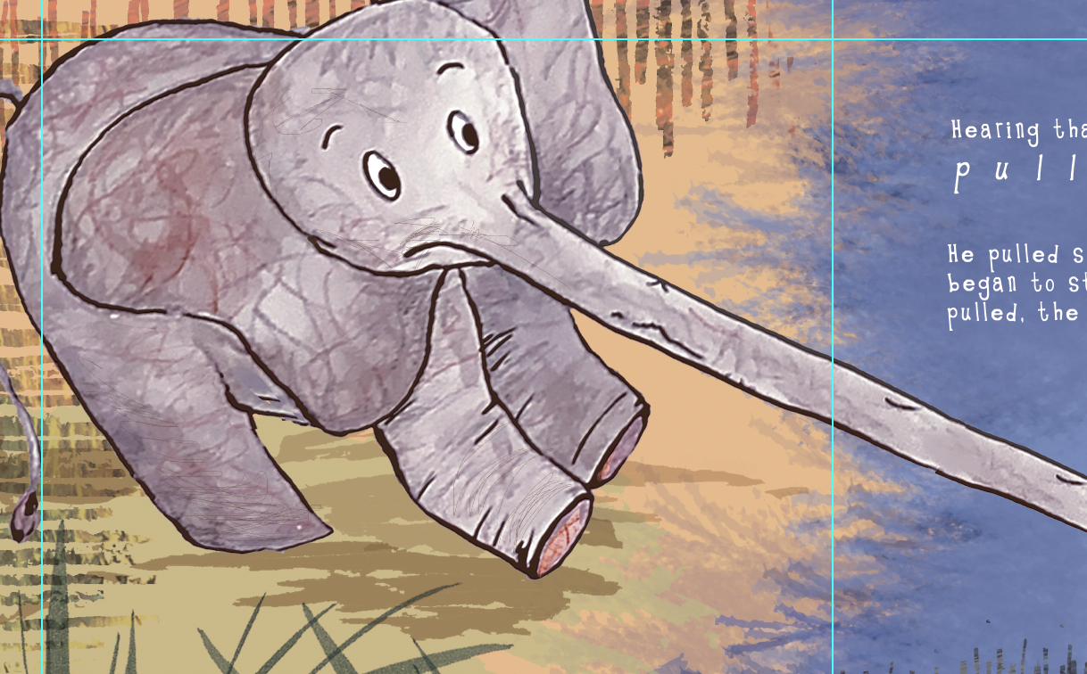
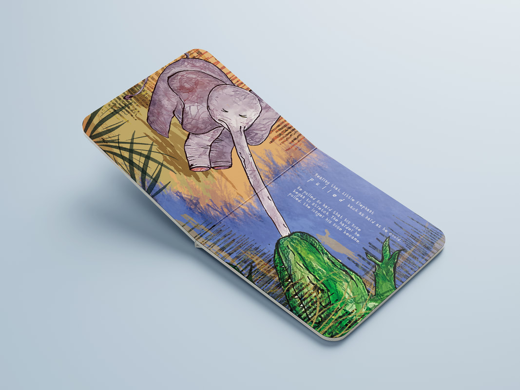
Below were some initial development ideas for my double page spread - roughly figuring out composition using a range of textures within photoshop. Also I played with the text to allow adjustments within the composition. After figuring out composition and layout, I went on to produce the double page spread in the same style as the front cover - keeping in mind lots of the things I had previously noted in feedback sessions regarding the composition (not having things too close to the edges etc).
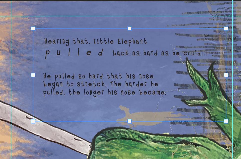
I played around a little bit with the text as initially I had the text centred but I had remembered that big bodies of text in this format are particularly difficult to read. Therefore, considering this is a book for children, I looked at arranging the text in the more common format of ranging left, ragged right (going back to basics of first year!). This makes the text easier to read, and I also experimented with the word 'pulled' to add a bit of fun to the text.
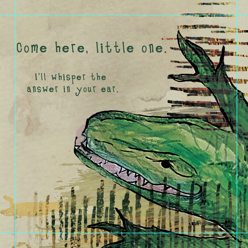
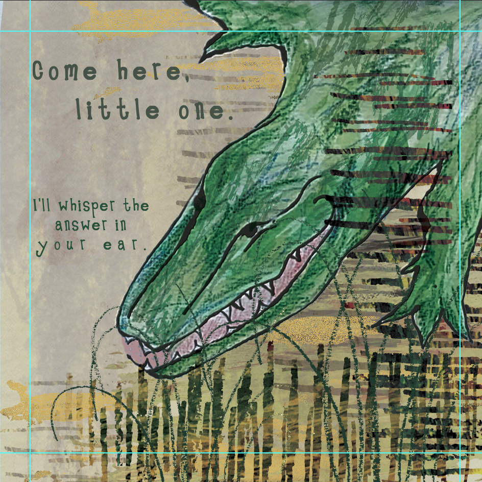
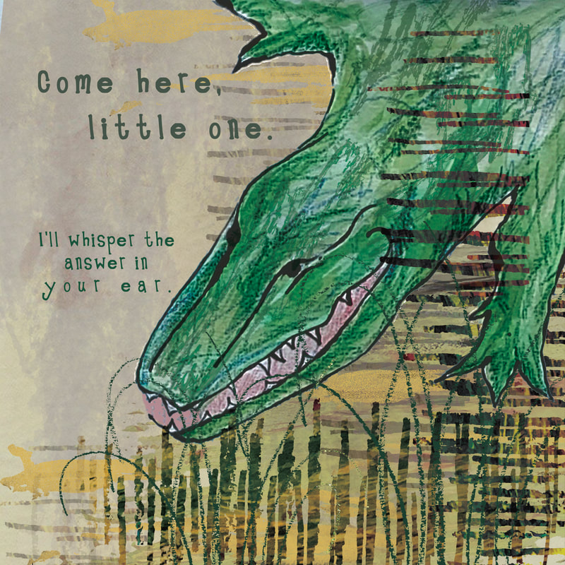
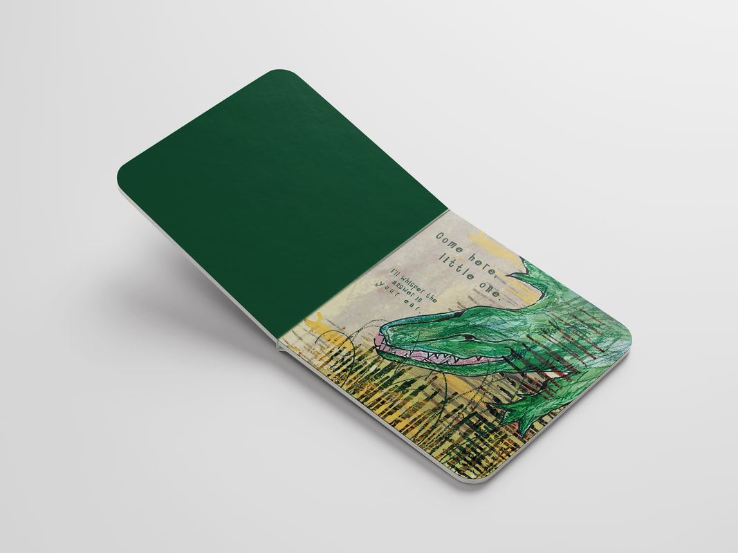
For my single page of the book, I experimented quite a bit with view point and composition, and the arrangement of the text. I looked at the portrayal of the crocodile from above - providing a level of threat from the character, and on the other hand, looking down at the crocodile almost as if you could imagine the elephant's ear listening to him whisper.
Although I like the third one where the 'whispering' text is arranged cleverly by the crocodile's mouth, I personally didn't really like this page. I preferred the composition of the first example but I had a bit more of a play with the text to make it a bit more engaging. I also made a few edits to the textural elements and the ink colour.

FINALS:

MOCK UPS:
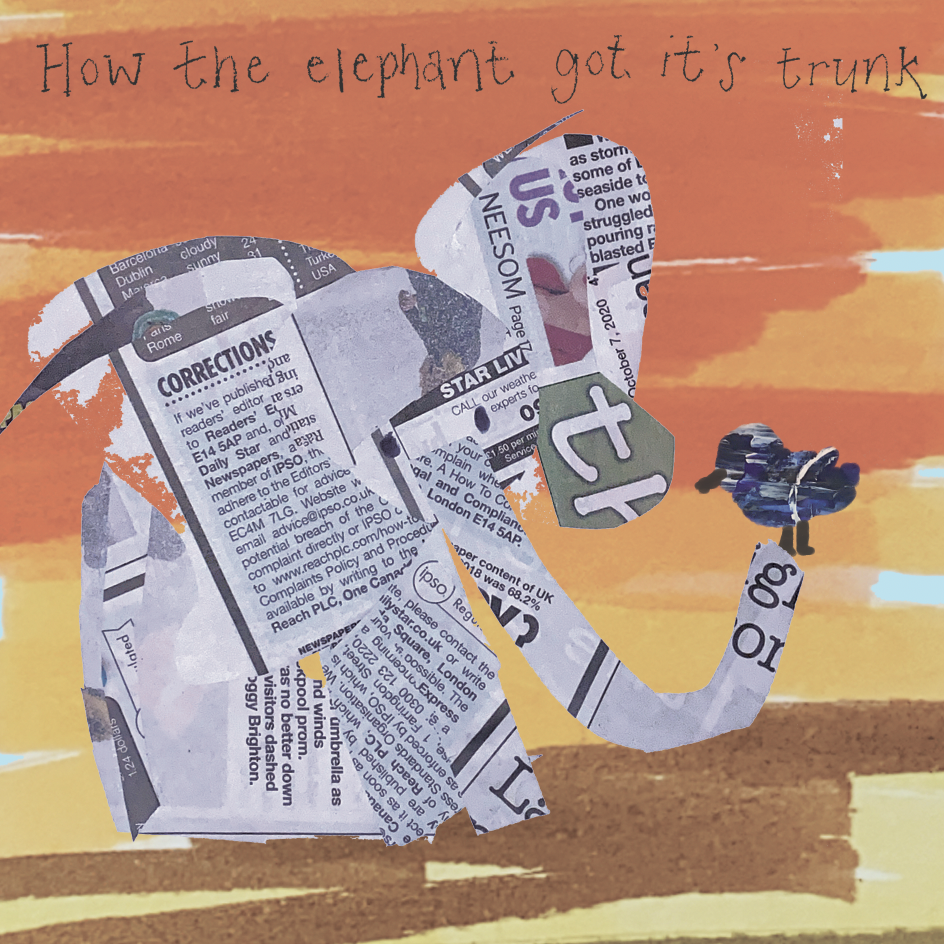
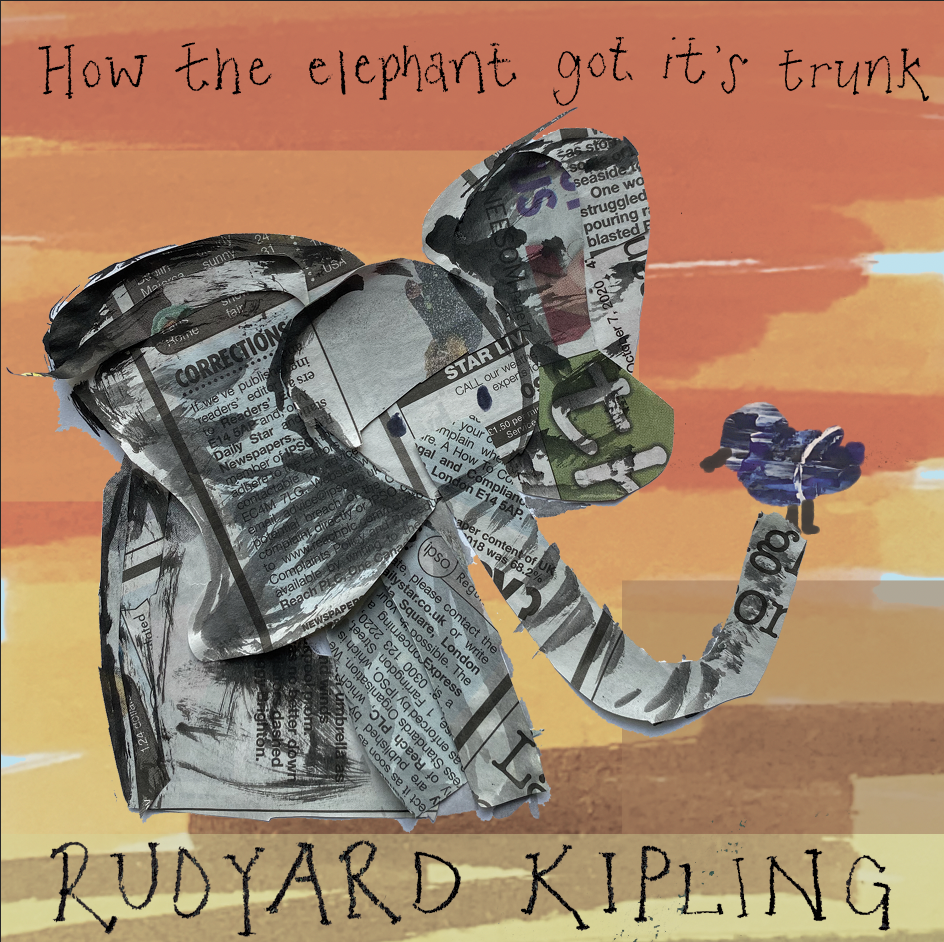
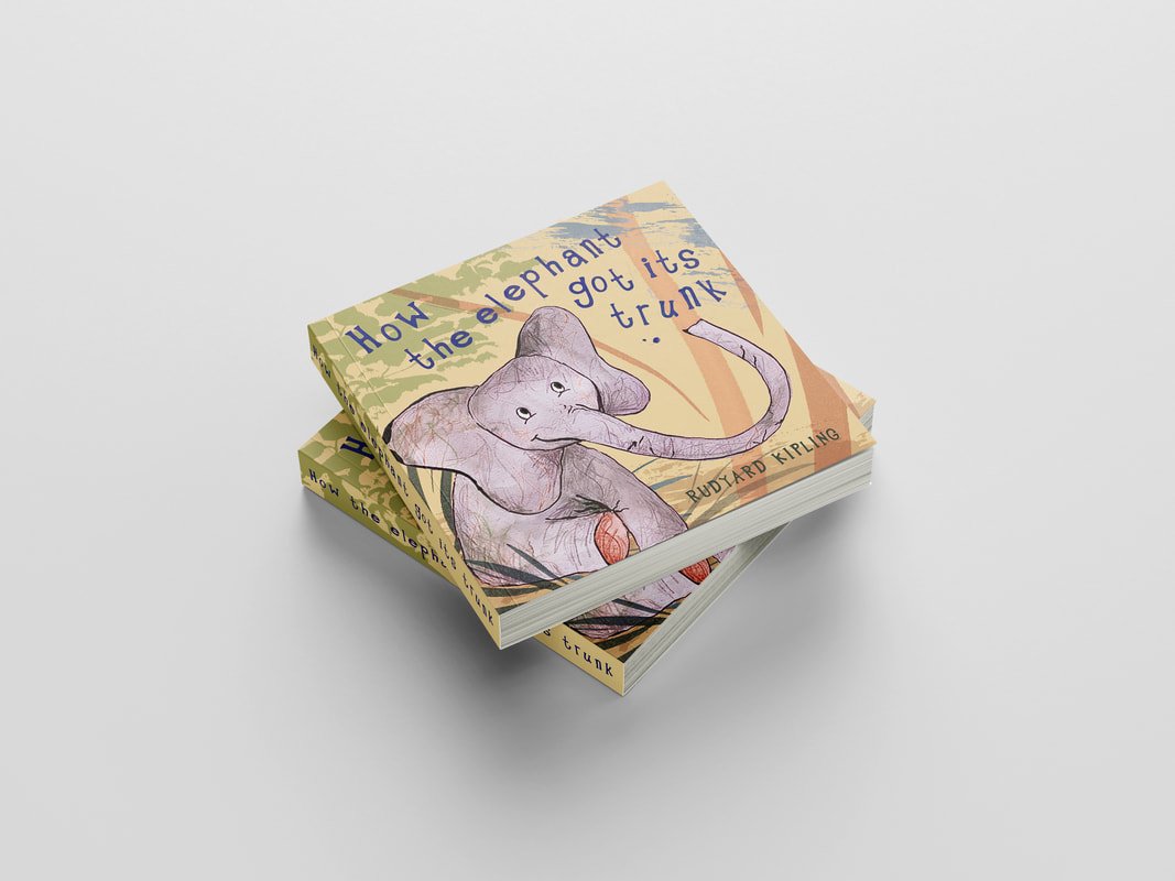
After some time for reflection on formative feedback, I had a look at experimenting further regarding colour, a play at making the elephant less generic, and some alterations to the type due to the colour variations. Regarding the elephant, I aimed to make the character less of a washed out grey colour and potentially a more purpley tone.
UPDATED FINALS/MOCK UPS
0 Comments
|
Archives |










































 RSS Feed