|
The final project of the module consisted of analysing an allocated text and producing a series of thumbnails, developments, and a final illustration in response to your given text, focusing heavily on communicating through colour. We were also given art direction which was to be followed through the outcomes. My text was a passage from a poem by Thomas Traherne. I found it quite a difficult excerpt with it being very religious and spiritual. I spent the start of the project really getting to grips with the poem, understanding what the meanings behind it were, and I actually started to find it an interesting text and I thought it was a really nice excerpt. I made analysis notes which I will link below, along with my Pinterest board where I recorded all my artist research - looking closely at Max Parrish and William Blake in particular. I began producing basic thumbnail visuals, and having a mess around with colour options - aiming for a warm, celebratory approach (following the art direction). I then looked at 3 of my initial ideas more closely, and then produced my final illustration which I scanned into photoshop for final editing. For my final illustration I chose to use watercolour and inks to produce a warm, vibrant and celebratory feel to the piece. I included rays within the piece, along with a figure featured in the 'sky' as such, which provided the spiritual aspects, aiming for a mood of posession, power and visionary unrealism. The inks I used contain a shimmer element which I thought was very fitting for the magical, spiritual art direction. I was happy with the final outcome - with the focus being on colour communication I think I expressed the moods and feelings I was aiming for. What I learnt through the work of Emil Nolde, is that with the right use of colour, an illustration doesn't have to be particularly complicated to still express an effective outcome. 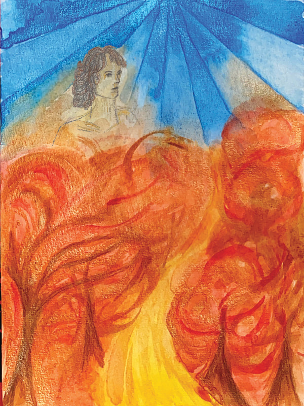 As I surprisingly began to quite enjoy the poem, I decided to do a few more edits, using a William Blake approach. By the end of the project, I really liked reading the poem (after hating it at the start) so I wanted to do some pieces where the language was included. I used gold ink to paint out a sample of the poem and the staircase, and then edited it in photoshop, using paper textures and layers of colour to achieve a similar style to William Blake. I didn't spend a great amount of time on these but I was enjoying creating them!
0 Comments
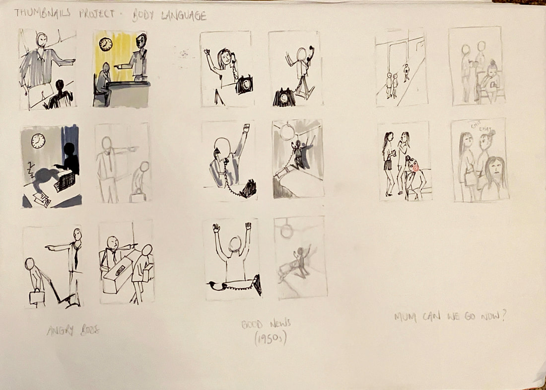
This week task was a similar theme to the last project, but this time focusing more heavily on the use of body language to portray moods & feelings. We had a quick task in the lecture of producing a series of silhouettes to describe different feelings which was a very useful activity. The 6 scenarios we were tasked with this week were as follows: Angry Boss - two figures - an office setting Good News - a single figure holding a phone - 1950s Mum can we go now? - two old friends meet on the street, the teenage daughter of one doesn't want them to talk for long The Anniversary - a couple celebrating an anniversary in a restaurant. They hate one another... The Big Jump - a figure in an aircraft just before having their first parachute jump Genius at Work - serious concentration in an academic or scientific setting I found this project interesting looking at the different body languages and how important these are to an illustration in portraying a message. I found it a bit of a challenge incorporating interesting compositions and perspectives with the main focus being on the figures body language so this was definitely a useful task. For my 'angry boss' title I used scale as a bit of a factor as well to make the boss look more authoritative with the employee much smaller highlighting status, and I thought ink was a good choice as it's a more harsh material to link to the mood. The 'good news' thumbnail I chose to use ink as well as this is based in the 1950's so I thought I'd stick to black and white. I also tried to link the fashion and hairstyle to the era, and of course the style of phone. I thought the message was well portrayed with the figure jumping on the bed. For my 'mum can we go now' visual I decided to have a bored teenager, conveyed through the resting head on the hand, and blowing bubblegum out of boredom, whilst the adults enjoy their coffee leisurely. The 'anniversary' visual I decided the couple hated each other so much that one of them was stood up at the restaurant. While the woman is upset at the table, the balloon deflates further signifying the mood. I like the perspective I've used for the 'big jump', I think it's an interesting composition and I think the body language portrays the feelings of being scared and anxious well. Finally my 'genius at work' visual I have a scientist analysing their experiments closely. I used watercolour pencil crayons for these 2 visuals which I really enjoyed using and I'm really pleased with how they turned out.
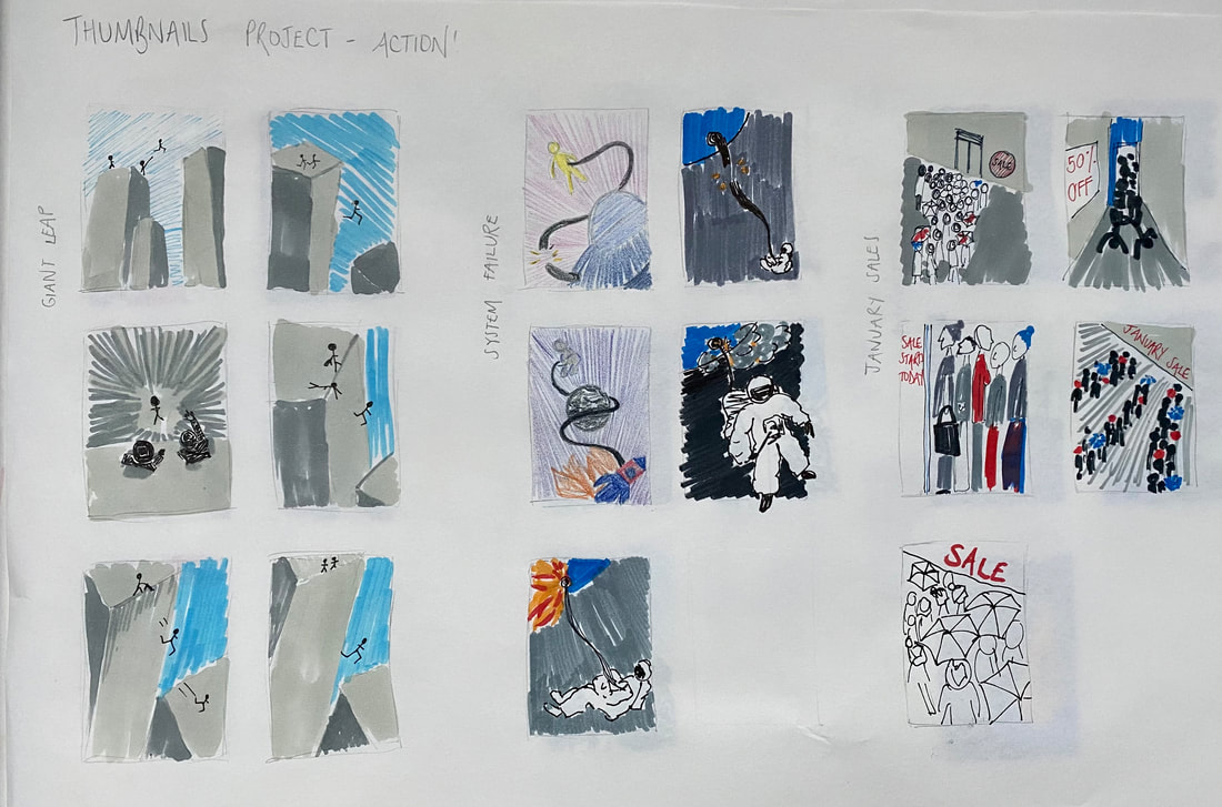
For the next project within the Illustrator's Toolkit module was a task purely based on producing thumbnails for a series of scenarios, focusing widely on varied perspectives and composition. After producing initial thumbnail ideas we then had to produce a final thumbnail visual, including colour and tone, which would be a mockup/rough idea of the final illustration. We were given 6 different scenarios, with details of what to include. The titles/scenarios are as follows: Tango - two figures, movement, sexy, close, exotic, café Vertigo - a steeplejack - daytime - windy day Ambushed - two figures - a city's back streets - night Systems Failure - one figure, spaceship, physical struggle A Giant Leap - rooftop chase, three figures, peril, bravery January Sales - claustrophobia, queuing, doors opening, multiple figures I like the different perspectives I have used for these visuals above. I'm really happy with my 'tango' visual, I think it is quite a dynamic composition, and the checked cafe floor really stands out, along with the red dress. I think my 'vertigo' thumbnail is good at expressing wind, I used watercolour and ink for a loose effect. I like the diagonal composition of this 'ambushed' thumbnail, I think it really adds to the tension. I used acrylic paint as I thought this was the best material, particularly for dark colours and highlighting the relevant tones. For my 'the giant leap' thumbnail, I used a different perspective to emphasise the height which I think works really well. I used watercolour pencil crayons to apply colour to this visual, using a linear effect for the sky to link to wind and also the direction of the 'giant leap'. I added relevant tones, although the scan doesn't really show this well. For my 'system failure' visual I used ink and watercolour, using lots of water to make a fluid, space like effect. I had the figure falling out of the frame to further emphasise the physical struggle/fall. For my 'January sales' visual I used acrylic paint to figure out colours, and i wanted to highlight the claustrophobic aspect by filling the frame with people. I loosely added in brush strokes of colour to make a blurred effect, with the intention of making it look busy and claustrophobic. Also my use of cool colours allows the mood to be wintery which is ideal for January.
Overall, I found this a really useful project, particularly for thinking more critically about composition and varied perspectives. I think I could definitely do with some more practise within this area, specifically getting ideas down as thumbnails quickly and effectively rather than being so decisive in my mind before putting pen to paper. |
AuthorSecond year illustration student, studying at the University of Cumbria Archives
December 2020
Categories |





 RSS Feed