|
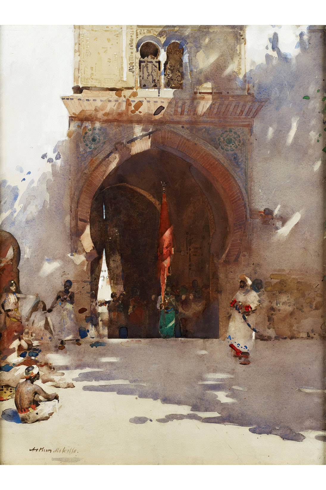
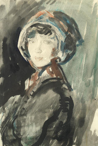
For this weeks task, alongside the acrylic artists we were given some watercolour artists to choose from as well, and again produce some studies using their influence. I chose to study Ambrose McEvoy and Arthur Melville. I really liked Arthur Melville's use of colour and his combination of both precise yet abstract details. He has a clear understandnig of perspective, and I really like the loose aspects of his pieces, good use of colour around the piece which ties everything together nicely. Here I produced a study in his style, I am happy with the detail I included however I think maybe I could've added some loose washes of colour around to add to his style. The other artist I chose to look at was Ambrose McEvoy. I love the spontaneity of these pieces, and their quick improvised feel. I found this quite difficult as it's not a style I'm used to working in, but it was quite enjoyable being able to use very loose marks. The pieces involve very atmospheric lighting so I tried to incorporate that within my studies.
0 Comments
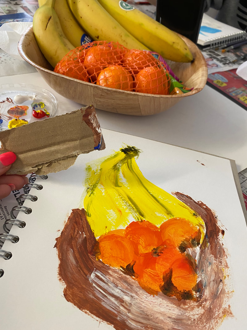
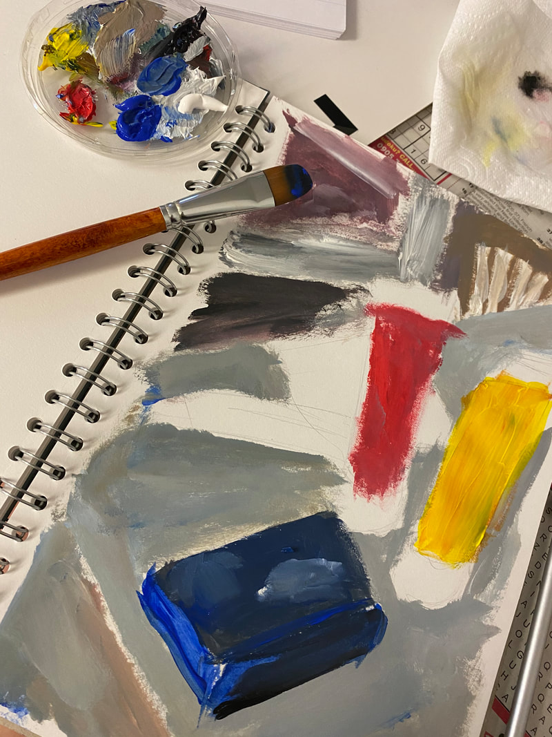
For this week's brief we were given lots of artists who use acrylic paint, and we had to closely look at 2 of them and produce some studies in their style. I chose to look at Emma Carlisle and Ivon Hitchens. I found Ivon Hitchens work quite different to many of the other artists. He really pushes the boundaries with his strong use of colour and mark making. It is very abstract and hard to figure out what the scene consists of. I really enjoyed the style of Ivon Hitchens, it was very loose and expressive and I had fun creating these pieces.
The other artist I chose to look at was Emma Carlisle. I found this a bit more challenging due to how abstract she is. I really love mark making so I tried to incorporate that in her style, using big brushes and a variety of objects to apply the paint. I looked at her instagram highlights for tips on painting and some examples of her acrylic work. I like how her style is messy and quite sketchy so I tried to express that aspect. https://www.instagram.com/emmacarlisle_/ Despite this being quite difficult to replicate I found it a really enjoyable way of working, and it inspires me to be more loose and free with paint. The variety of shapes and feelings which can be expressed through mark making I find fascinating and I think it's a technique I had almost forgotten about so it was a useful exercise. For this weeks brief, following on from the 3D sculpture task, we were instructed to make a mask using any media. Not being the biggest fan of 3D sculpture work, I opted for an embroidery hoop and I used thread as a means of communication for my mask. I produced half using flowers and used lots of loose threads for the other contrasting side of the mask. I got a lot of inspiration from Jose Romussi who is an embroidery artist I have followed for some time. I love the way he uses embroidery to essentially mask identities and highlight different aspects of moods and feelings inside and outside the body.
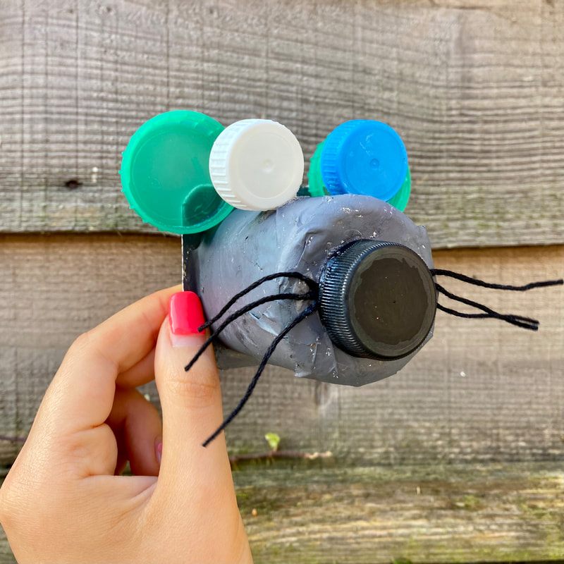
For the next week's task we had to produce 3D sculptures of cats and dogs using unlikely materials. We looked at numerous artists in our lecture, and one who stood out to me was Alan Fletcher. Despite not being commonly known as a sculpture artist, he produced many 3D animal figures which were just produced for fun to keep his grandson entertained, using any
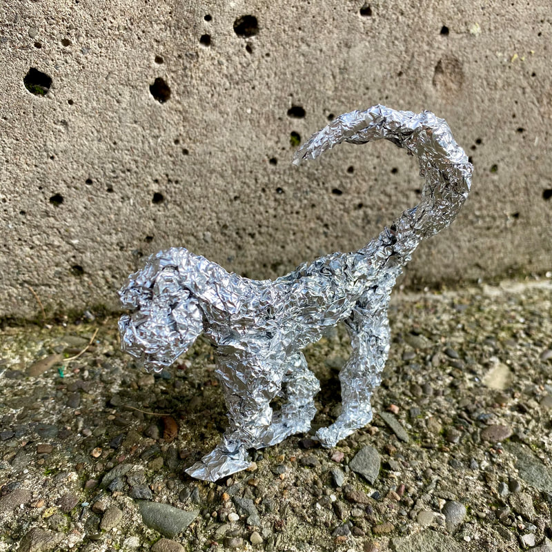
For my other 2 models I tried to explore the other characteristics of these animals. I used tinfoil to create a more smooth and delicate creature, looking at the fragility and delicacy of the animals. I think these turned out really well and they were fun to produce, and weren't very time consuming.
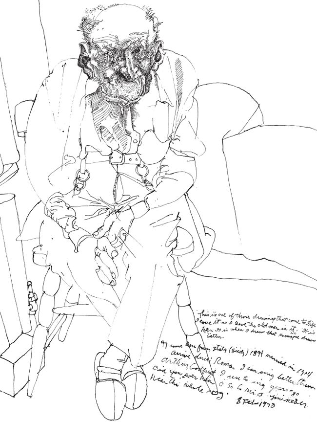
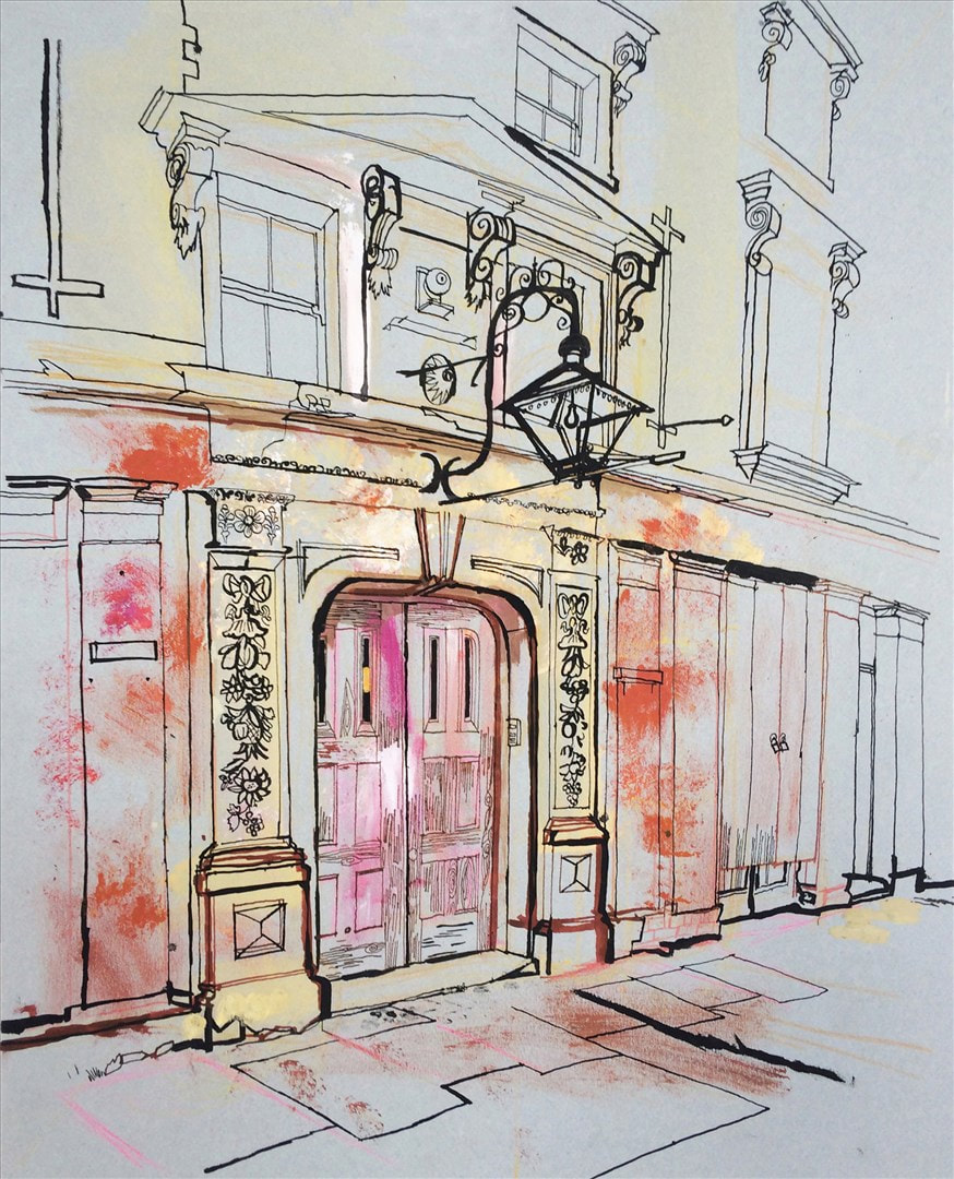
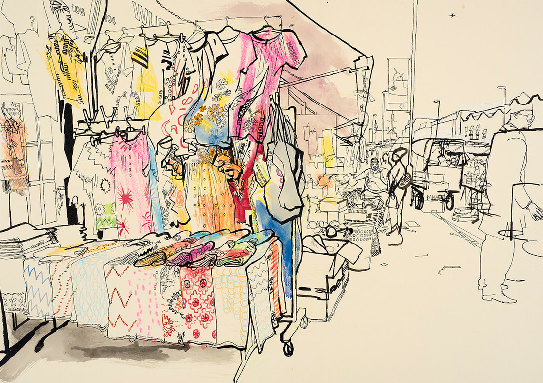
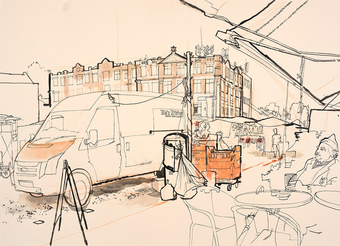
For our first task for this module, we had to experiment with pen & ink. Studying lots of different artists, I produced some artist studies, and some still life drawings and self portraits inspired by different artists, using a range of media and paper. The main brief of this task involved producing a drawing of a room in my house using pen and ink. Below, is my drawing of my living room which was inspired by Lucinda Rogers. I love the varied use of line thickness, and the way the shading gives a real sense of the antiqueness of the house.  Alan E Cober is another artist who I find incredibly fascinating, particularly for his book 'The Forgotten Society'. It contains a collection of drawings and studies of the lives of people from 3 'forgotten societies', hidden from the public eye. The three societies/communities being prison, nursing homes, and mental institutions. Using possibly ink and dip pen, he provides a responsive approach using free and expressive marks. He provides the viewer with an honest and emotional response. One thing I particularly love is the small aspects of handwritten notes.
Lucinda Rogers is a fascinating artist who works. mainly with ink, and sometimes crayon and watercolour. She works in quite a traditional way, almost as a reporter, as she immerses herself into the environment and works straight from eye to paper. This definitely motivates me to get out and draw more often on location as her work contains aspects of spontaneity and such movement (despite the static scene). I really like her varied line thickness, allowing things to be pulled forward making it easier for the viewer to read. I also find it so intriguing the way perspective is often distorted - sometimes there isn't a distinctive horizon line which I would say gives the scene some more personality and movement. Here I have done some studies of Lucinda Rogers' work, one of a view from outside my house, one of my living room and I also did a study of some shoes that were in the hall way - doing my own creation of a similar piece of work that Lucinda Rogers' had done of some muddy shoes. I really like this style of working as I feel you can work more freely and I think the varied thickness in line is really effective. I really enjoyed the shoes study as you can still add in lots of little details and using my finger tip for shading and 'mud' I thought gave this study a real personality.
http://www.lucindarogers.co.uk/index.php
https://www.instagram.com/lucindarogers1/ Daniel Egneus is an artist who I've looked at regarding my pen & ink studies. I find his work fascinating and also varied. He uses a good mix of dip pen and brushes. His illustrations are quite loose and dreamy, and they inspire us with their depth of beauty and detail. Here I have done some experimentation in his style, using both dip pen and brushes. I really like the looseness of his lines, and I like the way he adds tone with this fluid technique. I found the brush study a little bit more challenging for me due to the lack of lines I think, however I do like the surrealism and the use of colour in an undefined way. I really like his still life studies and especially the way the objects intertwine and overlap in a very impressionistic manner. The abstract technique he uses I find intriguing and I like the contrast and personality this provides to the illustration.
https://www.instagram.com/danielegneus/
https://danielegneus.com/ |
AuthorSecond year illustration student, studying at the University of Cumbria Archives
December 2020
Categories |


 RSS Feed