PRINT DESIGN PROJECT
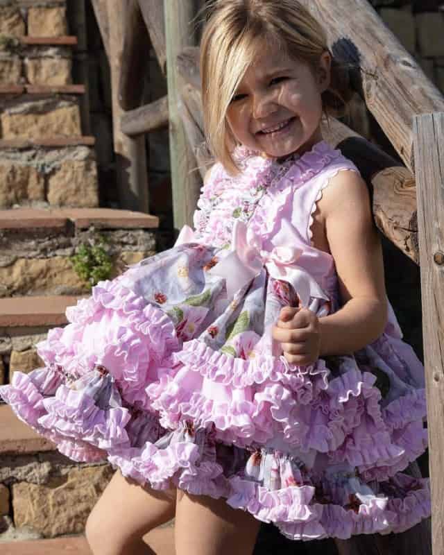
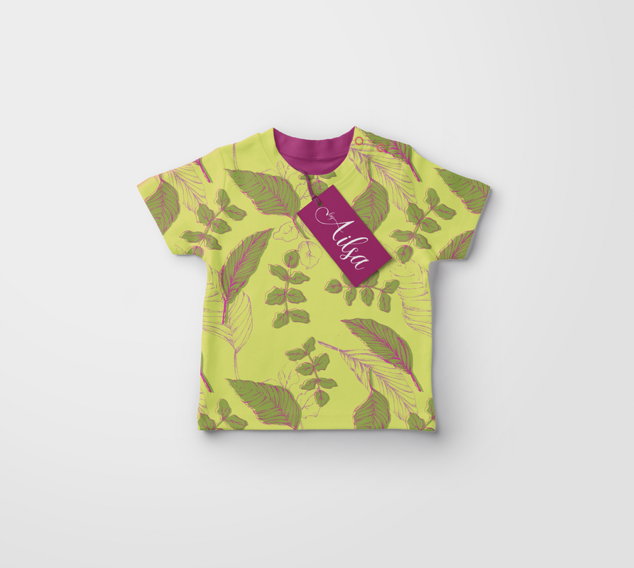
Children's clothing today is extremely stereotyped according to their gender, so this brief is aimed at combatting the stereotypes within children's clothing through a print design brief. Girls clothing is often associated with pink, unicorns, fairies, flowers etc, whilst boys clothing commonly leans towards dinosaurs, tractors, animals etc with green/blue colours. I plan to produce a series of print designs suitable for a kids clothing collection - either unisex, or could target each group separately to directly combat the stereotype.
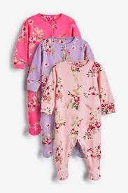
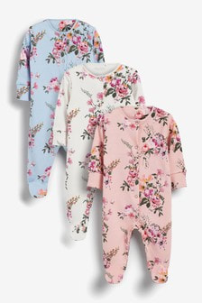
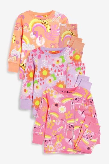
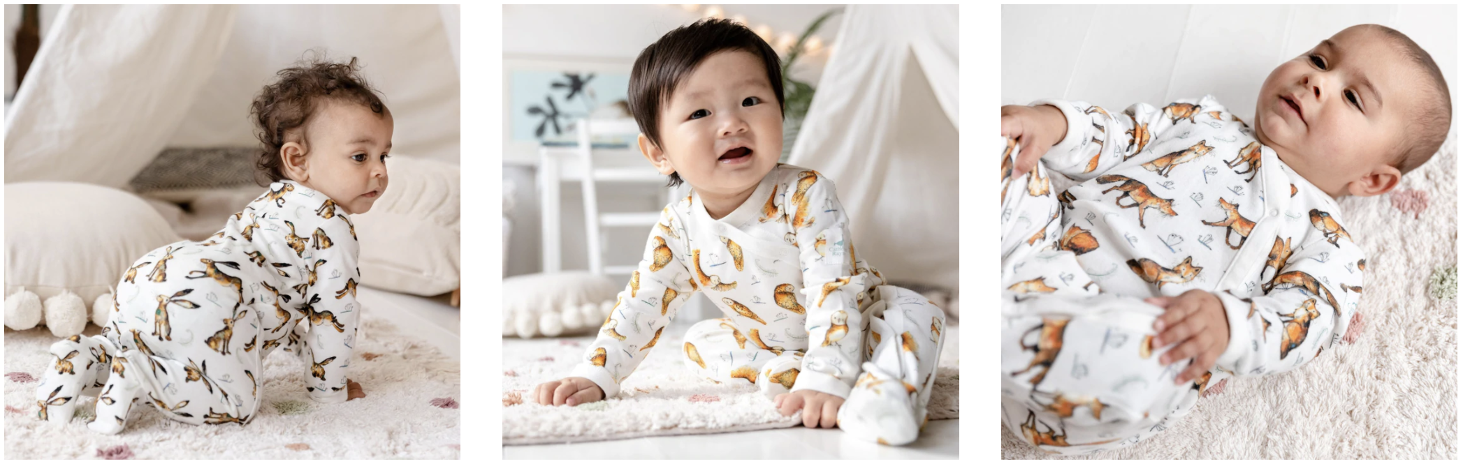
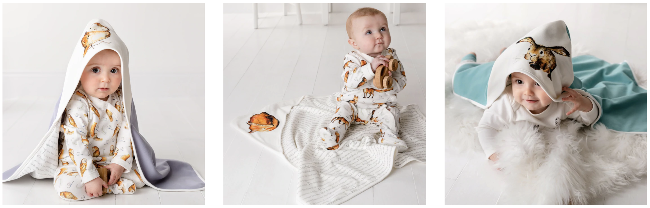
BABY GIRLS CLOTHING

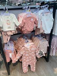


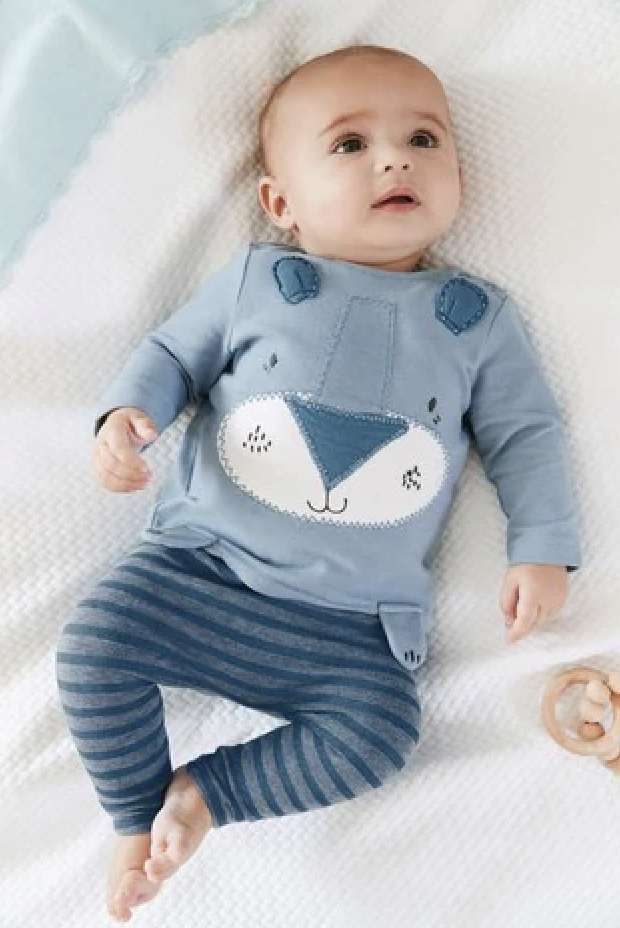
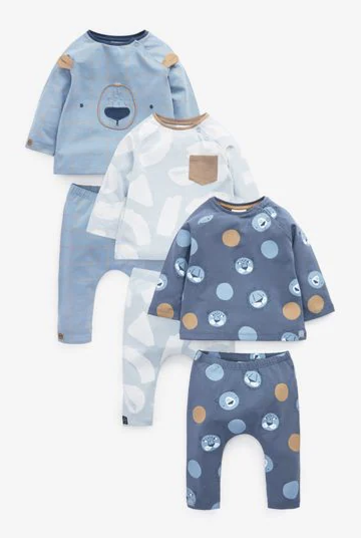
BABY BOY CLOTHING


Evidently, current themes within children's clothing is very sterotyped in terms of colours and animals and interests etc. so I plan to produce a series of prints for a Summer 2022 collection which goes against this.
Catherine Rayner:
I have been a fan of Catherine Rayner's work for years now and I love her style. Well known for her children's books, she has more recently been doing children's clothes, particularly baby ranges with her illustrated book characters.
I have been a fan of Catherine Rayner's work for years now and I love her style. Well known for her children's books, she has more recently been doing children's clothes, particularly baby ranges with her illustrated book characters.
|
|
Katy Welsh:
I really like the work of print designer Katy Welsh as her pieces are quite abstract and bright and colourful. I think this would be useful to explore as it would be expressive and also might be interesting with the idea of producing unisex prints - working more with shapes and textures than distinct animals and objects.
I really like the work of print designer Katy Welsh as her pieces are quite abstract and bright and colourful. I think this would be useful to explore as it would be expressive and also might be interesting with the idea of producing unisex prints - working more with shapes and textures than distinct animals and objects.
Jocelyn Proust:
Again the works of Jocelyn Proust is colourful and focuses heavily on shapes and textures, I like the expression involved in both Katy Welsh and Jocelyn Proust's work, and think I will definitely use this within my prints as it allows more room for working towards both genders, and colour will play a huge role.
Again the works of Jocelyn Proust is colourful and focuses heavily on shapes and textures, I like the expression involved in both Katy Welsh and Jocelyn Proust's work, and think I will definitely use this within my prints as it allows more room for working towards both genders, and colour will play a huge role.
Seamless pattern tutorials:
|
|
|
|
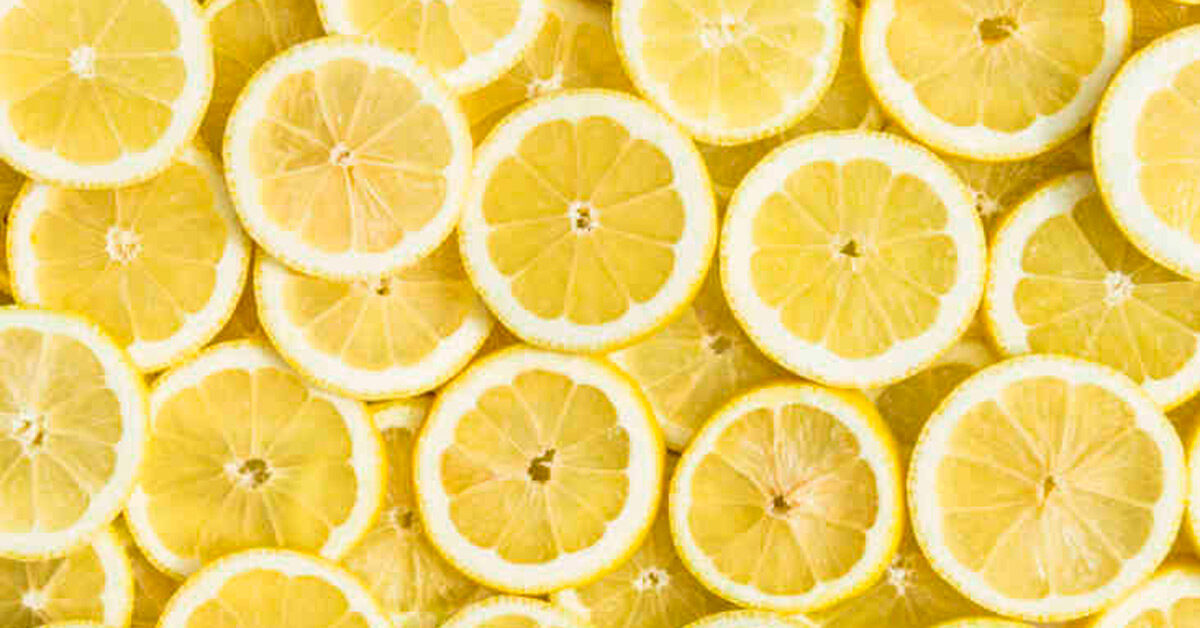
Themes for SS22:
For my print collection I want to do 3 different themes, all based around summer. I thought fruit, animals and a nature one would work well so I'll collect some inspo and reference images below.
For my print collection I want to do 3 different themes, all based around summer. I thought fruit, animals and a nature one would work well so I'll collect some inspo and reference images below.


|
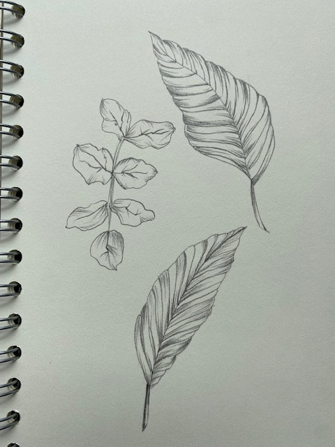
PRACTICE PATTERN TILE: (REMEMBERING HOW TO DO IT)
I created some fruit drawings and scanned them in to produce a pattern with, just as a bit of a practice to get into the swing of things again. This was just figuring out how to make the pattern tile again etc. as I would have my final patterns much more colourful and bold. |

|


COLOUR IDEAS:
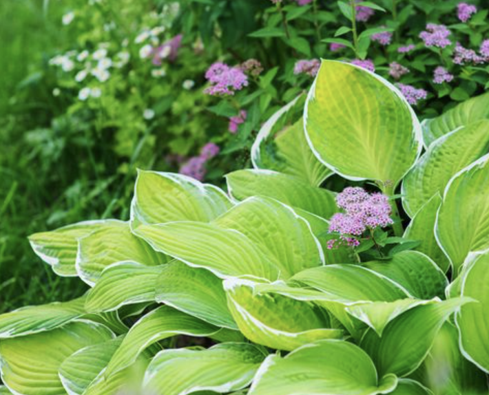
Colour is a really important aspect of this project as I aim to ensure all patterns are suitable for all genders. I also want to make sure all patterns have a summer, positive, happy vibe, I will link my pinterest board below.
Colour is a really important aspect of this project as I aim to ensure all patterns are suitable for all genders. I also want to make sure all patterns have a summer, positive, happy vibe, I will link my pinterest board below.

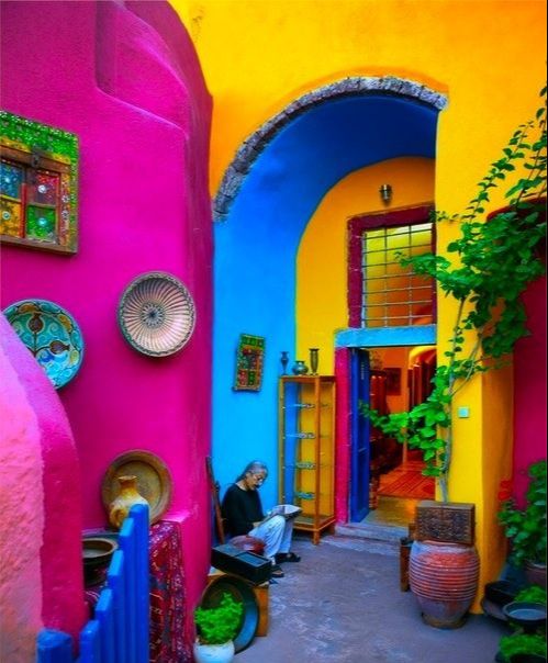
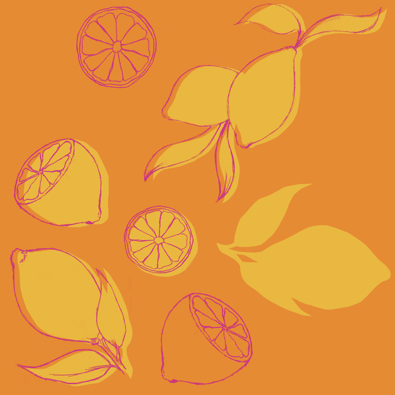
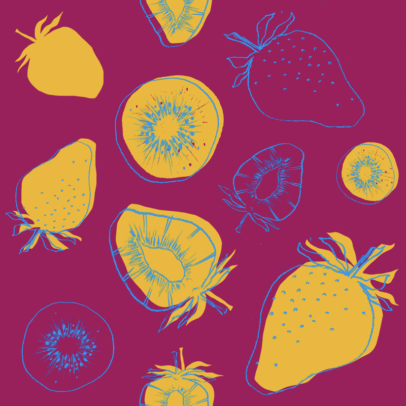
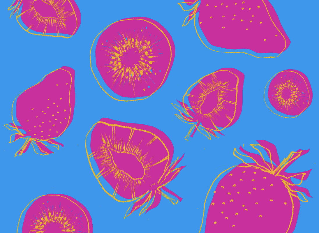
I used the tool on Adobe which generates a colour palette from an image and felt the mood of this image portrayed how I wanted my prints to feel. I like how these colours are so bright and have a positive vibe, and also feel like these would be suitable for all genders. I think this colour scheme would be best for the fruit collection due to its vibrancy.

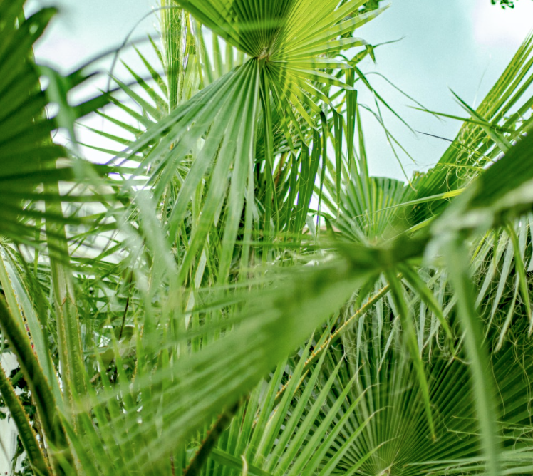
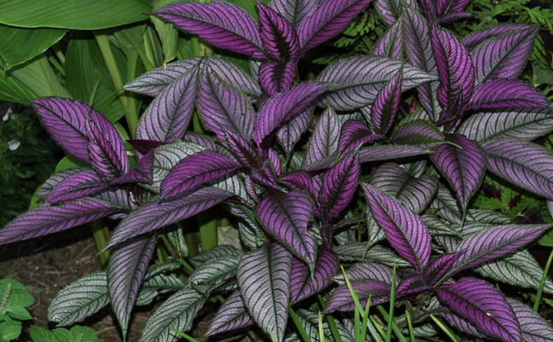
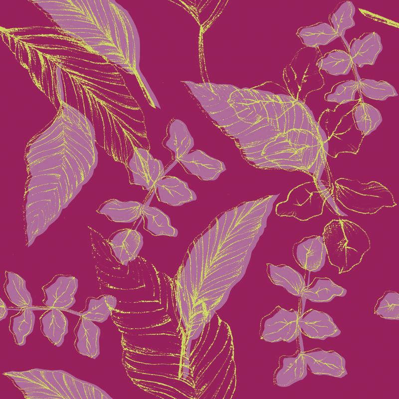
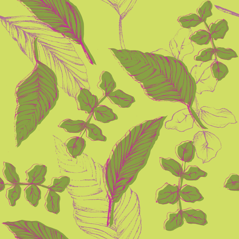
For the nature print, I thought a jungle vibe would be interesting, and I was thinking of greens and purples and I found this image which I thought was really cool, I think the contrast in colours is exciting and is definitely suitable for all genders. This will also allow for different colour ways which will be interesting to look at. This colour scheme in comparison to the one I used for the fruit pattern however is a little more on the dull side, so I took the two purple/pink shades from the first colour palette and used those as a guide for brightening the other colours.

|

|

I liked the look of the colour scheme with the blues and oranges (above), but didn't think it fit very well in the collection, so I used it as inspiration for the animal colour scheme, taking into consideration the other two palettes so that the final collection fits well and collorates with everything else.

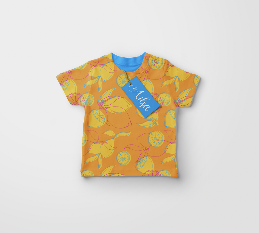
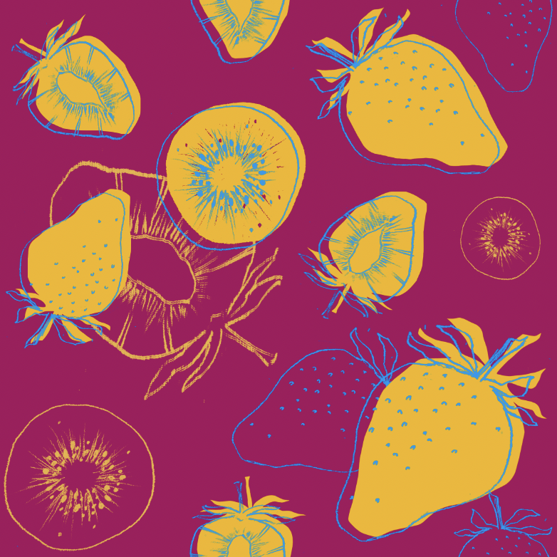
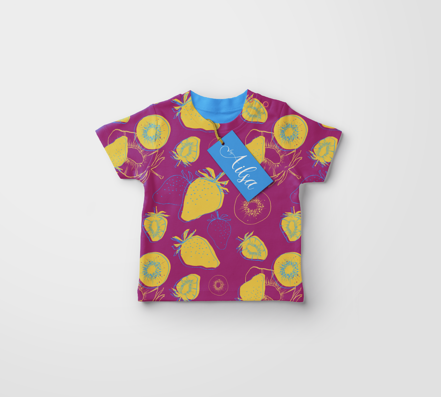
FRUIT PRINT 1:


FRUIT PRINT 2:


JUNGLE PRINT 1:
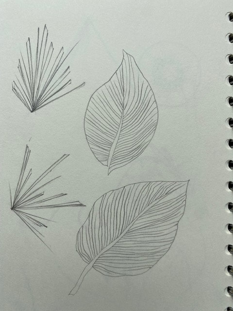
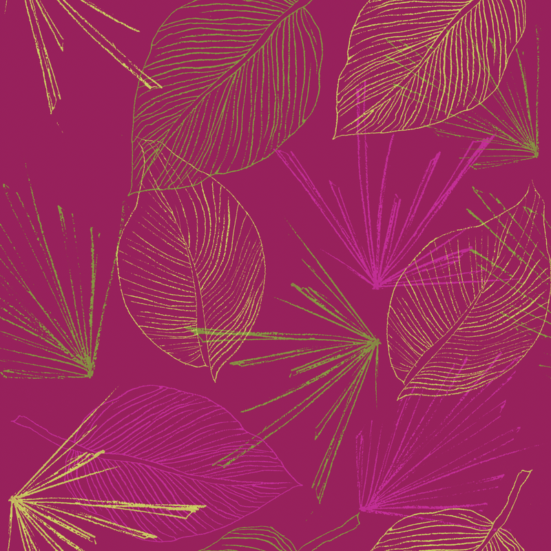
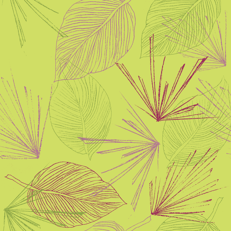
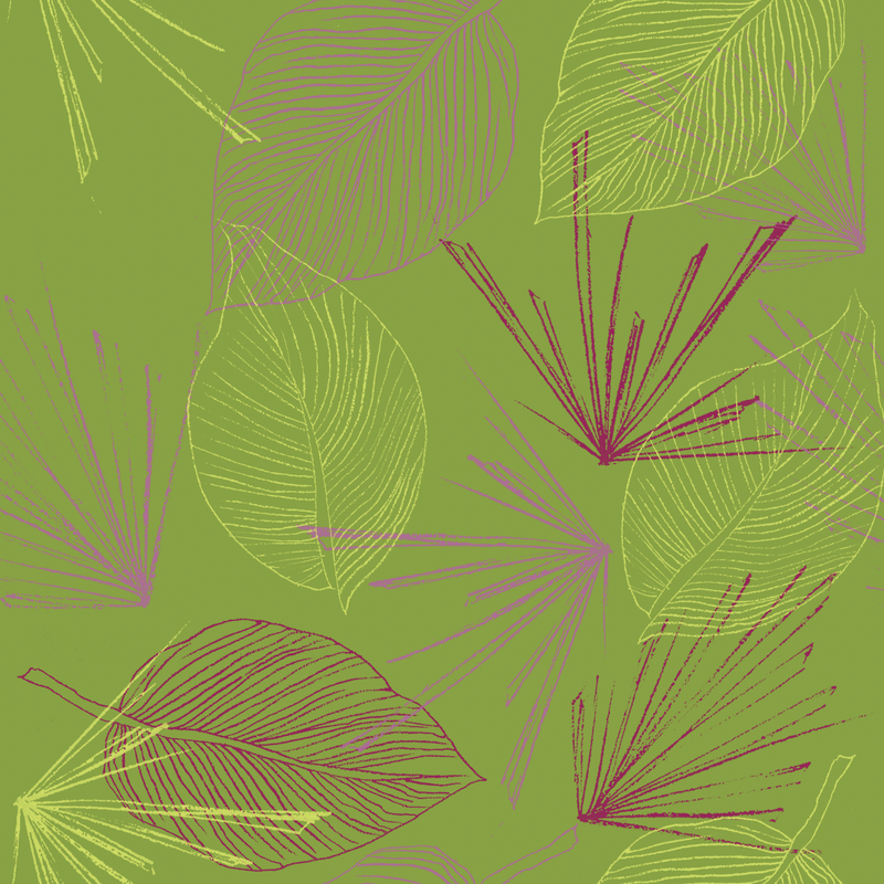
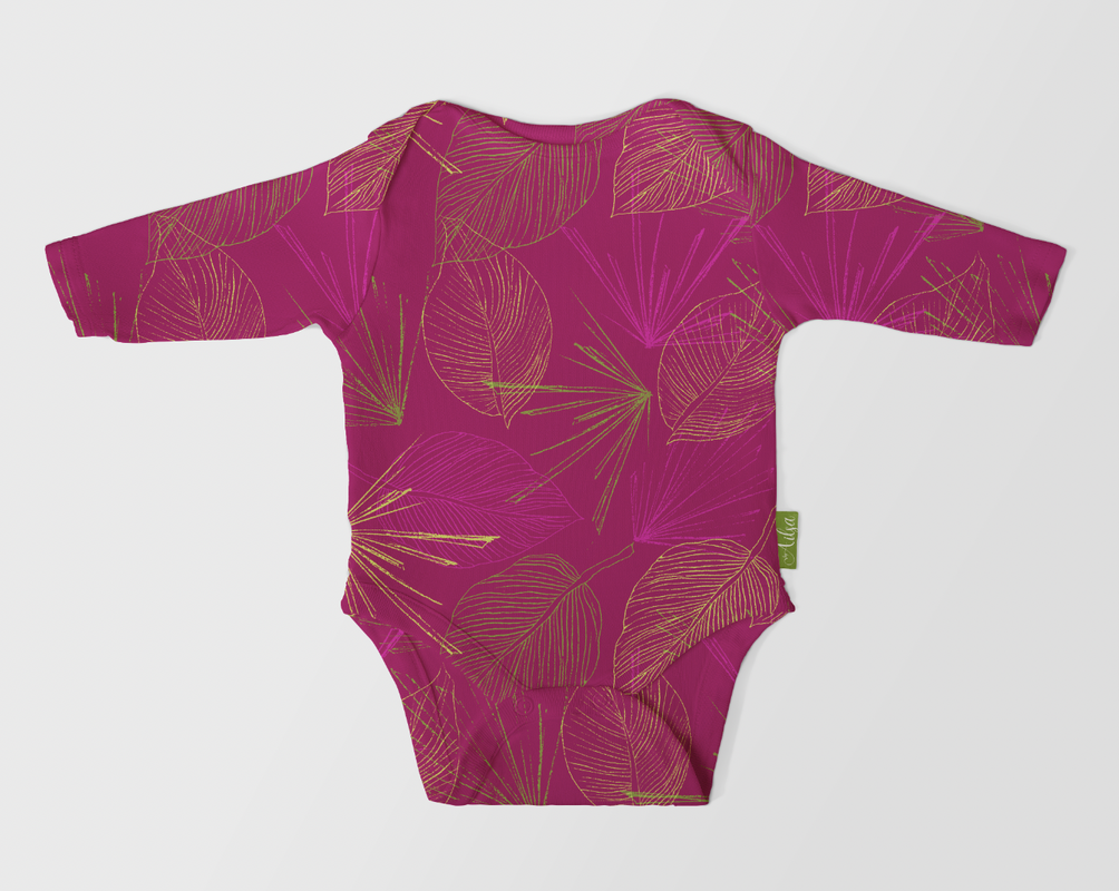
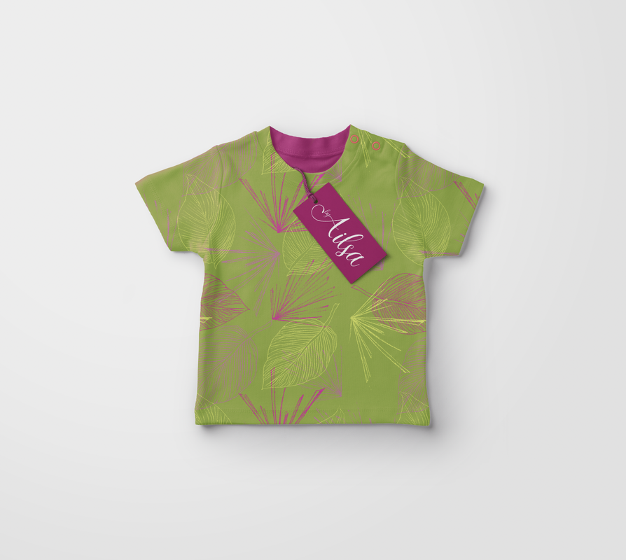
JUNGLE PRINT 2:


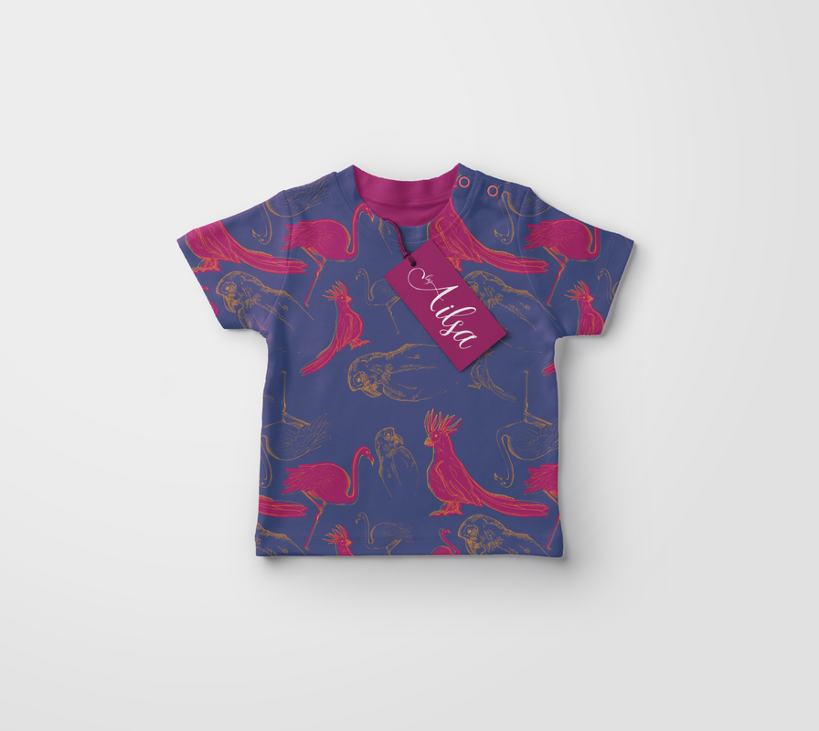
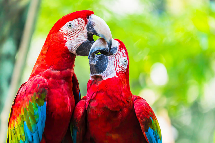
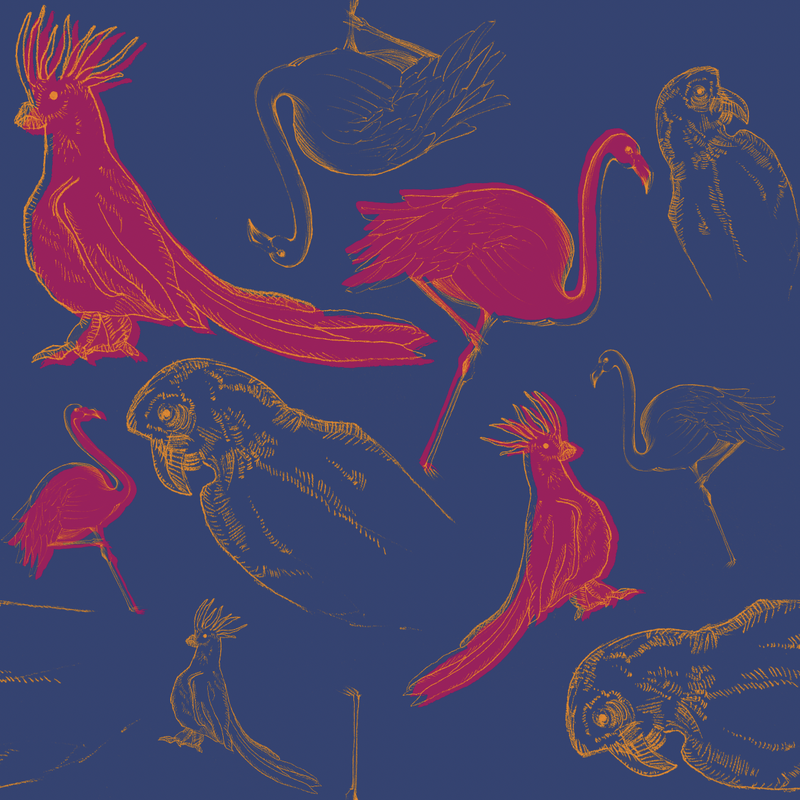
ANIMAL PRINT 1:


ANIMAL PRINT 2:


FINALS: