|
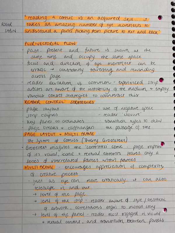
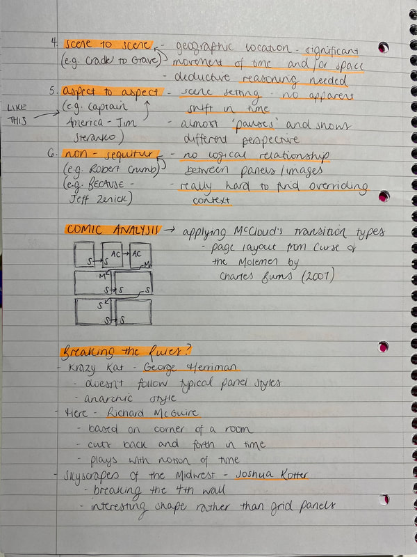
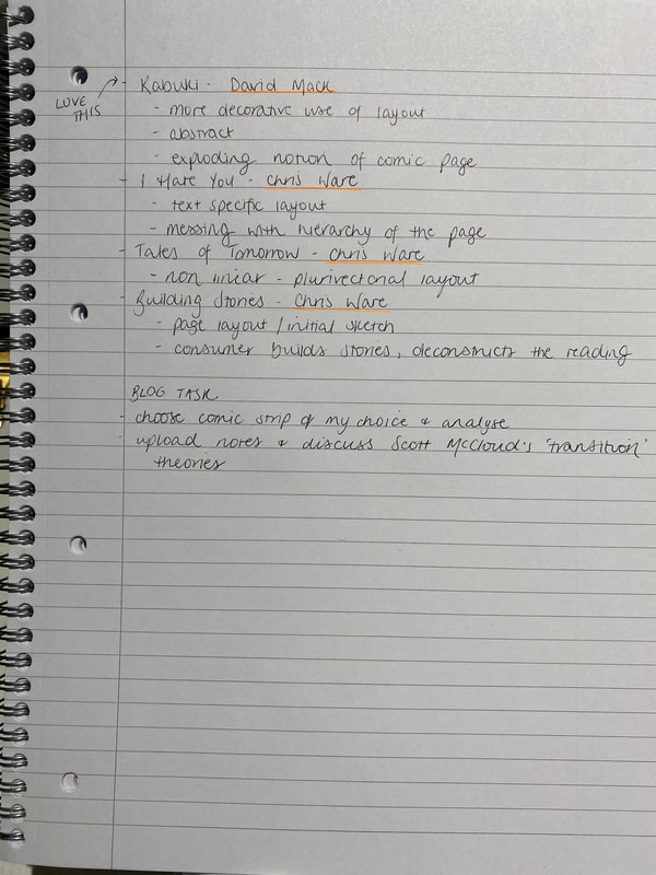
Today's lecture with Nick revolved around the analysis of comics, and the theoretical elements behind the construction of each page. It was a fascinating lecture, particularly learning about Scott McCloud's 'transition' types which I will discuss below. Scott McCloud's panel transition types can be used to describe the progression of panels within comics. The types are: (explanation of each can be found in my notes attached)
Analysis task:
0 Comments
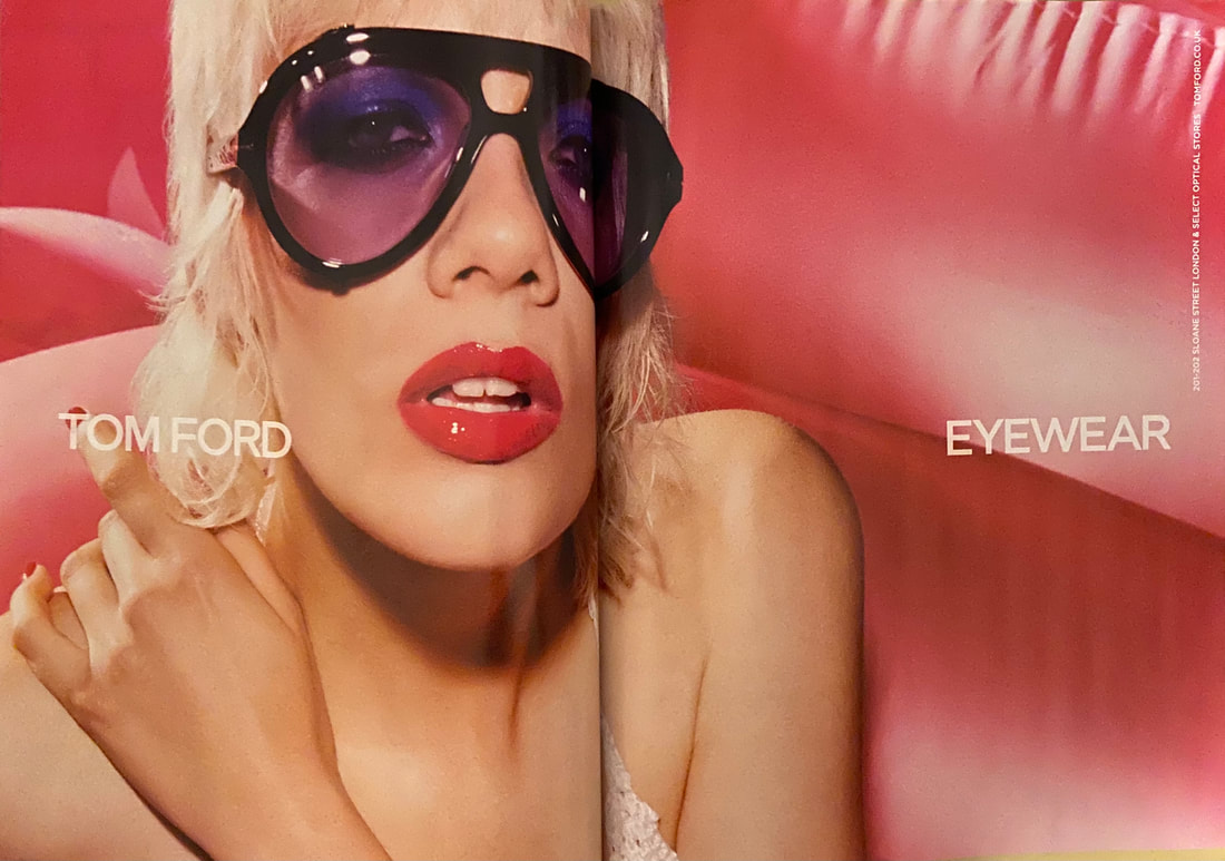
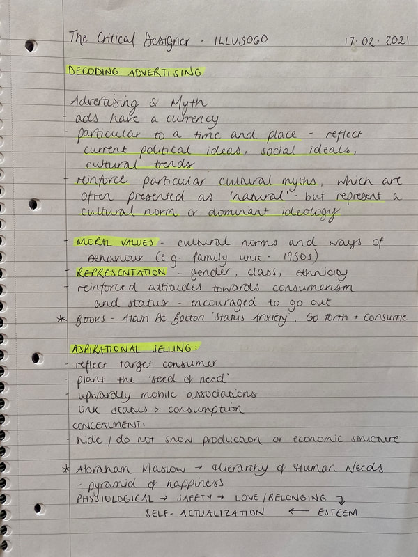
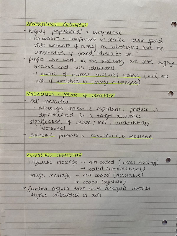
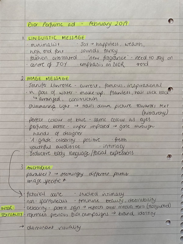
In this weeks theory lecture we discussed the meanings and messages embedded within advertisements. It was a really interesting lecture and this week's task is to decode an advertisement of our choice. I will upload my notes at the bottom of the post.
products and brands involved are luxury and expensive. The text is also halfway up the page - eye level - linking to the 'eyewear' concept. Regarding the image, the ad involves a fashion model, and it is obviously a non spontaneous set up. There has been a clear influence of an art director, makeup artist etc. making this a structured image, and could be interpreted as a work of art. Pink is the key colour here, which is a bold feminine colour, allowing us to infer that this ad is aimed at girls/women making a bold fashion statement. Attention is definitely drawn to the glasses as these are black and massively stand out within the image, which is good for an eyewear advert. The lips are also a key focal point as they are bright glossy pink, and are in line with the text which is clever as the viewer with then read across the image. The image is a close up, with the model looking seductive, drawing the viewer in - intimacy. You could also decode that as the model is 'dolled up' this links to confidence, which leads to the associations with the desire to be confident. Regarding anchorage, I would say this ad is image-specific as the image sends the main message. Furthermore, looking at the myths involved, I would infer that it is implied this is a signifier of feminine beauty. The model involved is a white, young, blonde female, which is the dominant normality.
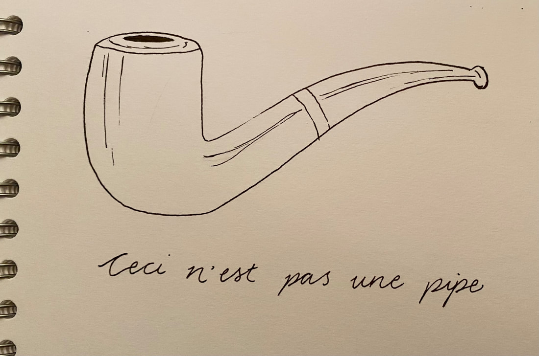
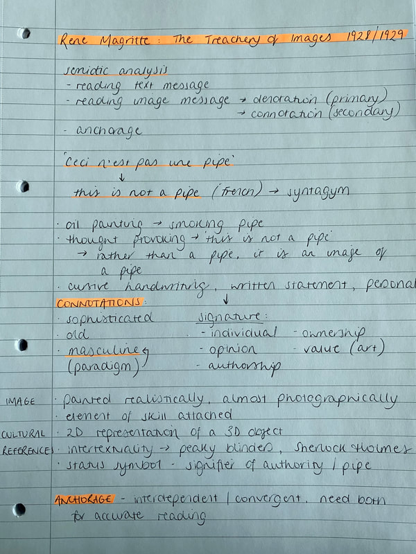
For the second lecture of this module we turned our critical gaze to words and images. We discussed here the different types of achorage, the difference between denotation and connotation, and intertextuality. It was a very interesting lecture, I will recap the main elements below, along with my lecture notes.
Lecture notes:
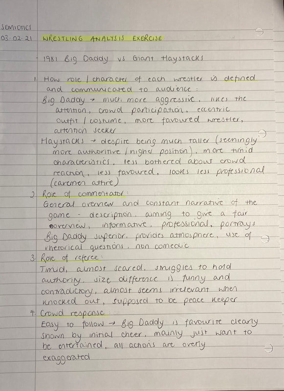
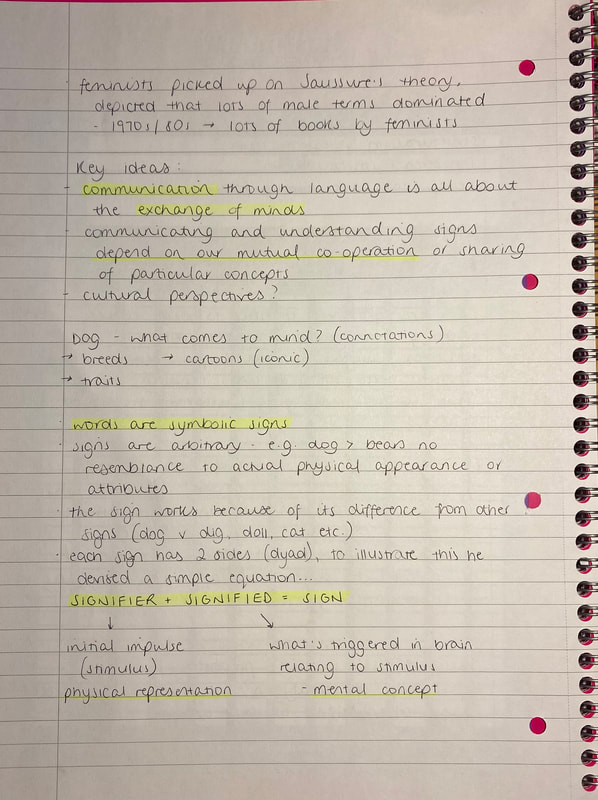
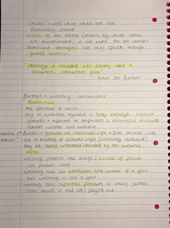
Today's session introduced the new module for the semester - The Critical Illustrator, where we will be looking into the more theoretical side. For our first session with Nick, we looked at semiotics, the basics, terminology, applying a semiotics methodology, and cultural myths and how these are embedded in cultural texts. I found this a really interesting lecture and I'm looking forward to the rest of the module - I will recap on the terminology we learnt (through Jonathan Bignell's media semiotics studies) within this post and upload my lecture notes at the bottom. Some of the key figures mentioned in the lecture were Ronald Barthes, Jonathan Bignell and Ferdinand Saussure. Semiotics is essentially the study of signs and sign systems within society, an investigation into how meaning is created and thus communicated. Anything capable of conveying meaning is a sign. Signs are often grouped together to form codes - i.e. clothing (dress codes - formal/informal). Clothing is also an example of a sign system, which involves a great communicative element. Semiotics is a useful framework for depicting visual 'texts' around us, looking beyond the surface at underlying cultural messages and ideas. I think it's also important to note how systems also evolve through time which I found fascinating to read about. Diachronic linguistics - the study of the evolution of linguistic signs through time and synchronic linguistics - the study of signs at a particular point in time. Although this study was initially used regarding the evolution of the English language, it was also put into other contexts as they explained the communication and meanings involved. For example, denim jeans used to be regarded solely with work attire, manual labour, whereas today, denim jeans are a sign whose meaning communicates youthfulness and a casual style, which belong to the 'everyday dress code'. In contrast, suit trousers are a sign relating to a different dress code/sign system. So as we can see the coded meaning of jeans depends on their relationship with, or their contrast with, other coded signs in the clothing system - rather than their meaning regarding the history of them. Synchronic linguistics reveals more about the modern meaning of jeans than diachronic linguistics would. I find the communication/meanings, and evolution of fashion so interesting, so I had a look at The Fashion System by Ronald Barthes, where he looks at the philosophy of fashion. He writes about fashion, emerging the theory that fashion is a language, and therefore has a grammatical structure. One quote which I found particularly thought provoking was: 'One detail is enough to transform what is outside meaning into meaning, what is unfashionable into fashion, and yet a detail is not expensive.' Also in the lecture, we did an exercise where we applied a semiotics methodology. We watched a video of a wrestling match in 1981, and looked at the signs involved in order to display certain meanings. I will link my notes below.
Lecture notes:
|
Archives |











 RSS Feed