|
Nick's recent lecture involved modernism, cubism and Russian constructivism. We looked at the innovation and expansion of the arts during this period which was really interesting. We looked into 3 of the main cities - Paris, Milan and Moscow, and I will be focusing on constructivist posters in this blog and exploring the key attributes.
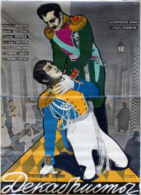
The photo montage aspects within the poster are particularly powerful due to subject of the image. Furthermore, one distinct aspect of Rodchenko's posters is the geometric, diagonal format which is successful. Although it is very simple, it is a good way of portraying a message clearly and cleverly to ensure the audience can understand it.
In conclusion both posters were very successful in their time, but both served two different purposes. The propaganda poster by Rodchenko was to deliver a message and the Stenberg Brothers poster was advertising a movie. Due to the type of audience, both used a similar bold font, easy to understand and portray the message, or express emotion.
0 Comments
During this week's history lecture, Tony moved on to Art Nouveau which I enjoyed as I'm finding it really interesting moving through the decades each week. I was intrigued to realise that the movement of Art Nouveau differed between different European countries as I thought it had particular characteristics through them all. The two different motives are nature and geometry for this movement and it differs between cities. Architect A H Mackmurdo, from the Arts and Crafts Movement was one of the biggest influences for this era due to his curved, linear, natural details, which carried through to Art Nouveau. One of the main cities I'll start with is Glasgow. Charles Rennie Mackintosh is definitely a significant name when it comes to this movement due to his huge success. Despite nature being a big drive for this era, Mackintosh was mainly influenced by geometry. He cleverly used his Scottish heritage to produce Celtic inspired pieces, lacking curves and ornamentation. Known for his geometric furniture and his recognisable celtic rose motifs, his work has moved through the movements. Therefore, Mackintosh was the main inspiration for the Art Deco which follows this era. The Viennese loved the work of Mackintosh. Art Nouveau in Vienna was mainly lead by Koloman Moser, Josef Hoffman, Joseph Maria Olbrich and Gustav Klimt. Mackintosh was the main inspiration for Josef Hoffman. Architecture was a strong element of the era and the Secession building (1897) was probably the biggest feature of this movement in Vienna, which was built by Joseph Maria Olbrich. The building also contains a mural by Gustav Klimt which is definitely of the Art Nouveau period. This is where Glasgow and Vienna differ as Vienna was heavily inspired by nature - featuring lots of linear, ornate decoration. Spain also have their own take within this movement. Gaudi was one of the main artists through this era, with his extraordinary architecture. Heavily influenced by nature, Gaudi created Parc Guell (Barcelona) and La Sagrada Familia which have gothic, oriental details. Ceramics were also one of his loves, along with architecture, and iron sculpture often featured. It is clear how this differs from Glaswegian art due to the curved linear details, in comparison with the strong geometry from Mackintosh. The Casino de Madrid, a social club of the early 19th century also has details of Art Nouveau with its ornamentation and oriental exterior. Nancy, a northeastern French region, is the last location I will cover. Known for its Art Nouveau character, Nancy contains many beautiful churches and palaces, along with wrought iron sculptures, filling the medieval areas. It is obvious that Nancy was inspired greatly by nature due to the lack of geometry, particular reference to leaves/greenery and animals, and a clear Japonism influence. The main artists include Louis Majorelle and Émile Gallé, and their work strongly differs from that of Mackintosh due to the curves. The glass work of Émile Gallé clearly highlights nature and the furniture of Mackintosh and Majorelle are complete opposites.
This week, Tony held a lecture about the Aesthetic Movement, looking at how Japan influenced art and design throughout Western culture. It became clear that, from the 1860's, many artists such as Van Gogh, Whistler and Degas, were being greatly inspired by Japanese art, particularly Ukiyo-e (wooden block prints). Before this time, Japanese art wasn't really valued due to the fact that there was no industrial society. However, it became much more popular once the craze for collecting Japanese art began - where the first samples were seen in Paris. Vincent Van Gogh was greatly inspired by Japanese art. For example his piece 'Japonaiserie: tree in bloom' (1887), is almost a replica of a particular piece from Hiroshige, 'Flowering plum tree in the Kameido garden' (1857). Van Gogh had learnt the importance of vivid colours by the Ukiyo-e masters, and therefore chose to copy some of Hiroshige's pieces, using bold, brilliant colours. Due to the fact that Japanese art was hidden for so long from the West, when Japan eventually opened up to the world, the prints were an instant hit since they differed so significantly with their bold colours and their clever use of space. Therefore, when Van Gogh discovered this influence, he used it to make his own work more interesting and exotic. If you look at Van Gogh's early works, such as 'The Angelus' (1880), we can see a drastic difference particularly in the use of colours since he only used dull colours during this period. In my opinion, his work before the Japanese influence especially lacks boldness, in both terms of colour, subject, and composition. Another artist who was inspired by Japonism was Gustav Klimt. A significant characteristic of the Japanese art is the pillar format, which Klimt used frequently in the late nineteenth century. One of his pieces 'Three children and a young woman' (1898), which I found in the book 'Japonism" by Thames and Hudson, uses this pillar format. It was a popular composition due to the fact you could produce spatial illusions that couldn't be achieved in a standard frame. Klimt could have been influenced by the piece 'Night scene: young girl on a horse with a young man' by Isoda Koryusai (1770s) which demonstrates a 'snapshot' with lots of detail, where a close up is thoroughly explored. One of Klimt's older pieces, 'Seated Young Girl' (1894), is completely different however. This piece is struck with a traditional appearance, which in my opinion lacks interest in comparison to pillar pictures, and we can therefore see that there was a significant change in Klimt's work throughout this era. In summary, it is clear that Japonism was a key movement in regards to the western culture, where artists were mainly influenced by the Ukiyo-e wood block printing. Japonism provided inspiration for various elements such as colour, composition, subject, and more, and we can see the drastic shift in artist's work.
During Nick's lecture this morning, we learnt about the history of jeans and how cultural text (e.g. art, clothes, film etc.) can reflect the culture in which it is created. I'm really interested in the fashion industry, so I found it fascinating to look back through the ages and see how jeans have developed, alongside the advertising that goes with them.
One of my favourite pieces of clothing is my red corduroy jacket and I think this represents my personality well.  Through the decades, corduroy has gone in and out of fashion, and there are still many mixed views on the material. Corduroy was originally a well liked fabric due to it's durability, warmth and it's fast drying quality. However, by the Victorian times it was associated with the working man's uniform, consequently being mass produced across America and Europe, appearing as the 'poor man's velvet'. Years later, corduroy was common in most uniforms, and in the 1920s and 30s, was seen as fashionable in suits, jackets, trousers, caps etc. and was therefore being worn not only for workwear, but for the modern age as well. Since the 1950s, cord hasn't been associated with certain social classes and is now worn by all.
I think currently and over the last couple years cord has been very popular, particularly in jackets or shirts. I own a few cord items myself and my Mum often talks about how she wore the same things when she was my age. Despite having history of being durable and practical, I would probably disagree as it isn't the most practical for living in the UK as it rains the majority of the time. I bought my jacket from Pretty Little Thing, which was drastically cheaper as opposed to other brands such as Levi's. To me this highlights the way this is mass produced now and is an easy fabric to get hold of. Although, there is definitely a difference in quality as Levi's are much thicker and more durable. Due to the ever-changing opinions on cord however, I was happy to compromise with the cheaper version as in a couple years it will probably be out of fashion again. My jacket also has a frayed edge, which shows how cord adapts to the current trends, allowing it to be worn as an every day piece. I do wear a lot of neutral coloured clothing, so I like to wear jackets or shoes which stand out a bit more and provide boldness to an outfit, which is why I love wearing this jacket so much. |
Ailsa ForresterIllustration student at the University of Cumbria. Archives
December 2019
Categories |


 RSS Feed