|
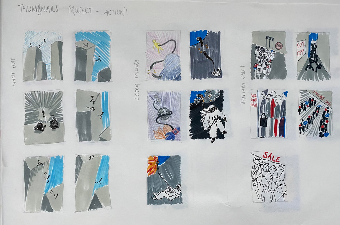
For the next project within the Illustrator's Toolkit module was a task purely based on producing thumbnails for a series of scenarios, focusing widely on varied perspectives and composition. After producing initial thumbnail ideas we then had to produce a final thumbnail visual, including colour and tone, which would be a mockup/rough idea of the final illustration. We were given 6 different scenarios, with details of what to include. The titles/scenarios are as follows: Tango - two figures, movement, sexy, close, exotic, café Vertigo - a steeplejack - daytime - windy day Ambushed - two figures - a city's back streets - night Systems Failure - one figure, spaceship, physical struggle A Giant Leap - rooftop chase, three figures, peril, bravery January Sales - claustrophobia, queuing, doors opening, multiple figures I like the different perspectives I have used for these visuals above. I'm really happy with my 'tango' visual, I think it is quite a dynamic composition, and the checked cafe floor really stands out, along with the red dress. I think my 'vertigo' thumbnail is good at expressing wind, I used watercolour and ink for a loose effect. I like the diagonal composition of this 'ambushed' thumbnail, I think it really adds to the tension. I used acrylic paint as I thought this was the best material, particularly for dark colours and highlighting the relevant tones. For my 'the giant leap' thumbnail, I used a different perspective to emphasise the height which I think works really well. I used watercolour pencil crayons to apply colour to this visual, using a linear effect for the sky to link to wind and also the direction of the 'giant leap'. I added relevant tones, although the scan doesn't really show this well. For my 'system failure' visual I used ink and watercolour, using lots of water to make a fluid, space like effect. I had the figure falling out of the frame to further emphasise the physical struggle/fall. For my 'January sales' visual I used acrylic paint to figure out colours, and i wanted to highlight the claustrophobic aspect by filling the frame with people. I loosely added in brush strokes of colour to make a blurred effect, with the intention of making it look busy and claustrophobic. Also my use of cool colours allows the mood to be wintery which is ideal for January.
Overall, I found this a really useful project, particularly for thinking more critically about composition and varied perspectives. I think I could definitely do with some more practise within this area, specifically getting ideas down as thumbnails quickly and effectively rather than being so decisive in my mind before putting pen to paper.
0 Comments
Leave a Reply. |
AuthorSecond year illustration student, studying at the University of Cumbria Archives
December 2020
Categories |



 RSS Feed