|
The final project of the module consisted of analysing an allocated text and producing a series of thumbnails, developments, and a final illustration in response to your given text, focusing heavily on communicating through colour. We were also given art direction which was to be followed through the outcomes. My text was a passage from a poem by Thomas Traherne. I found it quite a difficult excerpt with it being very religious and spiritual. I spent the start of the project really getting to grips with the poem, understanding what the meanings behind it were, and I actually started to find it an interesting text and I thought it was a really nice excerpt. I made analysis notes which I will link below, along with my Pinterest board where I recorded all my artist research - looking closely at Max Parrish and William Blake in particular. I began producing basic thumbnail visuals, and having a mess around with colour options - aiming for a warm, celebratory approach (following the art direction). I then looked at 3 of my initial ideas more closely, and then produced my final illustration which I scanned into photoshop for final editing. For my final illustration I chose to use watercolour and inks to produce a warm, vibrant and celebratory feel to the piece. I included rays within the piece, along with a figure featured in the 'sky' as such, which provided the spiritual aspects, aiming for a mood of posession, power and visionary unrealism. The inks I used contain a shimmer element which I thought was very fitting for the magical, spiritual art direction. I was happy with the final outcome - with the focus being on colour communication I think I expressed the moods and feelings I was aiming for. What I learnt through the work of Emil Nolde, is that with the right use of colour, an illustration doesn't have to be particularly complicated to still express an effective outcome. 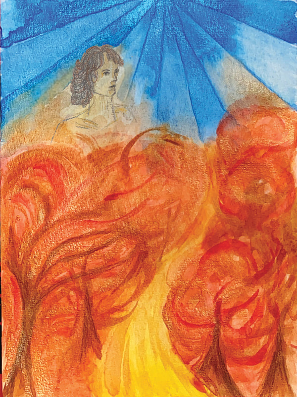 As I surprisingly began to quite enjoy the poem, I decided to do a few more edits, using a William Blake approach. By the end of the project, I really liked reading the poem (after hating it at the start) so I wanted to do some pieces where the language was included. I used gold ink to paint out a sample of the poem and the staircase, and then edited it in photoshop, using paper textures and layers of colour to achieve a similar style to William Blake. I didn't spend a great amount of time on these but I was enjoying creating them!
0 Comments
Leave a Reply. |
AuthorSecond year illustration student, studying at the University of Cumbria Archives
December 2020
Categories |
 RSS Feed