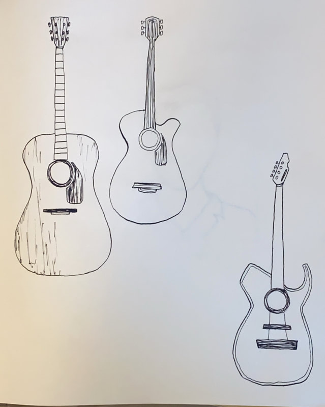
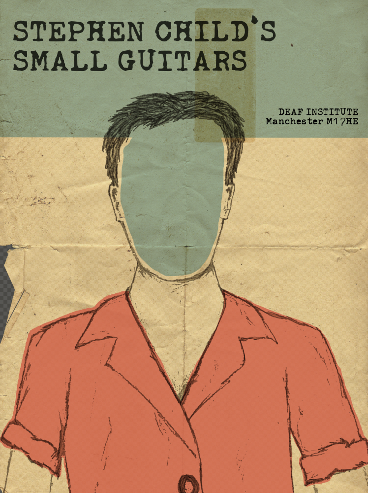
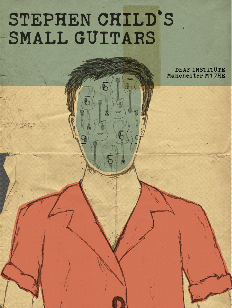
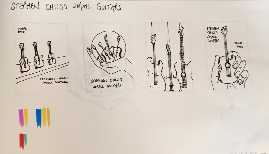
I really like the effect of the paper textures and I definitely learned a few tricks with photoshop to make this look like a realistic old band poster - altering the opacity of layers, using the multiply tool to make the layers not look as though they're just sat on top of eachother etc. I was pleased with the outcome of these, however from an illustration point of view I think I could create a design which suits the title more - Tony mentioned in a group crit that I was missing a trick by not looking into scale, so I looked into this a bit further. I also decided I wanted to use photoshop to create a screen print effect, as this is something which I think could be really useful to learn about for future projects as well.
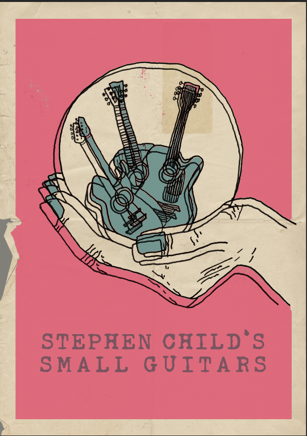
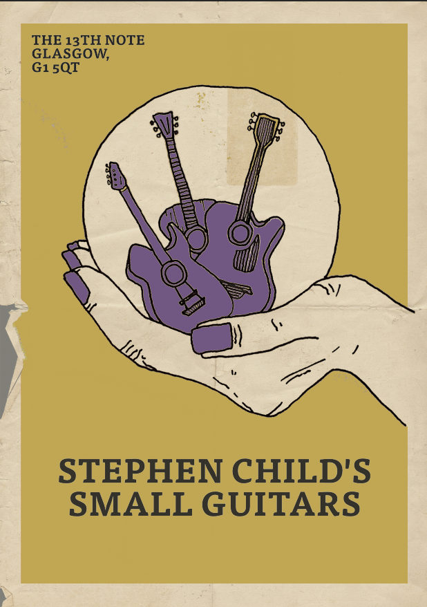
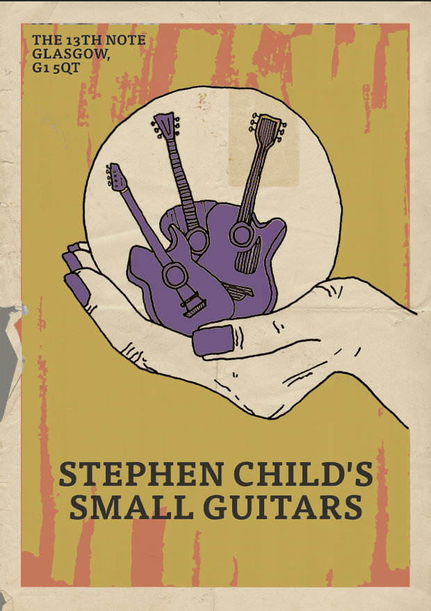
I decided that I wanted to use contrasting colours to make the posters really eye catching and exciting, and I thought of producing a series of screen prints - one for each venue for example. I also had a play using half tone which I thought was really cool. I used it on the line drawing and even though the difference was subtle I thought it gave quite a good representation of screen printing as well as there were little gaps in the spread of colour, and it gave a bit of a speckled effect. This would work particularly well on a more detailed illustration but overall a good trick to learn. I played around with lots of different colour combinations and different fonts etc, below are screenshots of my progression.
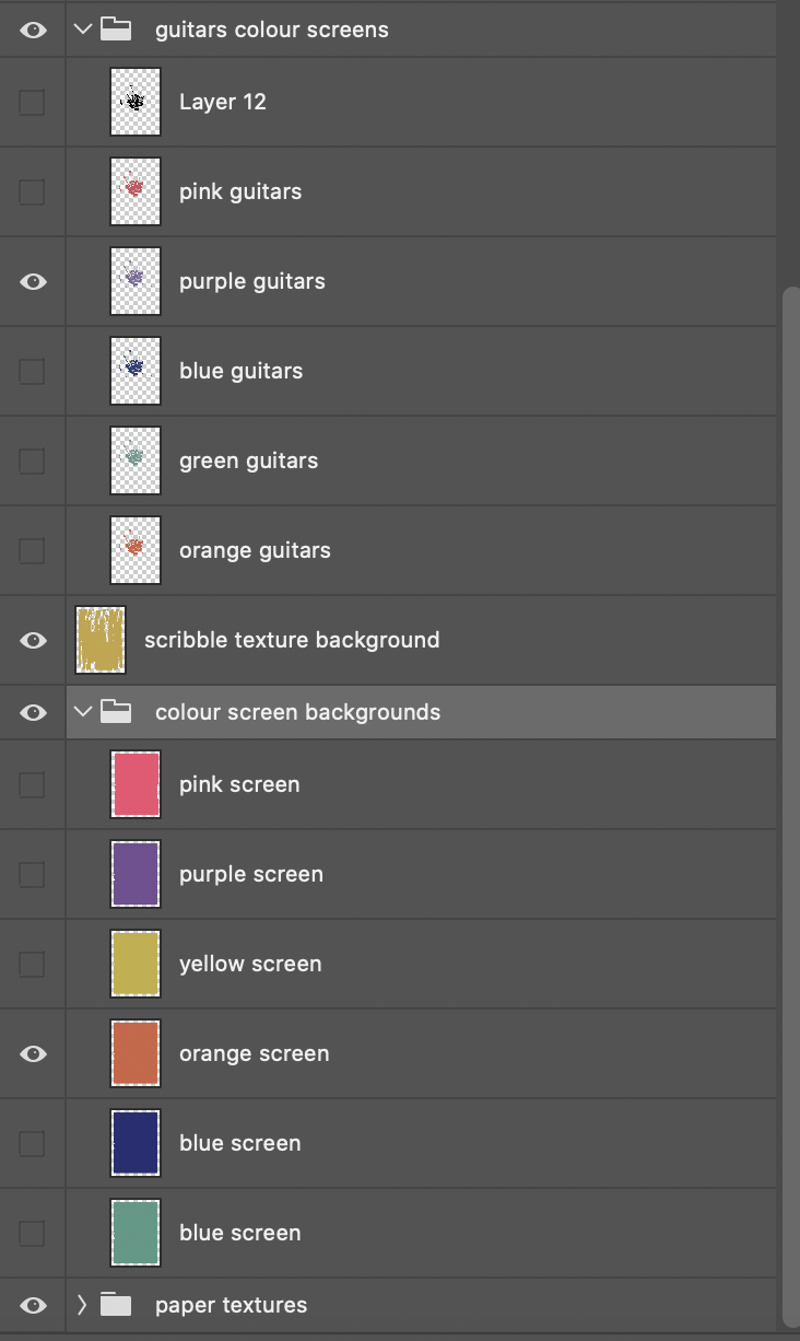
This is how my layers palette looked, I grouped everything to make each colour screen easier to find which worked well.
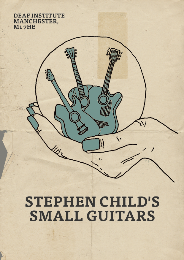
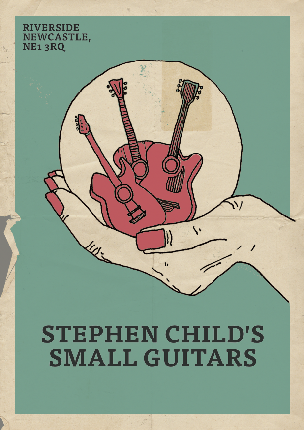
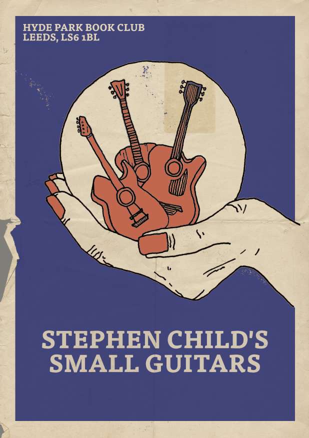
Here are my final screen prints, which would be a series - I produced 4 different ones for different venues. If I had more time, I wanted to look at t shirts, and how the design would be screen printed onto them.
0 Comments
Leave a Reply. |
AuthorSecond year illustration student, studying at the University of Cumbria Archives
December 2020
Categories |











 RSS Feed