AILSA FORRESTER
  • PORTFOLIO
  • PROJECTS
    • UX DESIGN
    • ILLU6050 FINAL SUBMISSION
  • PERSONAL WORK
  • ABOUT ME

Constructivism

10/25/2019

0 Comments

 
Nick's recent lecture involved modernism, cubism and Russian constructivism. We looked at the innovation and expansion of the arts during this period which was really interesting. We looked into 3 of the main cities - Paris, Milan and Moscow, and I will be focusing on constructivist posters in this blog and exploring the key attributes.
Picture
This Rodchenko poster involves bold visual aspects. Due to the low levels of literacy in Russia this was particularly effective. Considering the era of this poster (1920s), it was produced on a limited scale whilst production slowly recovered from the economical issues. This was the reason for limited, yet bold, colour range - one of the restraints from the economical difficulties. 
The photo montage aspects within the poster are particularly powerful due to subject of the image. Furthermore, one distinct aspect of Rodchenko's posters is the geometric, diagonal format which is successful. Although it is very simple, it is a good way of portraying a message clearly and cleverly to ensure the audience can understand it.
Picture
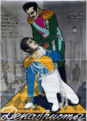
This example of a movie poster by Stenberg Bros. differs quite a lot to the Rodchenko poster. For starters it serves a different purpose - the Stenberg Brothers produced lots of movie posters. There is a much more innovative and experimental use of perspective, geometry, typography and colour. It is said that their vivid use of colours tends to compliment the movie's sense of struggle and 'revolutionary air of change' in society at the time. There were new propaganda tools due to the heavy industrialisation at the time. The expressive graphic text was originally designed to attract the illiterate population so it was therefore a clever way of expressing emotion to all audiences. ​
In conclusion both posters were very successful in their time, but both served two different purposes. The propaganda poster by Rodchenko was to deliver a message and the Stenberg Brothers poster was advertising a movie. Due to the type of audience, both used a similar bold font, easy to understand and portray the message, or express emotion.
Picture
Picture
Picture
0 Comments


Leave a Reply.

    Ailsa Forrester

    Illustration student at the University of Cumbria.

    Archives

    December 2019
    November 2019
    October 2019
    September 2019

    Categories

    All

    RSS Feed

Site powered by Weebly. Managed by 34SP.com
  • PORTFOLIO
  • PROJECTS
    • UX DESIGN
    • ILLU6050 FINAL SUBMISSION
  • PERSONAL WORK
  • ABOUT ME