|
For the second brief of the semester, we have been tasked with the Penguin Design Award Competition. We have to choose 2 out of the 3 books included, and produce a complete cover for the books. The options were:
The Diary of a Young Naturalist, adult non-fiction, by Dara McAnulty Girl, Woman, Other, adult fiction, by Bernardine Evaristo Murder Most Unladylike, children’s fiction, by Robin Stevens Penguin have some helpful information surrounding what they look for, and what makes a good spine etc on their website too so I will link these below. www.penguin.co.uk/company/work-with-us/cover-design-award/what-the-judges-are-looking-for.html https://www.penguin.co.uk/articles/2021/february/book-spine-design-cover-designers-interviews.html https://www.penguin.co.uk/company/work-with-us/cover-design-award/former-winners.html
After lots of thought, I opted for the adult fiction & adult non-fiction as I felt these were books I resonated with more myself. Having both a passion for nature, and a passion for equality and feminism, I felt both of the adult books were very up my street. Each of the books has its own brief and requirements for the final outcome, which I will document below.
I began initial inspiration with a Pinterest board of eye-catching, clever, book jackets, and I plan to do further research for each individual book.
GIRL, WOMAN, OTHER, BERNARDINE EVARISTO - ADULT FICTION 
This book seems absolutely fascinating, all about expanding race, equality, gender, sexuality, it is a book all about empowerment. Being almost 500 pages long, and the slow reader that I am, I thought it would be sensible to just read passages of the book to get a feel for it, and watch lots of youtube videos to aid me in my development. I have also been listening to the bbc radio 4 reading of the book whilst I work which I find really useful. I do hope to read this following this project however as this book is very up my street and a book I would very much enjoy.
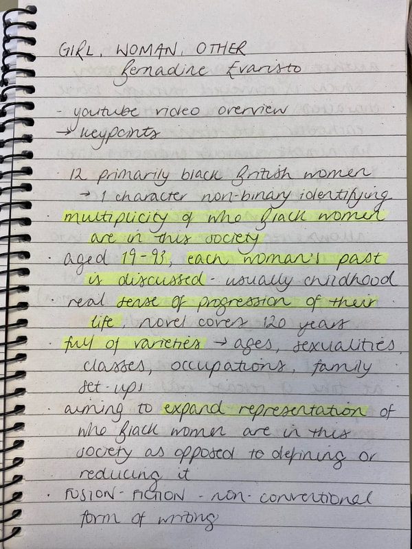
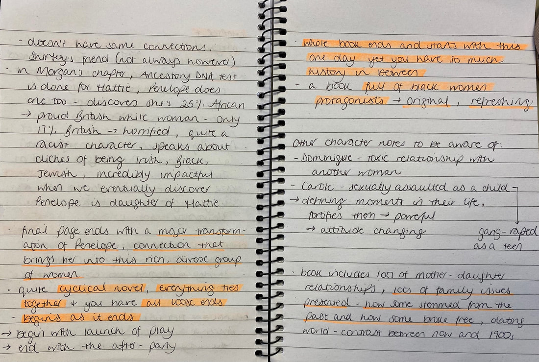
First was an interview with Bernardine Evaristo, which was very interesting, I will upload my notes along side:
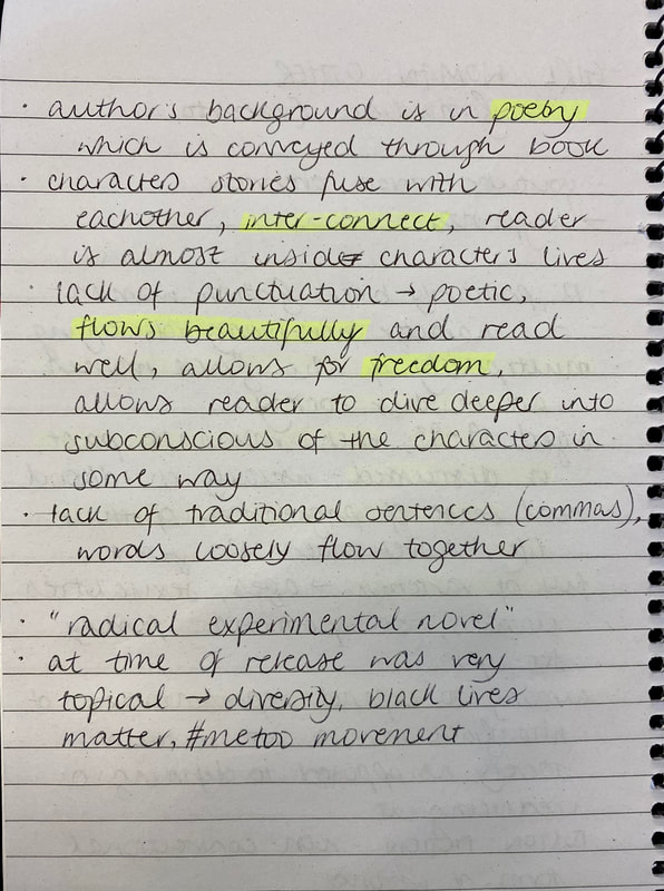
The next video covers an explanation of the characters in more depth & their connections which I found really helpful to get a better image in my head of how the book works. It was also really helpful to get an outside insight to this book. I made lots of notes on this so I will upload these alongside:
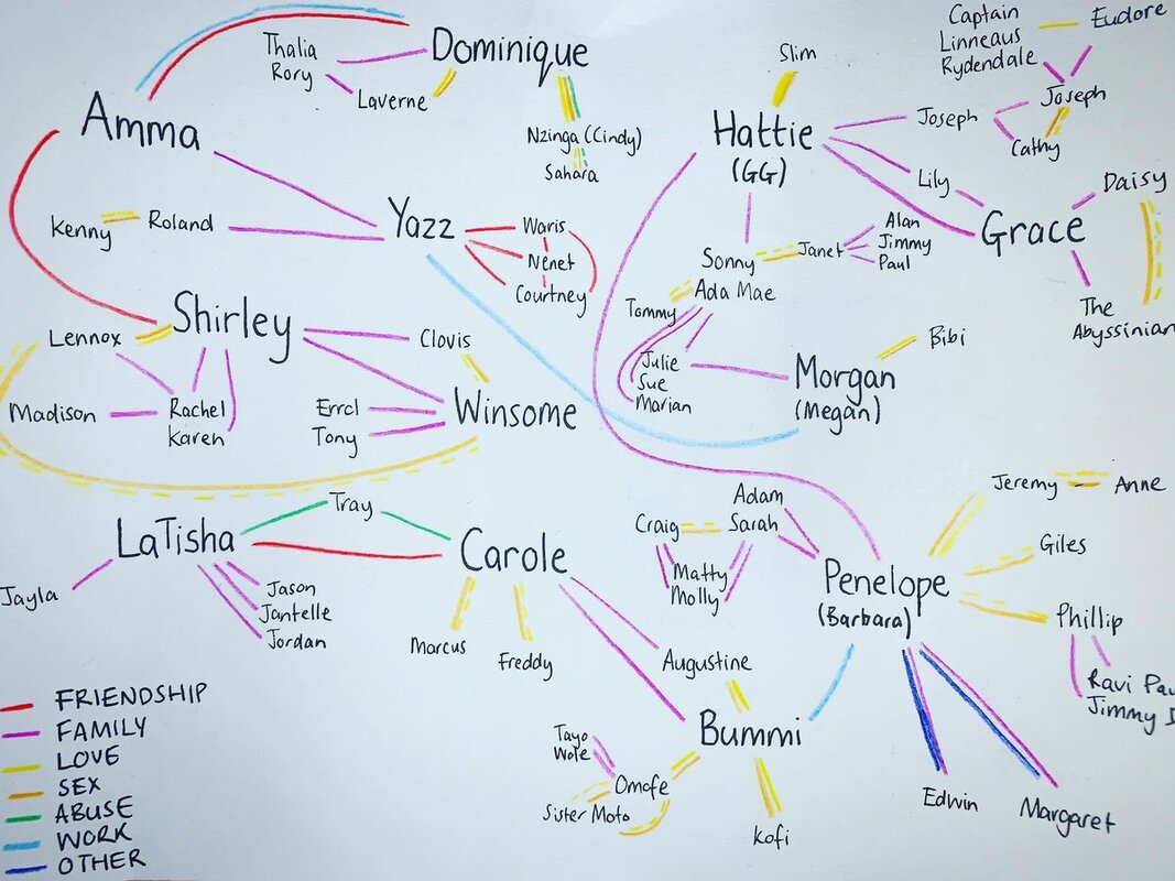
I also looked at some website sources to get a better explanation of the characters and the main key points of the book. It is quite complex and so these helped to clear some things up for me, which will help me to produce a cover which I feel is a good representative of what the book is about.
https://www.marmaladeandmustardseed.com/bookguidesblog/girl-woman-other https://www.supersummary.com/girl-woman-other/summary/
INSPIRATION & RESEARCH IMAGES
Initial thumbnails:
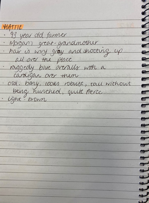
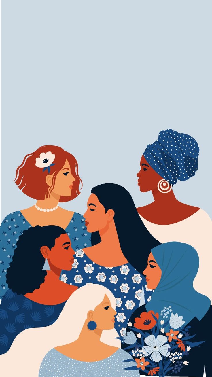
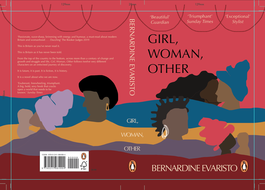
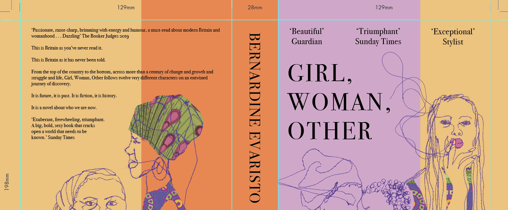
My initial ideas surrounded the portrayal of the characters, aiming to show how they are all connected and the 'cyclical' aspect of the novel. I also quite liked the idea of having different layers, potentially through collage, to show the depth of the novel and the connections involved. My aim for the cover is to highlight the variety of characters (age, race, sexuality etc), show that they are all connected, how the layers of lives overlap, and finally the cyclical element of the book - the way it starts and ends at the same scene - the play. I also think having the illustration spread across the front and back cover will further highlight the cyclical element of the novel. 
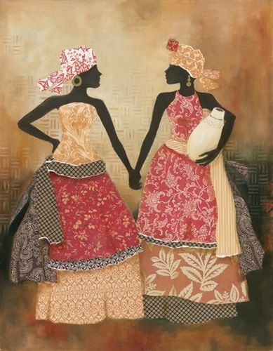
Rosie James - textile stitch art artist
I really like the idea of stitching all my different character profiles, portraying different elements of the 120 years, addressing the expression of empowerment, connections, family, love, sexuality, relationships. I thought this would be really interesting and I could layer up the profiles, using different opacities, and include plenty of colour and pattern since this book should have an African feel and should highlight bold expression. I think stitch would be cool as the loose threads would highlight the loose ends of the book and how they then come together at the end of the novel. Furthermore, if the figures are all kind of linked together with thread, this would be interesting to portray the cyclical element, the poetic way of writing, and the way everyone is connected.
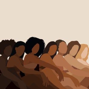
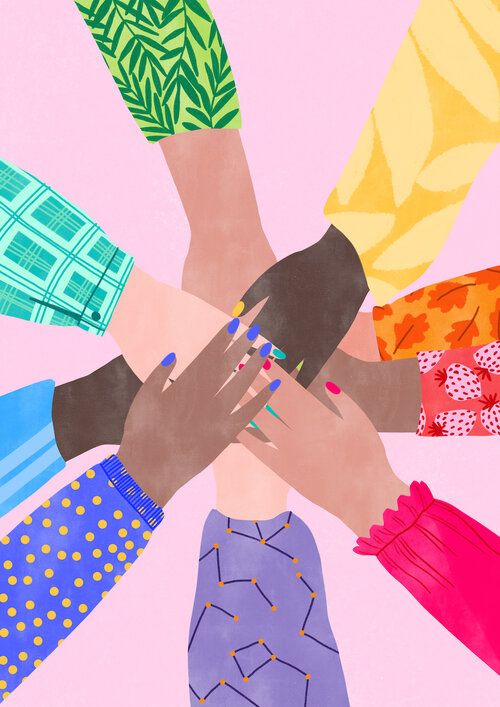
Imagery for the connection element, sense of belonging, women empowerment:
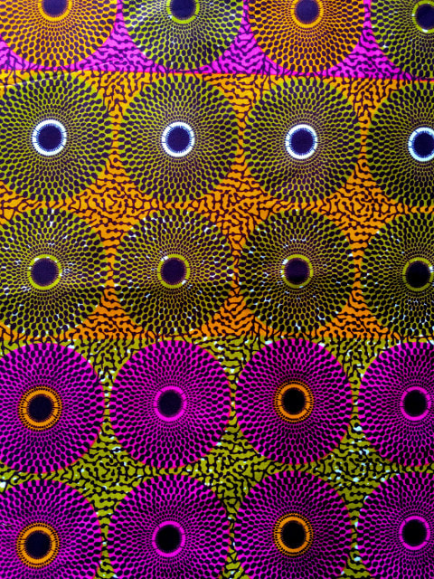
African patterns:
Developed thumbnails & experimenting with typefaces:
Experimenting with stitch:
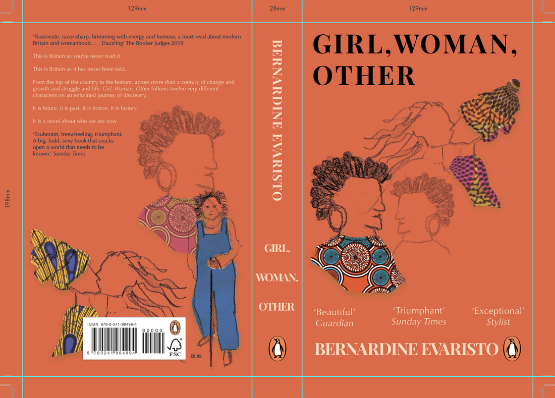
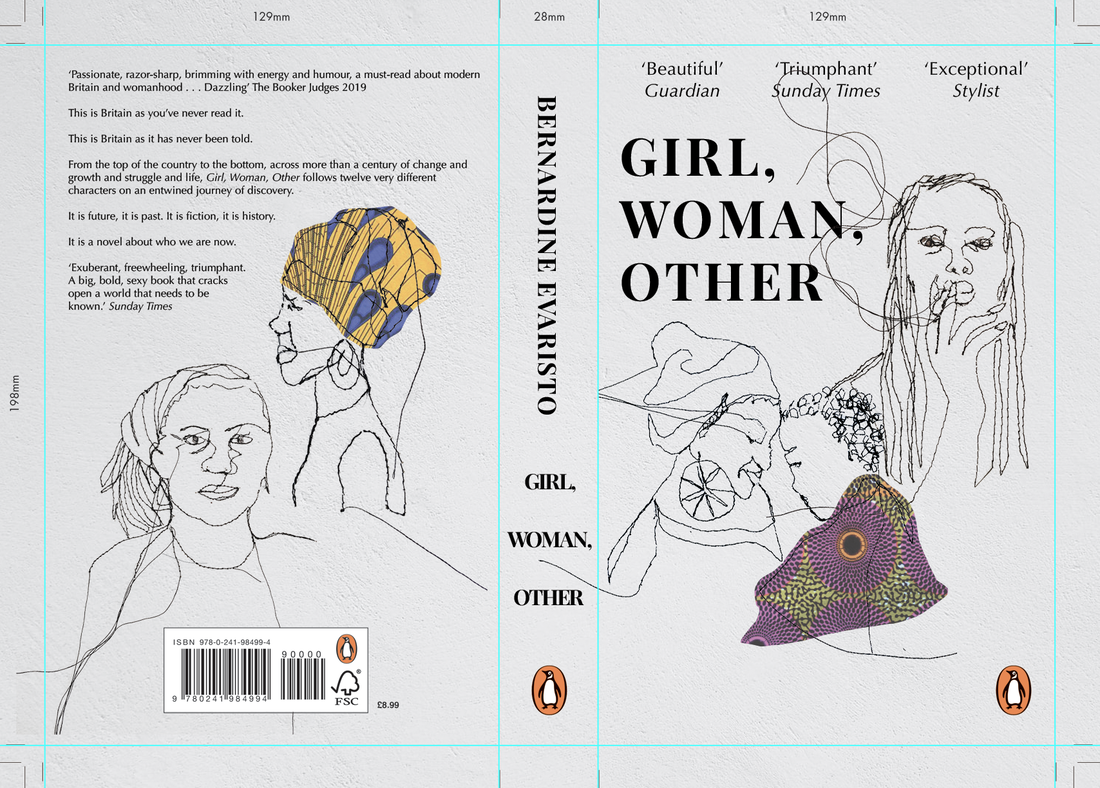
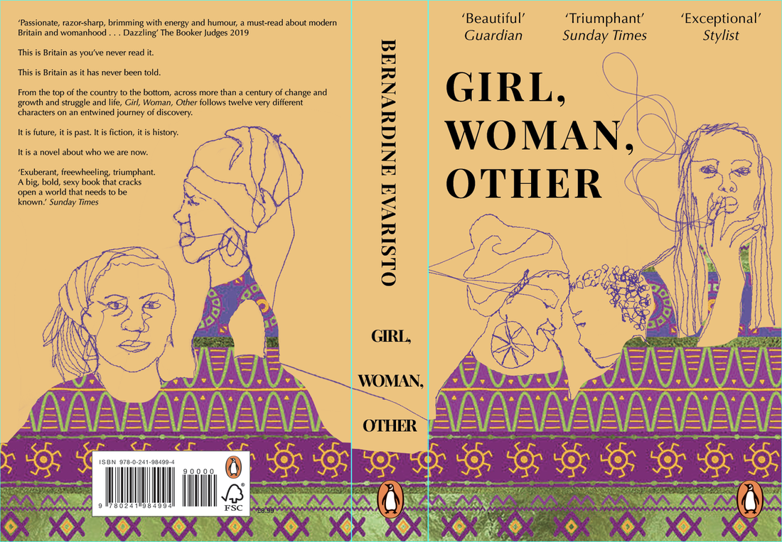
Layering stitched profiles, taking inspiration from Rosie James - think it portrays connections of characters well and the poetic, cyclical elements to the novel, but in the initial stages I didn't think it was bold enough so I had to play with the composition, textures and colour further to see what worked best. I also tried my other idea of the rows to signify the play/theatre element to the novel but I wasn't keen and I preferred the way the characters were connected in my other developments. I didn't look at type too much at the start whilst I figured out the other elements but I began to look further as I went on. I also just used African fabric textures that I'd sourced online but I made my own later down the line.
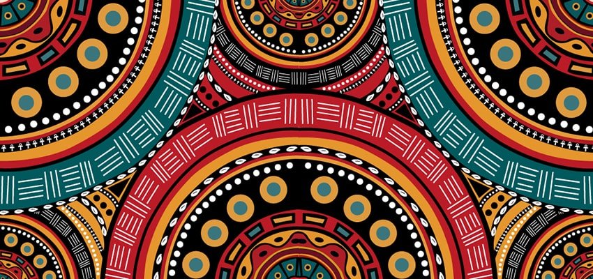
Making my own African pattern:
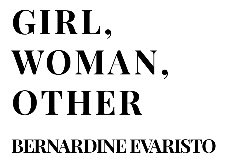
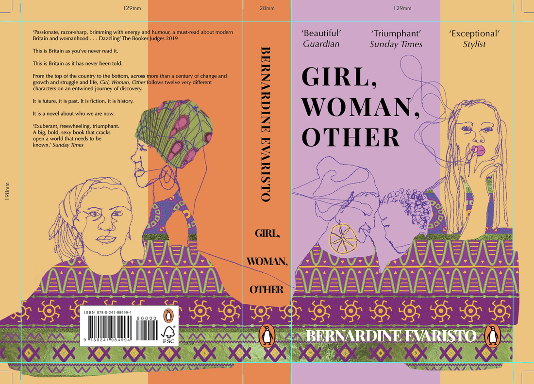
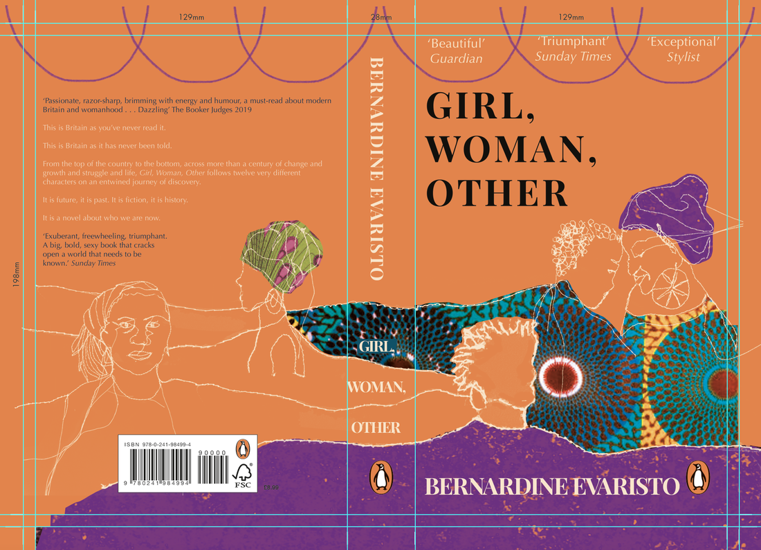
Playing around with typography:
I was hoping for a strong bold font to highlight the powerful women in the book, but also with a feminine side to it (serif font). Then it was just figuring out the colours to ensure the text stood out enough.
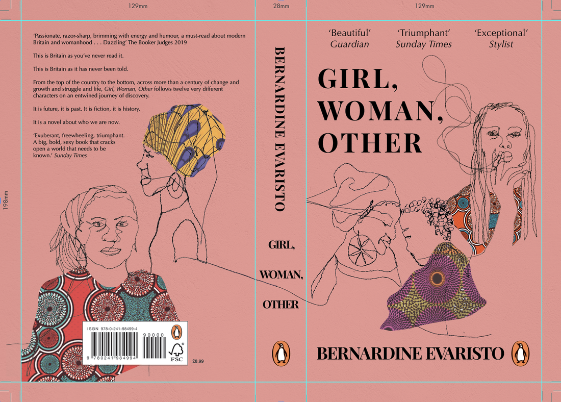
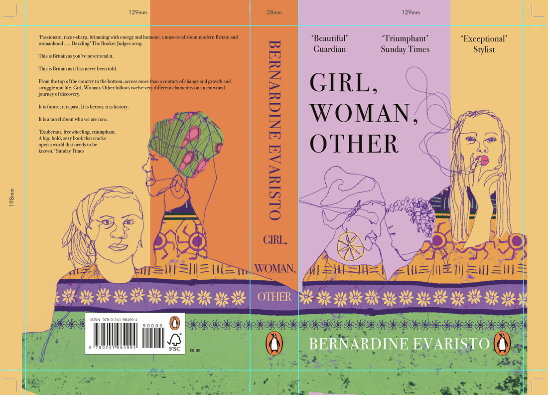
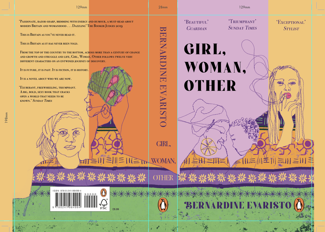
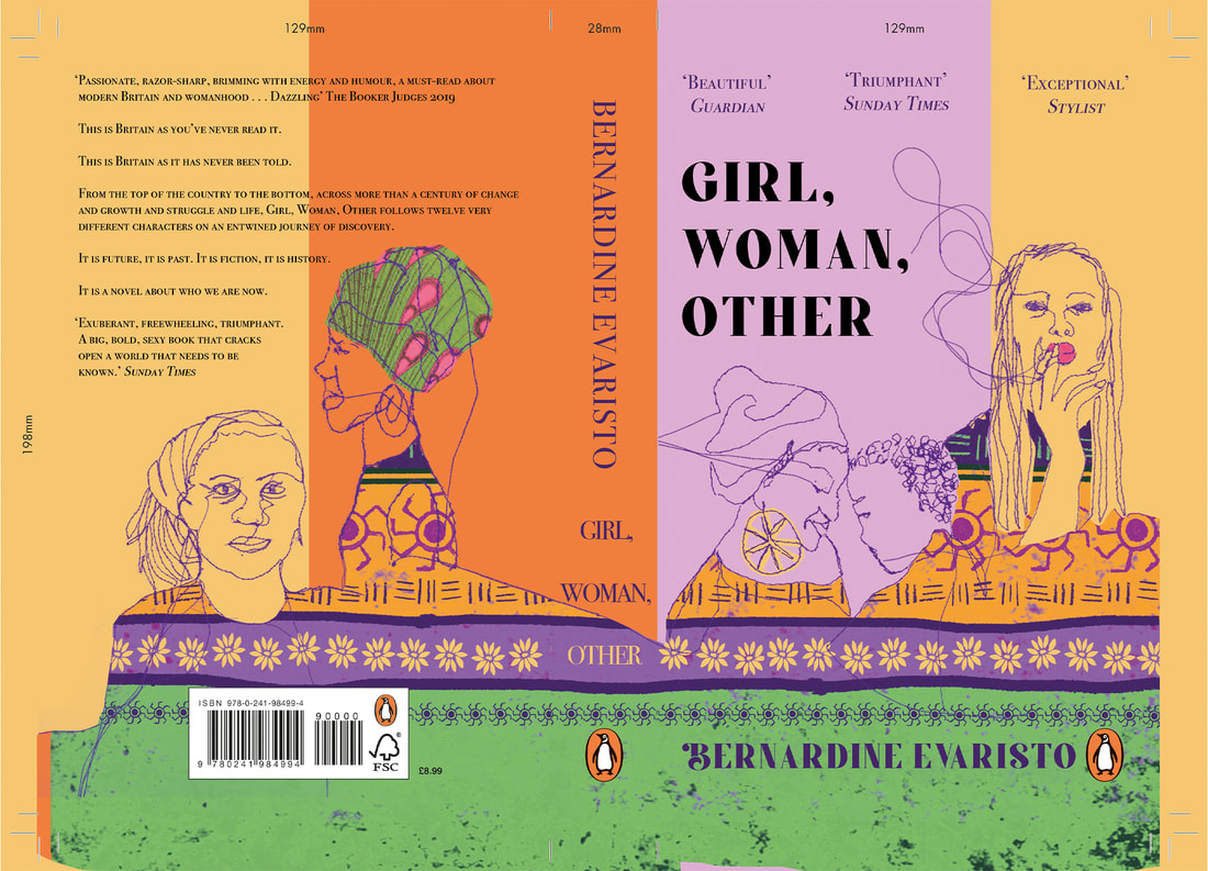
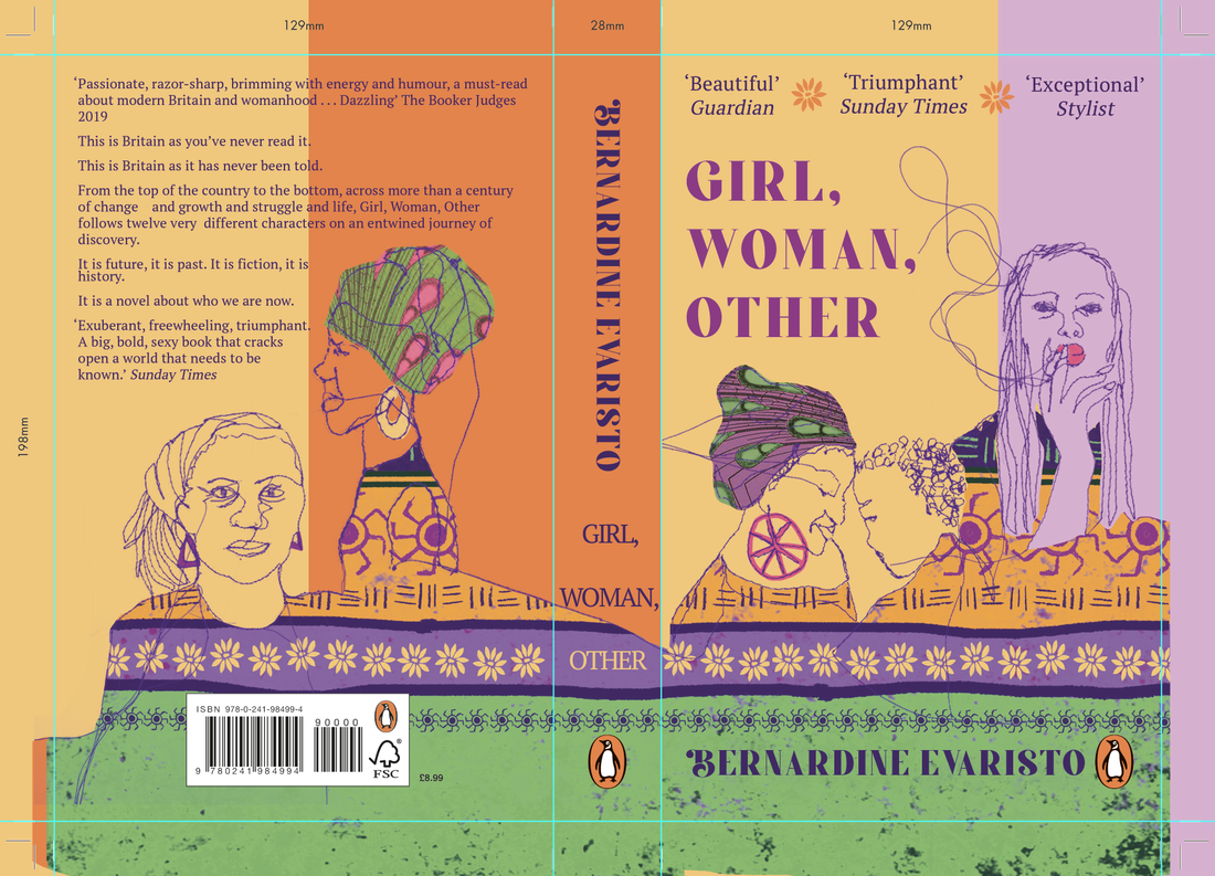
After lots of tweaking with text, colour etc, I was finally happy with the final cover for this book. I really enjoyed this book, I found it a really exciting project to work on. I think it portrays lots of elements of the novel well - the bright colours and African patterns highlight the culture of the book, and the variety of stitched profiles show it is a story about women, predominantly black women, and it covers lots of different ages and stages of life. All of the loose threads link up which further conveys that the characters are all connected in some way, and I used the pattern to further connect them but it also looks like their clothes. I didn't use any skin colours, just the bright background, which signifies an element of equality. Finally, I get a real sense of empowerment from the cover - strong independent women, lack of male presence, mother daughter bond (Amma and Yazz), a woman smoking (inspired by the character of Dominique) which is quite controversial. Overall, I am really pleased with the final outcome.
Following a crit with Tony, I made a few tweaks, particularly with the colour of the text, and I also changed the font on the blurb so it is more legible. I also added in a few more features to the profiles. Tony also mentioned that the front was quite bottom heavy so I played around with adding some pattern elements to the top.
Final cover (incl. bleed):

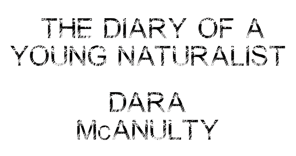
THE DIARY OF A YOUNG NATURALIST, DARA MCANULTY - ADULT NON-FICTION 
INSPIRATION & RESEARCH IMAGES
Initial thumbnails:
For my initial thumbnails, I was focusing on the portrayal of the 4 seasons, as the book is structured into 4 segments. Dara also explains in thorough detail the elements of nature he experiences in each season, so I was hoping that within each season of the illustration, we would see some of the things he mentions. He speaks about everything in such a magical manner that I think the elements involved (trees, leaves, animals) need to be illustrated with detail to highlight the depth of detail he goes into. Being an autistic teenager, I played with the colour red within my thumbnails as this is the colour used in association with autism pride - but also maybe this could be portrayed through the detail and magical way of illustrating what Dara sees. I played with several formats - postcard? diary page? layered seasons? In a crit with Tony he suggested playing with the vertical seasons idea, and to not solely focus on a double spread front and back cover as really the front should be the main focus. 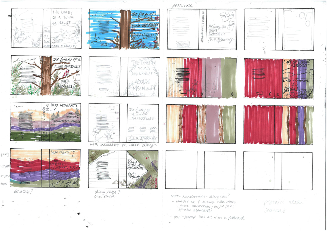
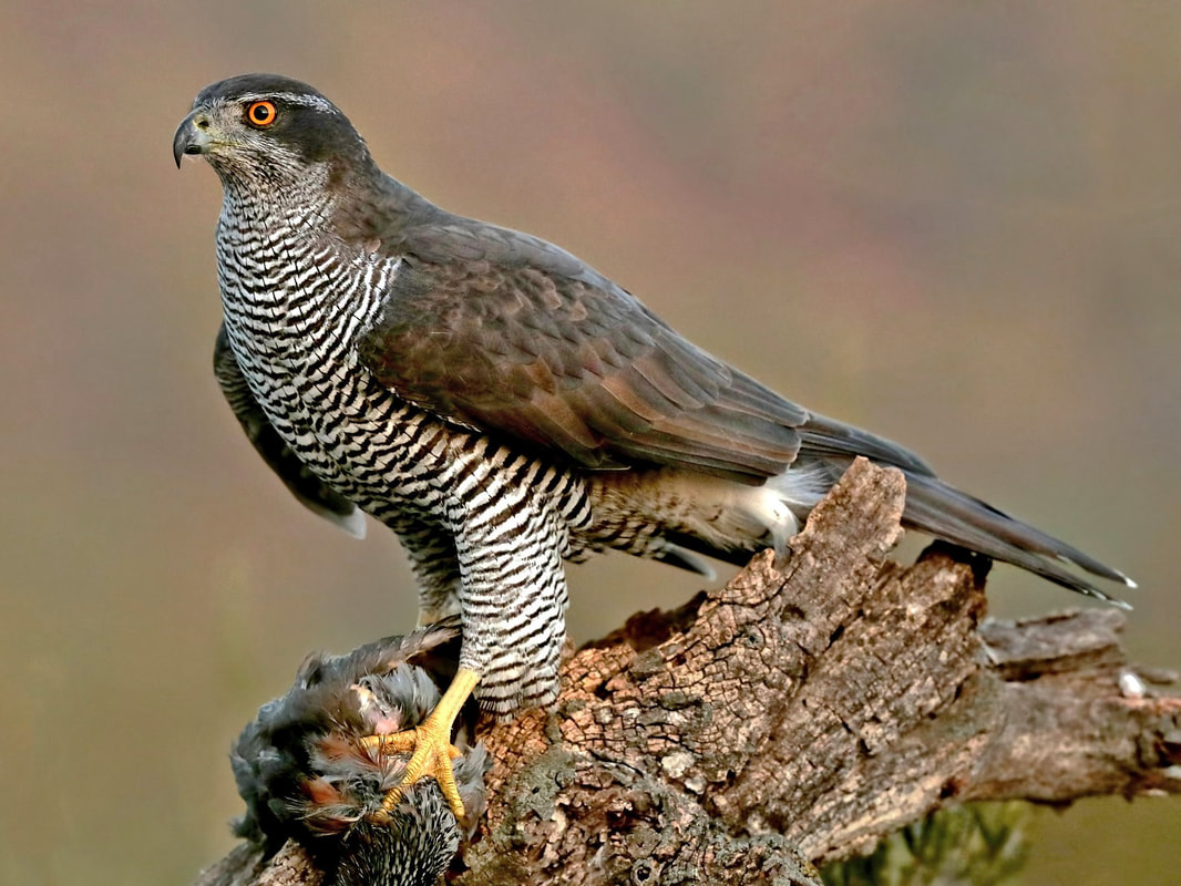
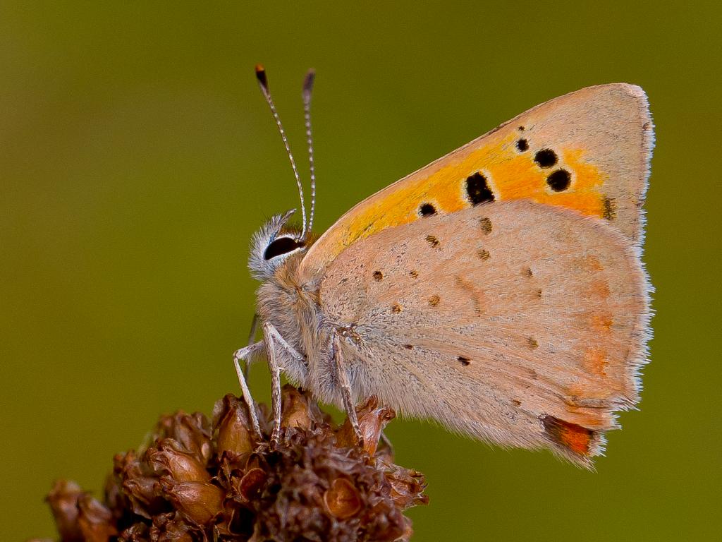
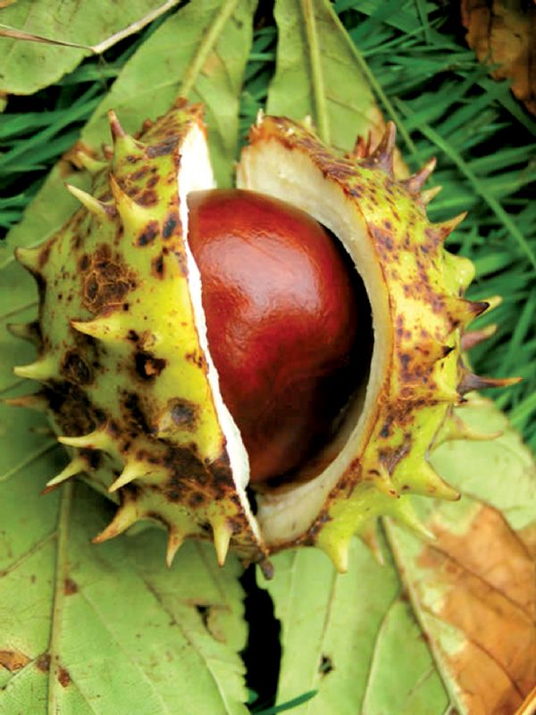
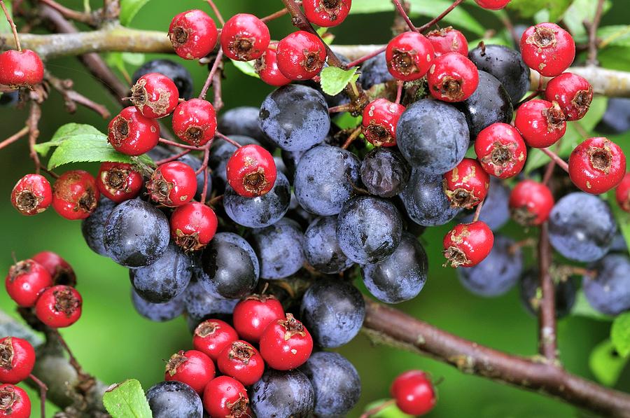
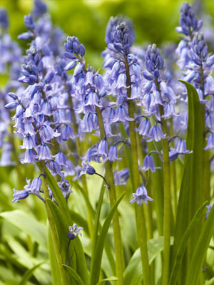
Research images of the elements mentioned in each season:
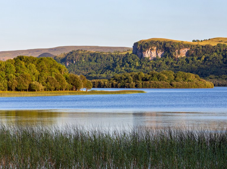
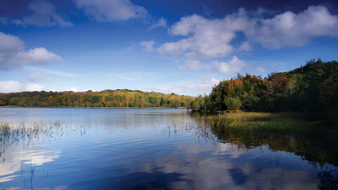
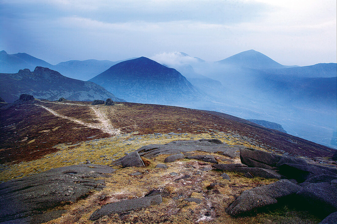
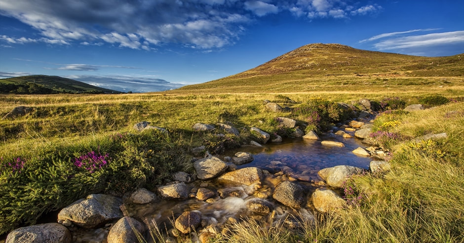
County Fermanagh (where the diary begins), Dara then moves to the other side of Northern Ireland, in the shadow of the Mourne Mountains in County Down:
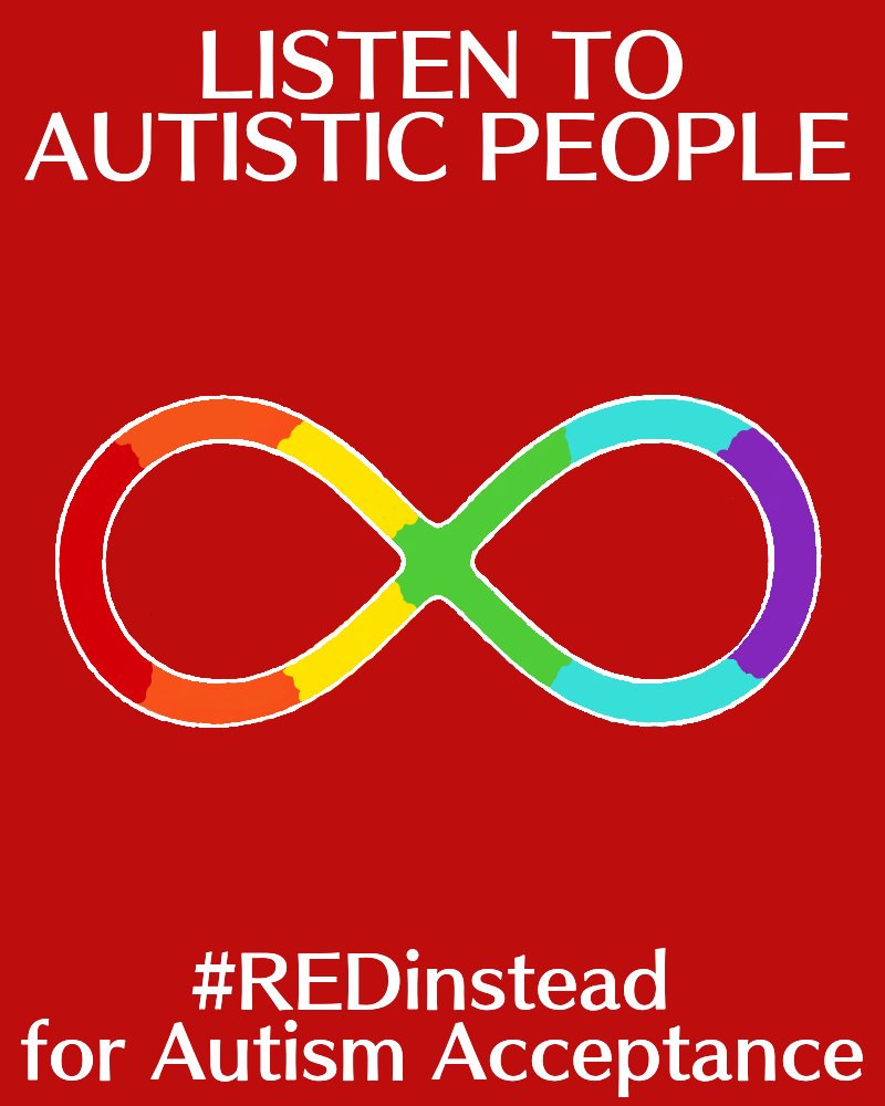
Autism imagery:
Developed thumbnails on a larger scale:
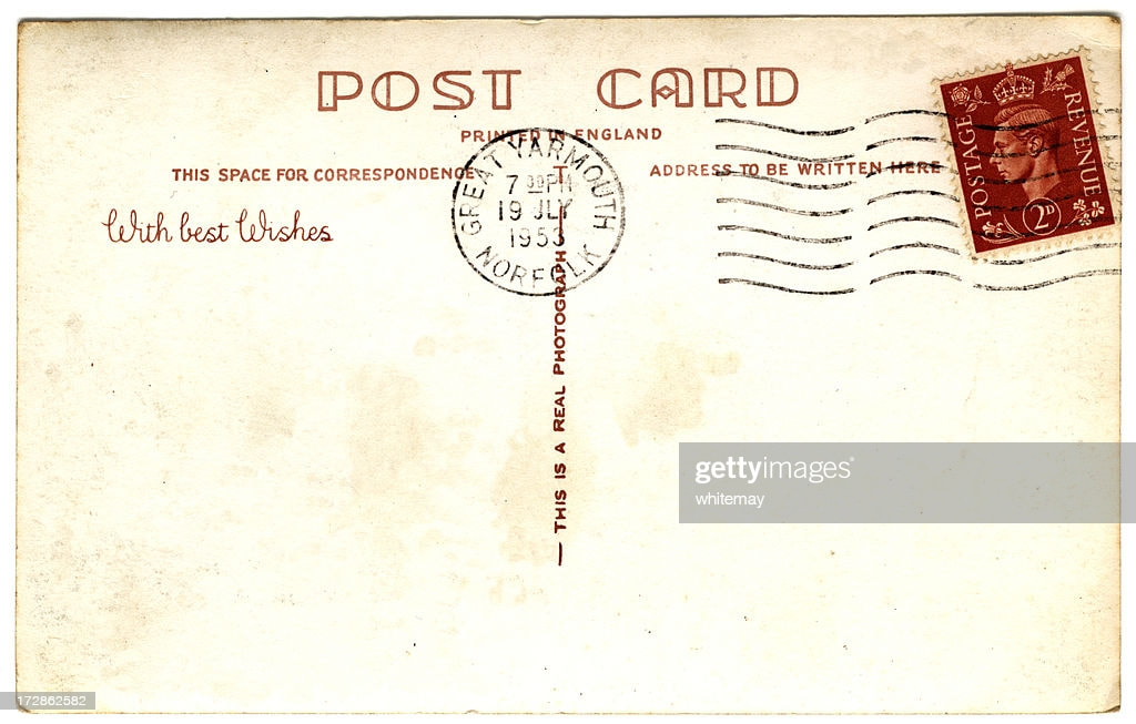
I worked on a larger scale here to see how all the text can be incorporated into different formats. The postcard idea I quite liked, there's plenty of space to lay out the text in a neat way, with the stamps including the quotes required, but there's little room for actual illustration so I don't think this one portrays enough elements of the book that I want to. The diary page highlights the diary aspect of the book, peel back to discover the natural elements discussed within, but again I don't think this is clear enough. I really want to focus on the seasons element so I think I prefer the ones where the seasons are layered together to highlight the journey of the book. I also experimented with portraying the seasons vertically, layered together with overlapping textures, highlighting the detail of the elements as discussed by Dara. Tony also discussed portraying a different scene in each seasons, experimenting with the 'slices' not matching up etc, but I think this would be a very busy front cover when there is lots of text to include. I think the horizontal layout of seasons works a lot better in regards to laying out the text, and also portraying a
Type experiments:
Along with looking at typefaces relating to the nature aspect, I looked at boys handwriting fonts to give the look of scribbling in a diary which I think look very interesting and would be good to experiment further with.
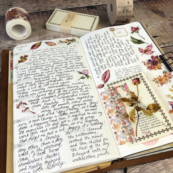
Scrapbook/journal concept:
Typography research:
Stamps:
Scrapbook experimenting, linking to the whole diary idea, with the thinking that he would collect things on his journey, have little doodles, scraps of paper etc:
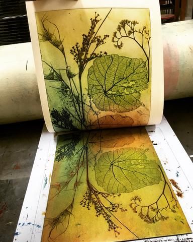
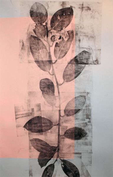
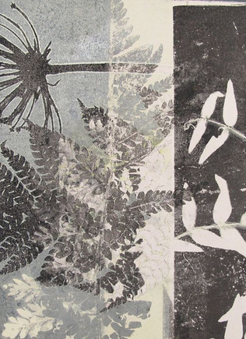
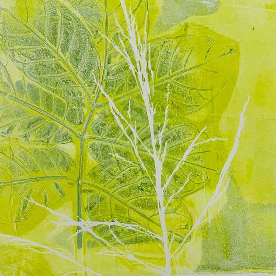
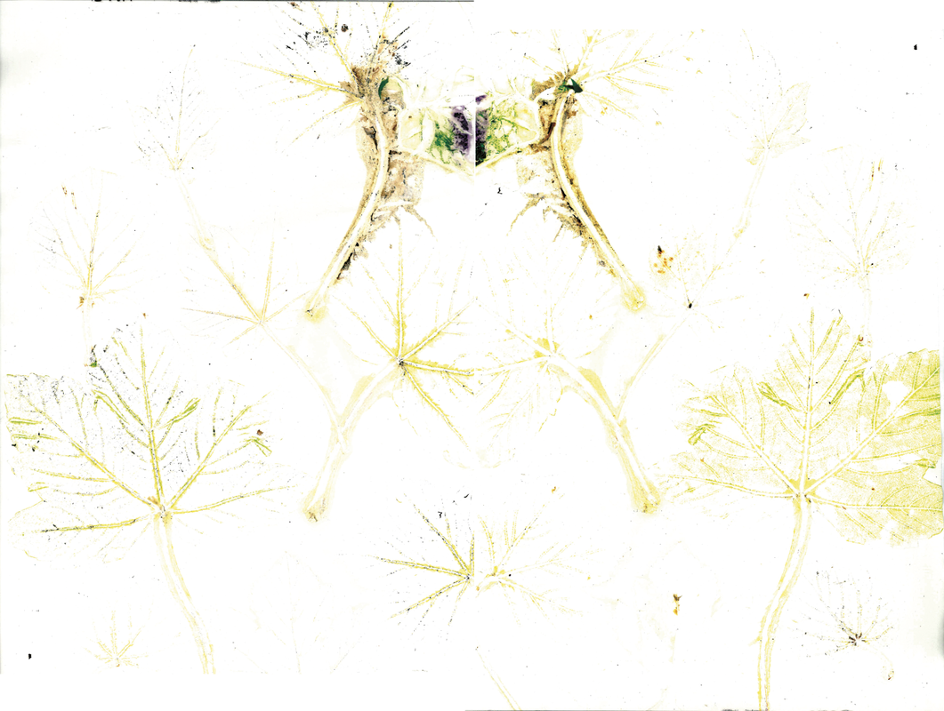
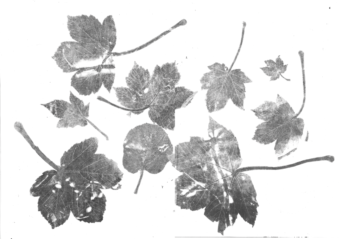
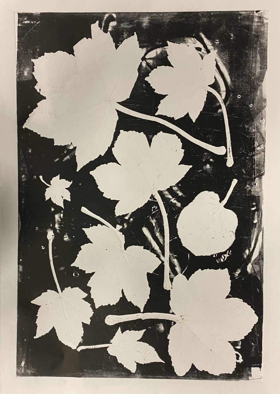
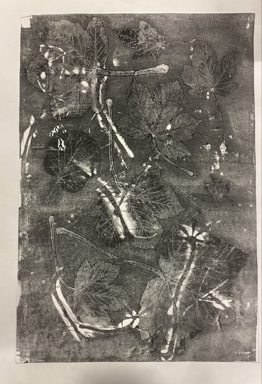
Mono-printing with leaves:
Further experiments, scrapbook/collage idea, :
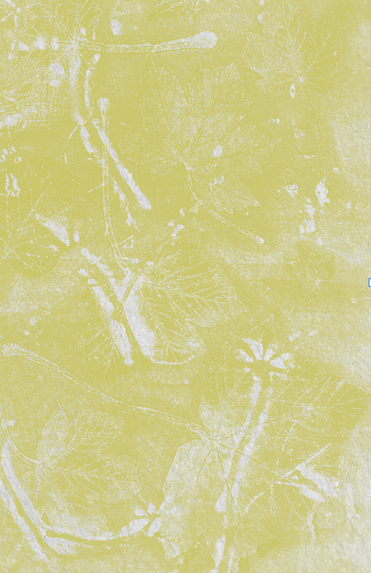
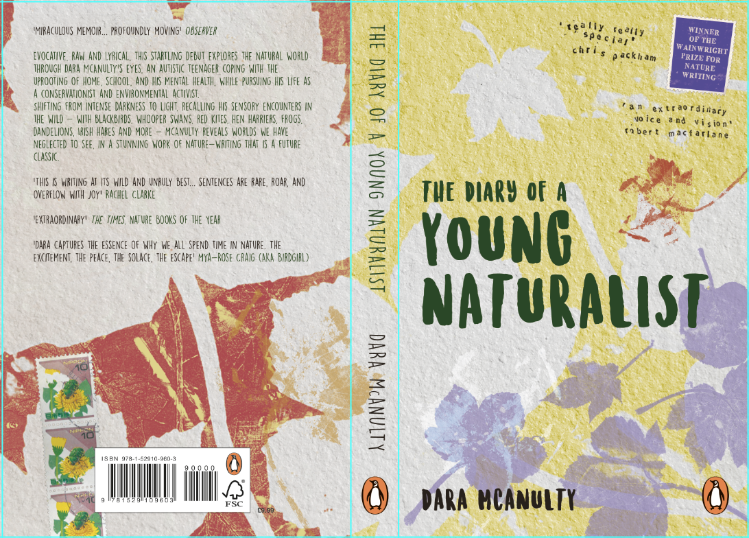
I found myself overcomplicating the cover I think, and I was getting quite frustrated with where I was going, and couldn't get what I had in my head down on paper. I realised I was probably trying to incorporate too much, and less is probably more. I really liked the leaves and the textures they gave, layering elements, so I carried on with some more experimenting, also seeing what they looked like mocked up as I worked:
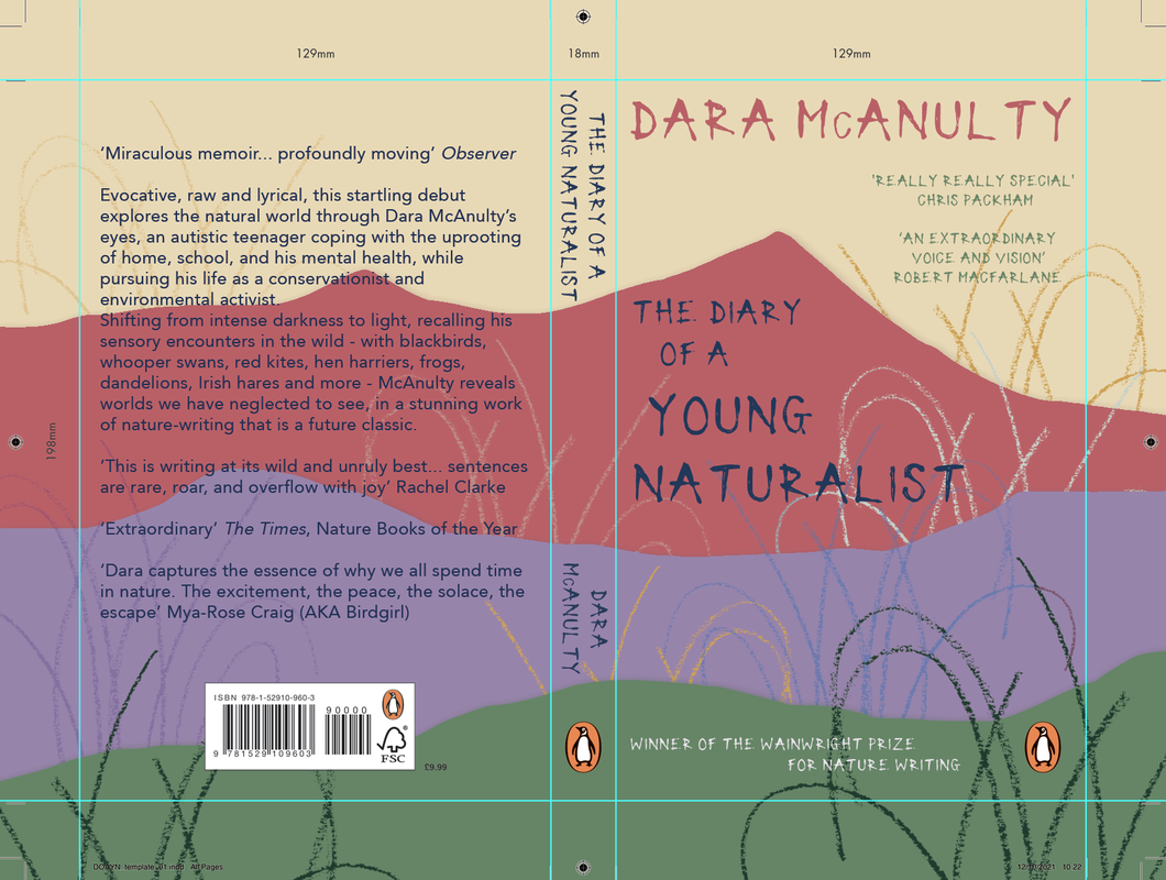
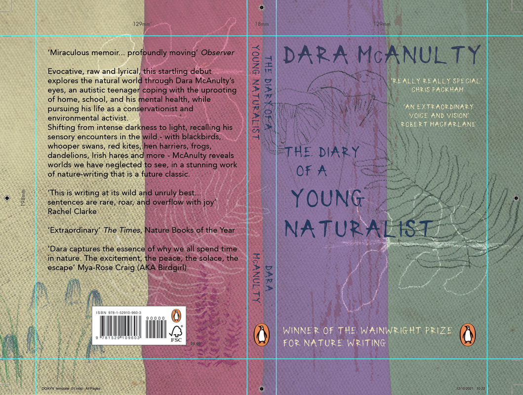
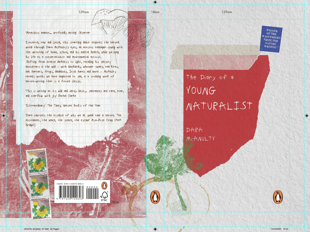
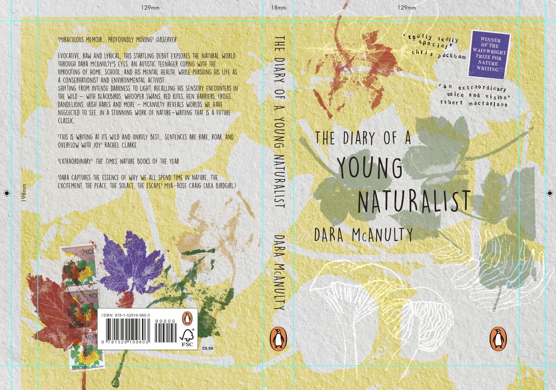
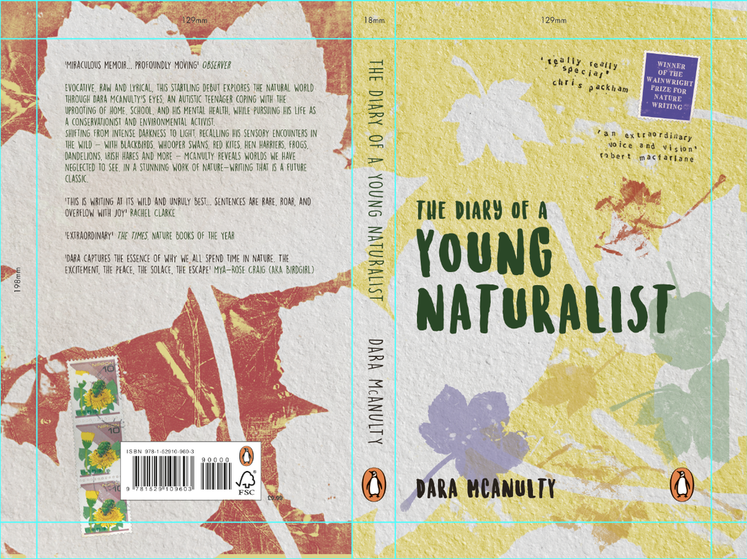
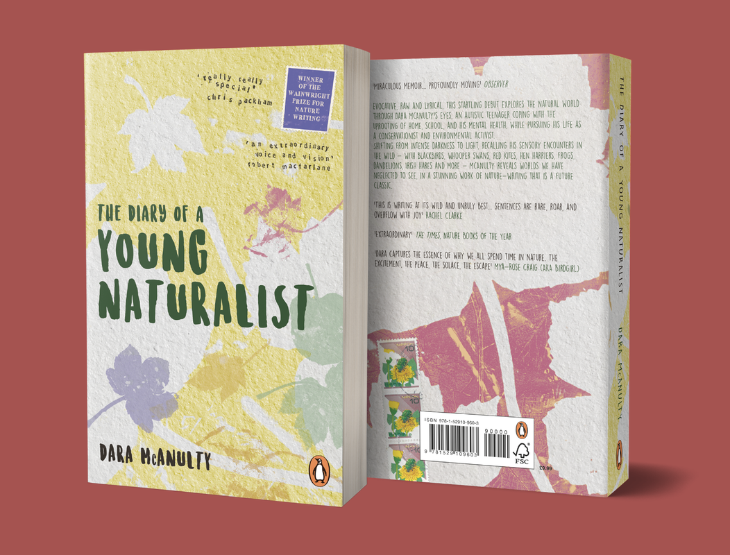
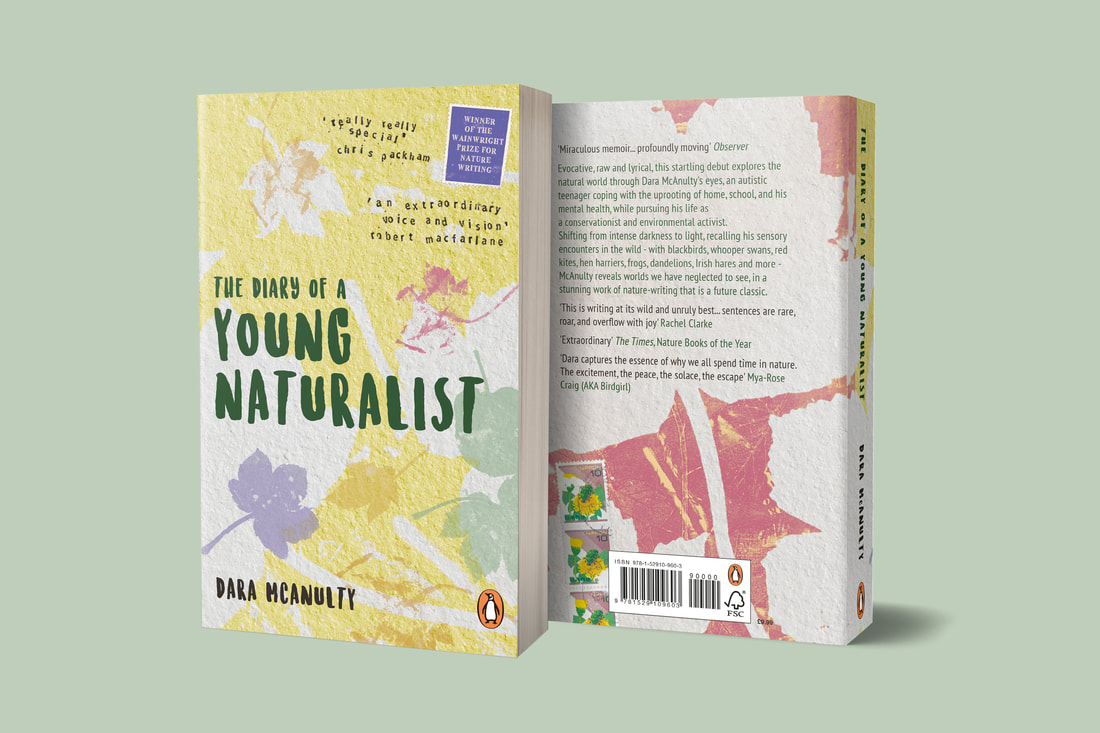
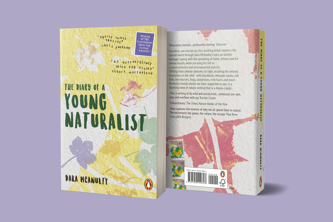
I finally got to somewhere I liked, with a composition that made a bit more sense than before. It's a bit simpler than I was originally intending but I don't think that'a a bad thing, I think it's a case of less is more. I was working with bright colours, which I think works well to portray the magical manner in which Dara speaks about nature. Red was a significant colour as it is the colour used in association with autistic pride, but I thought it was a bit too strong for the cover so I made it ever so slightly more pink, which I think works well as this book is all about Dara's unconditional love for nature. I tried to use a variety of colours for the natural elements, to highlight the different seasons which are covered, and I think they work quite harmoniously together. The text I was struggling with for the front of the cover, but I think this bold text works better and stands out more. I also kept the postcard influence for the quotes that needed including - linking to the stamps found on his journey, placed like they would be on a postcard.
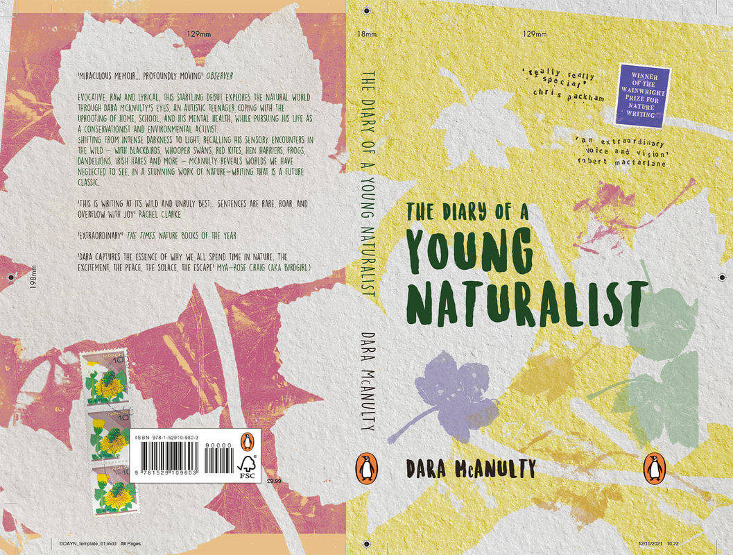
After a crit with Tony, he suggested some things with the typography, such as a lower case font on the blurb - although he did like that it wasn't a heavy font. Also on the front cover he thought it would benefit from another bit of colour in the negative space at the top so I amended these bits.
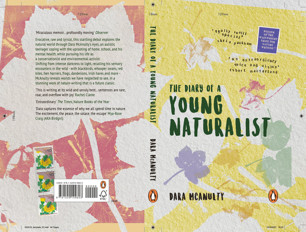
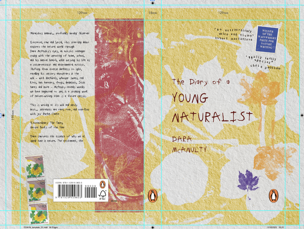
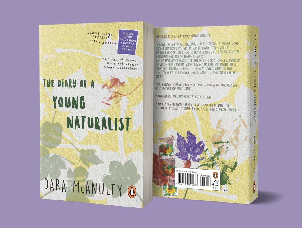
Final cover (incl. bleed):
0 Comments
Leave a Reply. |
Archives
November 2021
Categories |


 RSS Feed